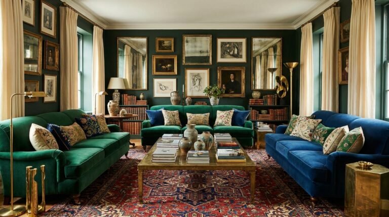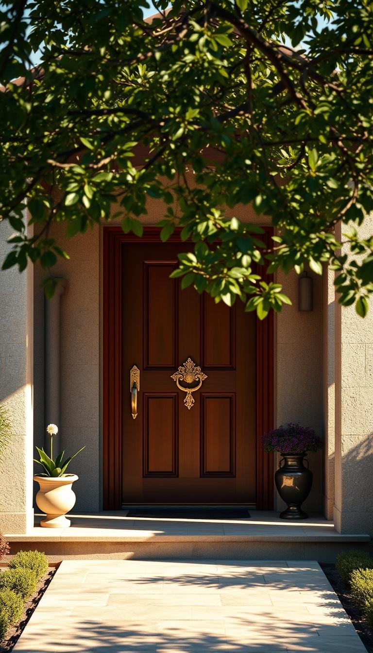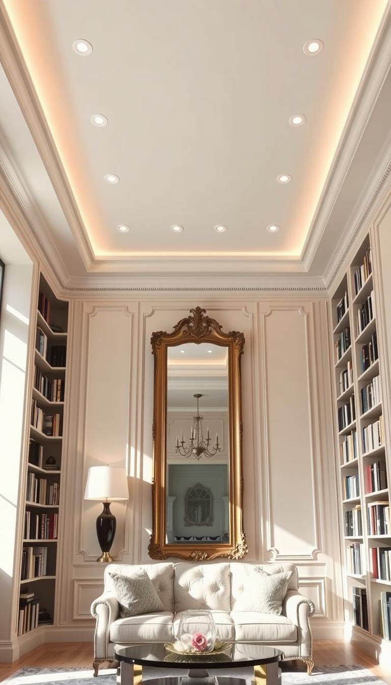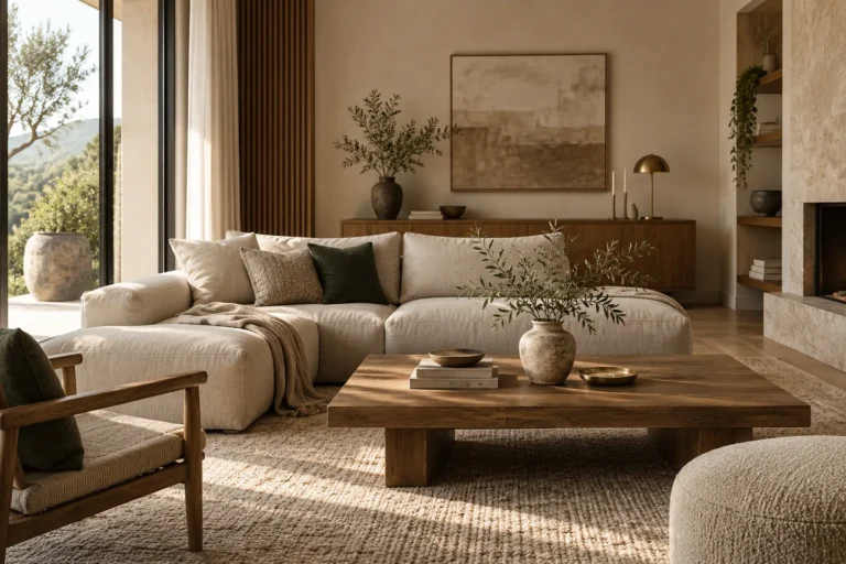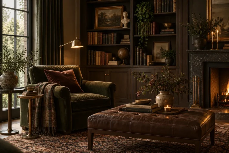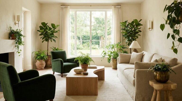
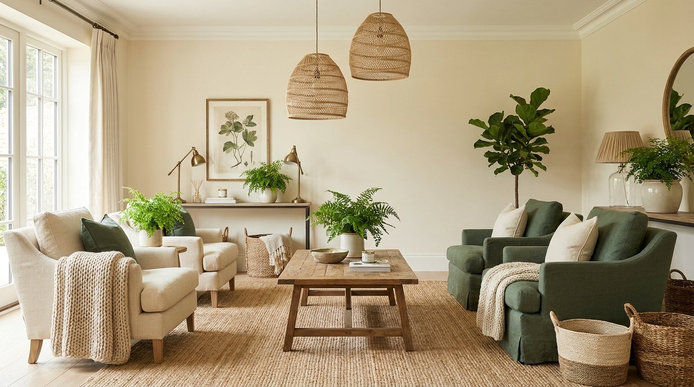
A cohesive interior uses materials that suit the room’s workload and repeat enough visual qualities to feel related. Choose durability, maintenance and location first. Then coordinate color, sheen, texture and finish so wood, stone, metal, tile, glass and textiles support one another.
The useful sequence is location → performance → maintenance → color → texture → sheen → edge and detail → combination.
1. Start with performance
A bathroom floor, dining chair, kitchen backsplash and decorative side table experience very different conditions. The first question is whether the exact product suits the use, not whether the material name sounds durable.
Manufacturing method, finish, backing, coating and installation system can change performance significantly.
2. Wood brings warmth, but species and finish matter
Wood varies in hardness, grain, color movement and response to moisture. Solid wood, veneer and engineered products can all be appropriate depending on the application.
When mixing wood tones, look for relationships in warmth and grain rather than insisting on an exact match. A pale oak floor can work with darker walnut furniture when other elements bridge the contrast.
3. Stone requires product-specific care
Marble, limestone, travertine, granite and other stones differ in porosity, hardness and sensitivity to acids or staining. Do not apply one universal care rule to every natural stone.
Ask the supplier about sealing, cleaning, stain sensitivity and the suitability of the finish for the location.
4. Porcelain and ceramic tile are not visually interchangeable
Tile differs by body, glaze, finish, size, edge and intended use. A product designed for a backsplash may not be suitable for a floor, and a glossy floor finish may behave differently from a textured one.
For kitchens, see our kitchen backsplash tile guide. For bathrooms, use the bathroom design guide.
5. Metal finishes add contrast and repetition
Brass-tone, bronze, black, chrome, nickel and stainless finishes can coexist when the mix feels deliberate. Repeat each major finish at least enough that it looks intentional rather than accidental.
Do not assume finish names are standardized across brands. One brushed brass can be much warmer or darker than another. Compare physical samples where close coordination matters.
6. Glass adds reflectivity and visual lightness
Glass can keep sightlines open and reduce visual mass, but fingerprints, water spots, glare and safety requirements matter by location. Tempering or other safety glazing may be required in some applications.
Use manufacturer and local building guidance for glazing near doors, showers, stairs and other safety-sensitive locations.
7. Paint finish affects more than color
Matte, eggshell, satin and glossier finishes reflect light differently and can change both maintenance and how surface imperfections read. Product formulations vary, so compare the exact paint’s intended use and cleaning guidance.
For color planning, use our interior color palette guide.
8. Textiles soften hard materials
Rooms dominated by stone, tile, metal and glass often benefit from rugs, curtains, upholstery and bedding. Textiles introduce softness, acoustic absorption and visual depth.
Browse the home textiles guide for fiber, construction and maintenance decisions.
9. Rugs connect material zones
A rug can bridge timber floors, upholstered furniture and metal or stone tables. Choose construction and pile for the room’s workload before using the rug as the palette anchor.
See how to choose an area rug for the full process.
10. Sheen is part of the palette
Two materials can be similar in color but very different in effect because one is matte and the other highly reflective. A successful room often mixes sheen deliberately: matte walls, soft textiles, natural wood and a smaller amount of reflective metal or glass.
Too many glossy surfaces can create glare. Too many uniformly matte surfaces can feel visually flat.
11. Texture helps similar colors feel layered
Warm neutrals become more interesting when they appear as plaster, linen, wood, stone and woven fiber rather than as a single flat color. Texture creates variation without requiring a broader palette.
12. Repeat materials across the room
A material usually feels more integrated when it appears more than once. A dark metal frame might connect with a lamp and cabinet hardware. A warm timber console might relate to dining chairs in the next room.
Repetition should be subtle. The goal is connection, not matching sets.
13. Mix wood tones by controlling the bridge
When several wood tones appear together, use another element to bridge them. A rug containing both warm and dark values, repeated black accents, or a consistent wall color can help varied woods sit comfortably together.
Avoid introducing many nearly identical wood finishes that clash slightly. Stronger, deliberate contrast can look more convincing than accidental near-matching.
14. Mix metals with one dominant finish
Choose one metal family to appear most often, then add one supporting finish where it serves a purpose. This is simpler than trying to make every fixture, frame and handle identical.
Connected rooms can shift the balance while repeating at least one finish for continuity.
15. Consider maintenance before committing to a large surface
| Material area | Questions to ask |
|---|---|
| Kitchen counter | How does it handle staining, heat-adjacent use, scratching and everyday cleaning? |
| Bathroom surface | Is it suitable for moisture and the exact wet-area location? |
| Upholstery | What is the cleaning code, wear guidance and response to pets or sunlight? |
| Flooring | How does it handle traffic, moisture, furniture and the household’s cleaning routine? |
| Wall finish | How washable is it and how much surface texture will remain visible? |
16. Choose edge details before installation
Tile trims, stone edges, countertop profiles, transitions, grout joints and cabinet reveals can strongly affect the finished result. These details should be resolved before materials are ordered or cut.
17. Use samples as a group
Collect the actual samples for floor, wall, textile, metal and stone when possible. Lay them together in the room and remove anything that introduces an unnecessary undertone, sheen or texture conflict.
A small coordinated sample board is more reliable than evaluating each finish separately on different websites.
Materials and finishes checklist
- Every material is suitable for its location.
- Maintenance requirements fit the household.
- Samples were compared together.
- Wood tones relate deliberately.
- Metal finishes have a clear dominant and supporting relationship.
- Sheen varies enough to create depth without glare.
- Textiles soften hard surfaces where needed.
- Edge and installation details were resolved before ordering.
Explore styles, color and materials
Continue through the Dwelanor Style Library and Color Palette Guide. The most convincing interiors are not built from a label. They are built from repeatable relationships between material, color, scale and light.