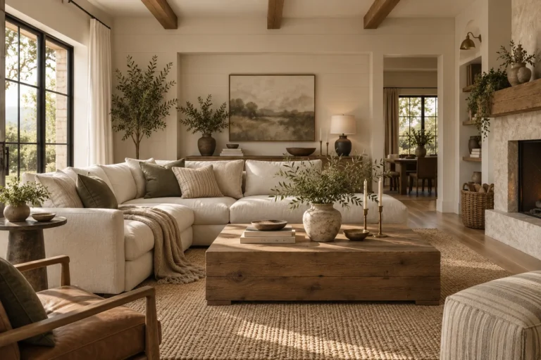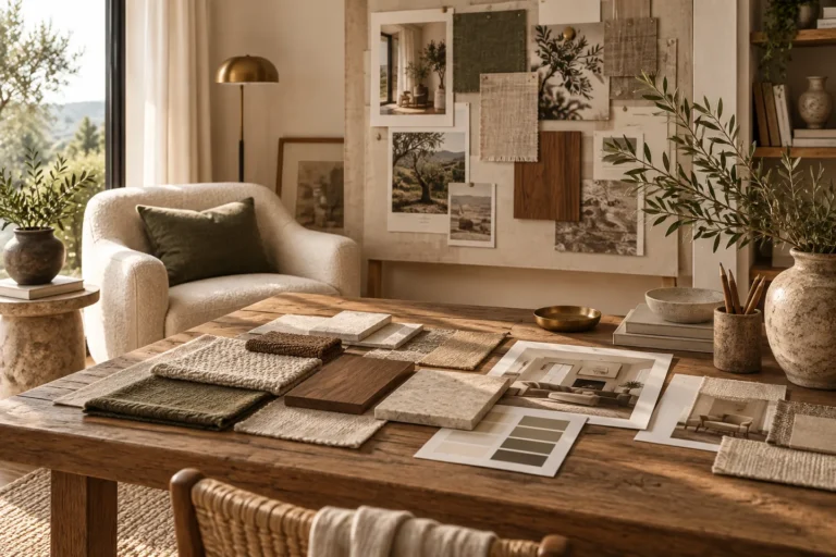
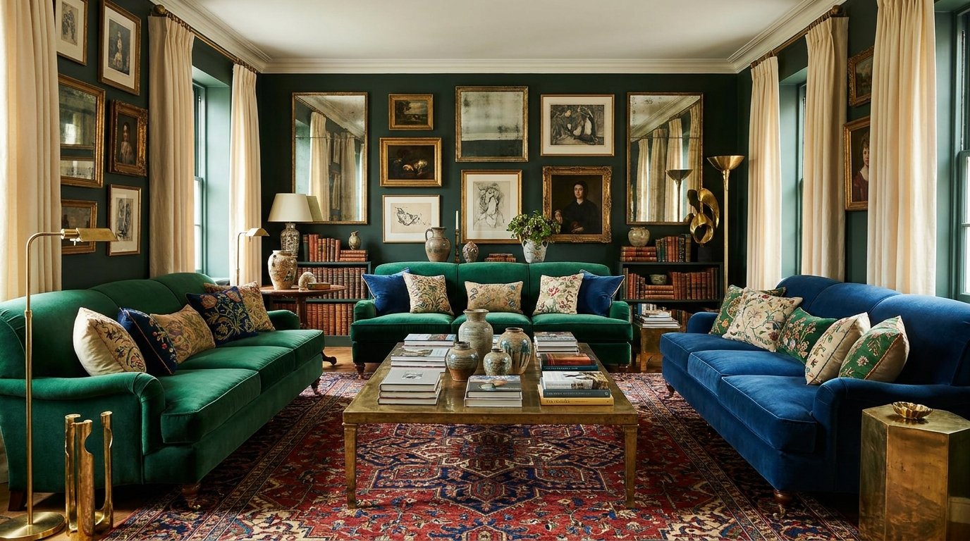
A cohesive color palette starts with the colors you cannot easily change, then adds a small number of repeatable hues that work in the home’s real light. Do not choose paint in isolation. Floors, stone, timber, upholstery, window light and neighboring rooms already influence the palette.
The useful sequence is fixed finishes → light → dominant neutral or color → supporting colors → accents → materials → testing.
1. Fixed finishes are the palette’s starting point
Flooring, countertops, tile, timber cabinetry and large upholstered pieces often cost more to change than paint. Use them as the first color references.
A warm oak floor, cool grey stone and cream sofa already create a set of relationships. The wall color should help those elements coexist rather than introduce a fourth unrelated direction.
2. Understand undertone by comparison
Undertones are easiest to see when similar colors sit beside one another. A beige may lean pink, yellow, green or grey when compared with another beige. A white can appear warm beside a blue-white and cool beside an ivory.
Compare samples against the actual fixed finishes in the room, not only against a white sample card.
3. Natural light changes color throughout the day
Window direction, exterior surroundings, weather and time of day affect how color reads. A paint sample that looks balanced in a bright showroom may appear darker, cooler or warmer at home.
Place large samples on more than one wall and view them in morning, afternoon and evening light. Also check them under the artificial lighting used at night.
4. Choose a dominant background
The dominant color is the visual field that holds the room together. It may be a warm white, beige, green, blue, clay tone, charcoal or another hue. It does not have to be pale.
In many homes, the dominant background appears on walls and repeats in large textiles or materials. Consistency makes it easier for smaller colors to feel deliberate.
5. Add supporting colors with a clear relationship
Supporting colors should connect to the dominant background and fixed finishes. They can be analogous, contrasting or tonal, but the relationship should be visible more than once.
| Palette approach | How it works |
|---|---|
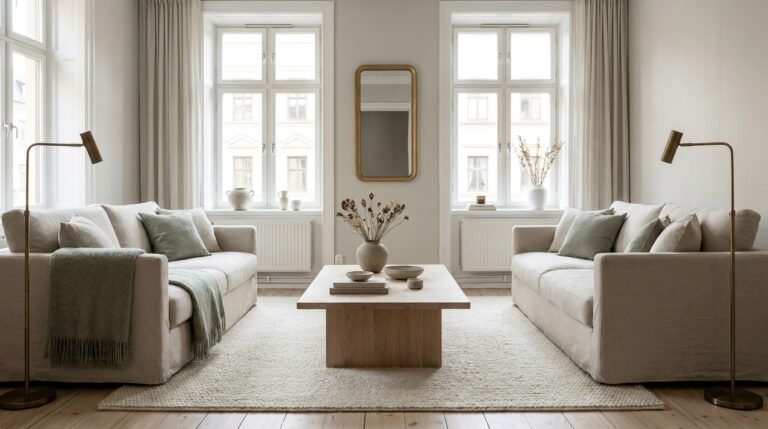
| Tonal | Uses lighter, darker and greyer versions of a related color family. |
| Warm neutral | Builds around cream, tan, brown, timber, brass-tone metals and muted color. |
| Cool neutral | Uses cooler whites, greys, blue-greys and restrained cool accents. |
| Earthy | Combines clay, olive, ochre, timber, stone and warm neutrals. |
| High contrast | Pairs light and dark values deliberately, often with a restrained accent palette. |
6. Use accent color in smaller doses
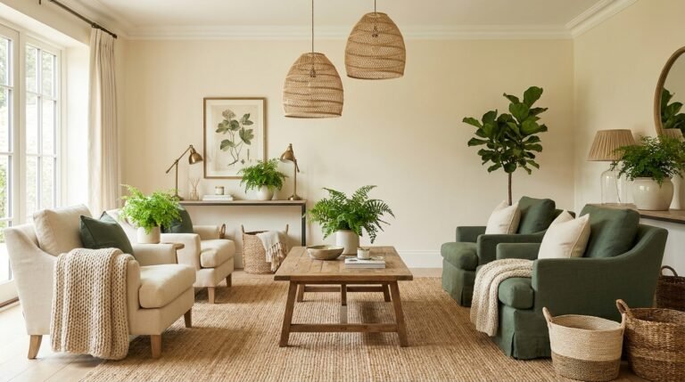
Accent color works best when it appears deliberately rather than randomly. A green repeated in artwork, a cushion and a plant container can create enough connection without every object matching.
Accents are also the easiest part of a palette to change seasonally or as preferences evolve.
7. Repeat color through materials, not only paint
Color appears in timber, stone, metals, textiles, art and plants. A room feels more layered when the palette repeats through different materials rather than through identical flat colors.
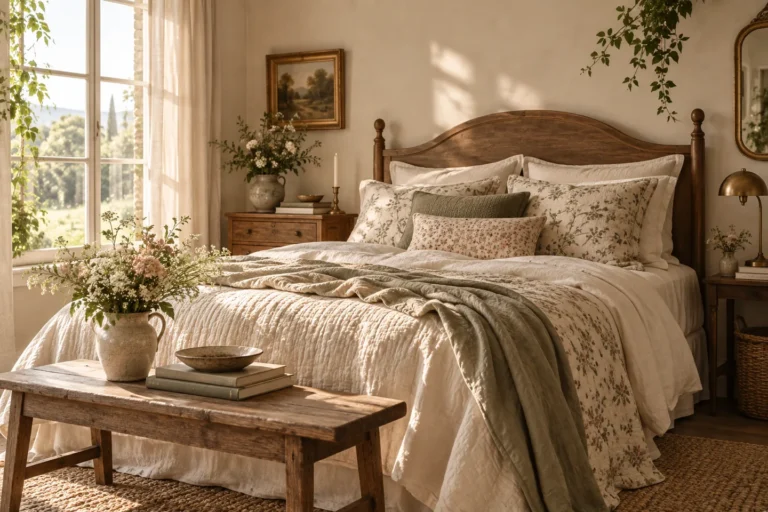
A warm brown might appear as walnut, leather and woven fiber. A soft green can show up in paint, linen and artwork. Variation keeps the palette from feeling formulaic.
8. Connect rooms without making them identical
An entire home does not need one paint color. Connected rooms can feel cohesive by repeating a few anchor elements: a background neutral, timber family, metal finish or accent hue.
A bedroom can be softer and a dining room more dramatic while both still belong to the same home.
9. Use stronger color where the architecture supports it
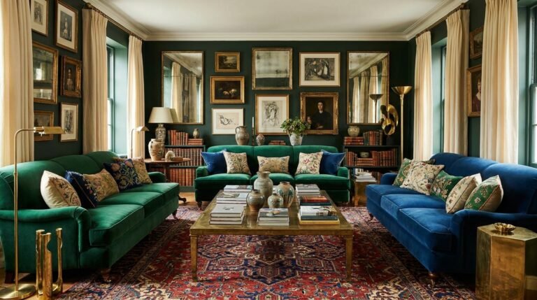
Small rooms, powder rooms, libraries and low-light spaces can handle deeper color when the choice is intentional. Pale color is not automatically more spacious, and dark color is not automatically oppressive.
For low-light spaces, see how to make a dark room feel warm.
10. White is still a color decision
Whites vary dramatically. Some read creamy, some grey, some green or blue depending on surrounding materials and light. Choose white by testing it against floors, trim and large furniture.
Do not assume the brightest white will make a room feel brighter. In limited natural light, a slightly warmer or more complex neutral may look more deliberate.
11. Build living room palettes from the largest pieces
In a living room, start with flooring, sofa and rug. Those elements occupy more visual area than cushions or decorative objects. Then choose wall color and supporting textiles.
Use the living room design guide and area rug guide for the broader room relationships.
12. Build bedroom palettes around bedding and atmosphere
Bedrooms can use a quieter palette because large soft surfaces already provide texture. Choose the wall, bed and main textile relationship first, then add smaller accents.
Browse the bedroom design guide, hotel-inspired bedroom guide and cottagecore bedroom ideas for different directions.
13. Kitchens need color to work with hard finishes
Cabinetry, stone, backsplash, appliances and flooring create a dense material palette. Choose paint and decorative color around those fixed surfaces.
See the kitchen and dining design guide for the full planning sequence.
14. Bathrooms can use contrast strategically
Tile, grout, vanity finish, metal and mirror frame all contribute color. In a small bathroom, reducing the number of unrelated finishes can create more calm than simply choosing lighter colors.
Use the bathroom design guide for room-specific planning.
15. Test paint properly
Use large samples and view them on more than one wall. If possible, test next to the floor, trim, curtains, countertop or other fixed finishes that will remain.
Give the sample enough time to see it under the room’s normal daylight and evening lighting. A quick judgment under one condition can be misleading.
16. Avoid copying a palette without its context
A room online may have different daylight, camera processing, flooring and materials from your home. Use inspiration to identify relationships rather than exact paint-color formulas.
If you are still defining your overall direction, start with How to Find Your Home Decor Style.
Color palette checklist
- Fixed finishes were considered first.
- Samples were compared against real materials.
- Natural and artificial light were both tested.
- One dominant background creates continuity.
- Supporting colors repeat enough to feel intentional.
- Accents remain a smaller layer.
- Rooms connect without being identical.
- Color is repeated through materials as well as paint.
Explore styles, color and materials
Continue through the Dwelanor Style Library for Japandi, cottagecore, dark academia, modern farmhouse, coastal and other approaches. A style becomes useful when it helps you make repeatable decisions about color, material, shape and light.