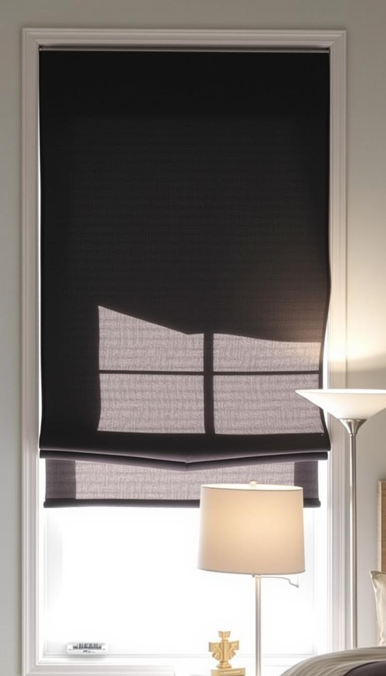
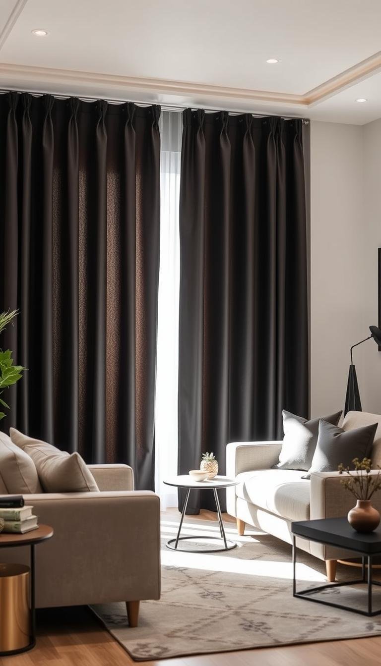
Blackout curtains do not have to look like contract drapery. The easiest way to keep them residential is to separate the two decisions: choose a face fabric you would happily use even without the blackout function, then make sure the lining and installation give you the darkness you actually need.
Matte linen-look fabrics, cotton blends and low-sheen velvet generally feel softer in a home than glossy synthetic faces. Just remember that even excellent blackout fabric can leave a bright outline if the panels are too narrow or the rod sits too close to the window opening.
Why I care about blackout curtains that don’t look “hotel-y”
My priority is a room that reads residential and relaxed, not institutional. I want the window treatment to feel like part of the decor, not a utilitarian add-on.
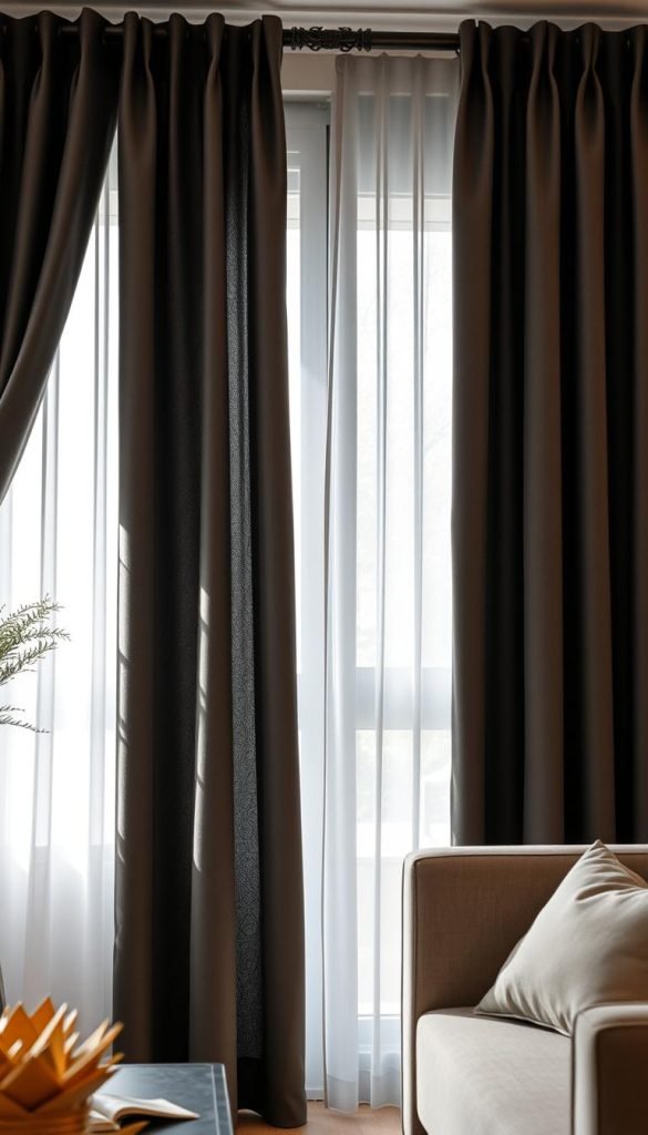
Shiny, stiff fabrics often give that commercial vibe. Most hotel-style panels use glossy synthetics and heavy laminates. I avoid finishes that photograph as flat or plasticky.
Performance matters, too. True blackout fabrics bring more than darkness — they help stabilize temperature and slightly reduce street noise. That improves sleep and makes the space feel calmer.
- I favor matte weaves and textured hand-feel over glossy coatings.
- I choose materials that drape naturally and hold a neat pleat.
- Longevity and easy care are part of the style decision.
| Feature | Commercial-style | My preferred pick |
|---|---|---|
| Finish | High shine | Matte, textured |
| Hand-feel | Stiff, synthetic | Soft, tailored drape |
| Comfort benefits | Basic light block | Light block + insulation + noise damp |
| Longevity | Fades, loses shape | Holds pleat, cleans well |
Buyer’s Guide essentials: what actually makes blackout curtains look stylish
Good blackout panels combine substance with subtlety. Choose materials that read as part of the room while still giving serious light control.
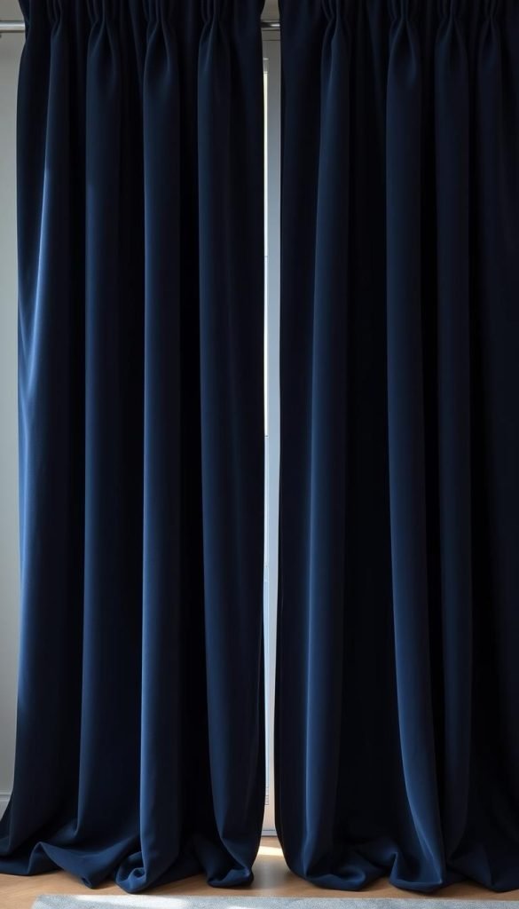
Balance form and function
Substantial, flexible fabric creates a cleaner fall than a stiff glossy face. Order a swatch when possible and check how the fabric hangs, reflects light and feels against the rest of the room.
Triple-weave and lining choices
Triple-weave construction can improve opacity without a separate plasticky-looking backing. A separate blackout lining can give stronger light control while letting you choose a face fabric primarily for appearance.
- I favor weighty fabrics that still move; this yields a tailored fall and better hem recovery.
- Texture is key: subtle slubs or brushed cotton add depth and photograph well.
- Look for a soft, matte lining that blocks without broadcasting itself.
- Check seams and hem weight so daily opening and closing won’t pucker the panels.
How do I pick blackout curtains that don’t look like hotel drapes?
Start with what you feel under your hand: the fabric will set the tone for both style and function.
My quick decision framework: fabric, color, heading style, and hang
Fabric first. I choose linen blends, brushed cotton, or matte velvet so panels read warm and tailored. A matte textile with solid construction blocks stray light and avoids a slick finish.
Color and heading. I favor earthy neutrals or deep tones so the panels blend with the room. For an elevated fall I use back tabs or rings; grommets only when the metal reads clean and matte.
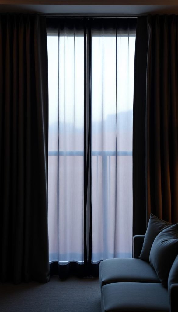
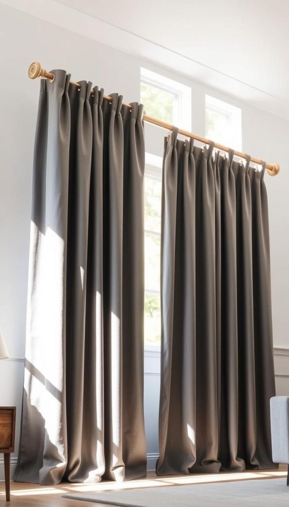
Hang and fullness. Hang high and wide, and get 1.5–2x fullness. That way the window looks larger and edge leaks shrink.
What I skip every time: overly shiny finishes and flimsy linings
- I avoid glossy microfiber and iridescent faces.
- No thin plastic backings or crunchy linings that reflect strange casts.
- Machine-washable matte options win if they keep drape and function.
| Decision area | My preferred choice | What I skip |
|---|---|---|
| Face fabric | Linen blend, brushed cotton, matte velvet | High-shine microfiber |
| Heading | Back tabs or rings | Shiny grommets with visible finish |
| Lining | Soft blackout or matte thermal | Thin, glossy plastic backing |
| Hang | High & wide with 1.5–2x fullness | Exactly window-width, low rod placement |
The best fabrics for a non-hotel look: linen, cotton, and matte velvet
A well-chosen textile gives a room character while still keeping light under control.
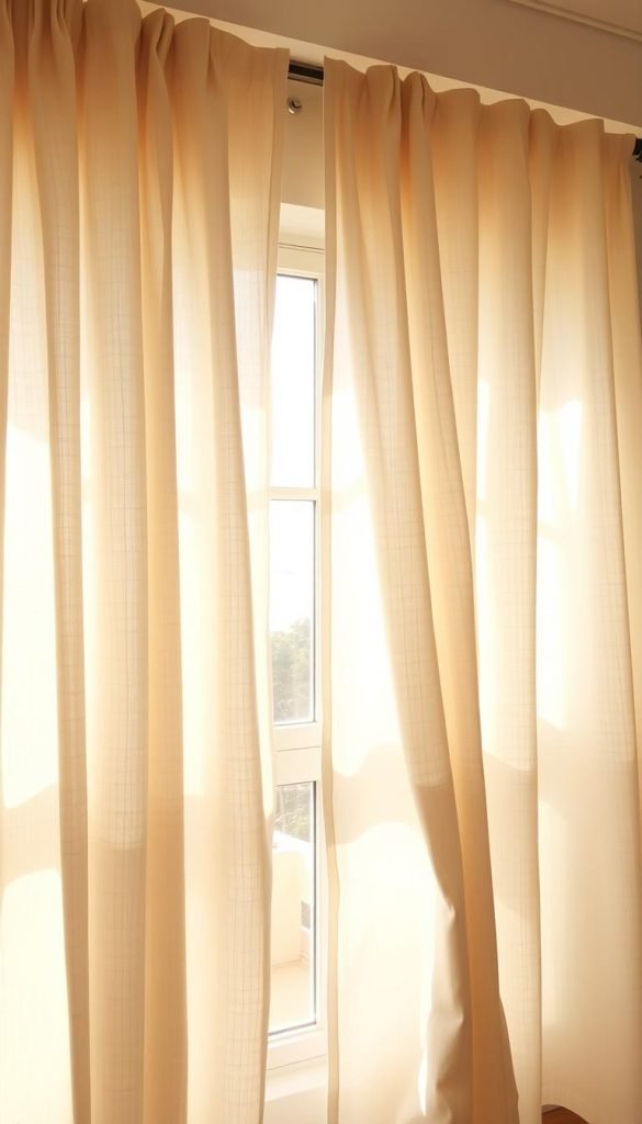
Linen and linen blends: textured, breathable, and elevated
Linen reads lived-in and refined. I like blends because they improve drape and light control while keeping that airy face.
Quince European Linen Blackout balanced softness and style and blocked about 80% of light. Blends often out-perform pure linen for practical blackout needs.
Brushed cotton and canvas: clean lines and soft matte finish
Cotton gives a tidy, modern fall with a soft matte surface. I favor midweight pieces with a good lining so panels fold quietly and hang straight.
Matte velvet: moody, luxe, and surprisingly versatile
Velvet brings depth without shine when the pile is dense and low-luster. Gracie Oaks Olivia Signature Velvet blocked roughly 90–95% and used a weighted hem plus back tabs for a polished hang.
- Favor textures that complement sofas, rugs, and paint.
- Avoid iridescent faces that read overly commercial.
- Steam samples: good fibers relax and hold a crisp line.
Color strategy: earth tones and deep neutrals that read “quiet luxury”
Earthy hues and deep neutrals create a quiet, collected backdrop for windows. They help the fabric read as part of the room instead of a standalone element.
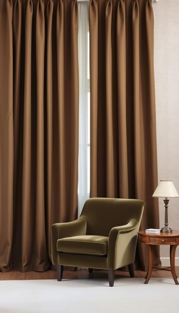
Oat, sand, olive, charcoal, navy, and warm whites that layer well
I reach for oat, sand, olive, charcoal, navy, and warm whites because these colors mix effortlessly with wood, stone, and soft metals.
Deep neutrals like charcoal and navy hide seams and hardware while absorbing light rather than reflecting it. Warm whites feel softer than stark whites and avoid cool blue casts in daylight.
Why I avoid high-shine hues and hard contrasts for blackout panels
High-shine or ultra-bright hues emphasize glare and seam lines. That makes panels read theatrical instead of homey.
When I’m unsure, I order swatches and view them in morning, midday, and evening. For small space treatments, I match panels to the wall or go one shade deeper so the whole space feels calm and cohesive.
- Keep curtain color slightly darker than sheers for depth without drama.
- Use neutral drapery to balance rooms with bold accents.
- Check backing color — soft backings prevent bright outlines at the edges.
Goal: a calm, matte field that supports the room instead of grabbing the spotlight.
Construction details that matter: heading types, linings, and fullness
The way a panel is built matters as much as the fabric itself.
Heading choices define the mood. Back tabs and rings read tailored and designer. Grommets can slide smoothly but often feel casual unless the metal is slim and matte. A rod pocket blocks top light well but can be stiff to operate; I choose rings or a baton if I open panels every day.
Lining affects both performance and finish. Full blackout lining gives the most darkness, while room-darkening balances softness with a gentle glow—handy in living areas. Black-back liners block light efficiently but can show a harsh edge. Triple-weave gives opacity without a plasticky feel and usually drapes more naturally.
Fullness and weight make the fall look intentional. I buy panels at 1.5–2x the window width so curtains stack in soft S-curves and reduce edge light. Heavier fabrics and weighted hems keep edges straight and limit gaps. I also check rod diameter and bracket projection so the curtain clears trim and returns close to the wall for cleaner control of light.
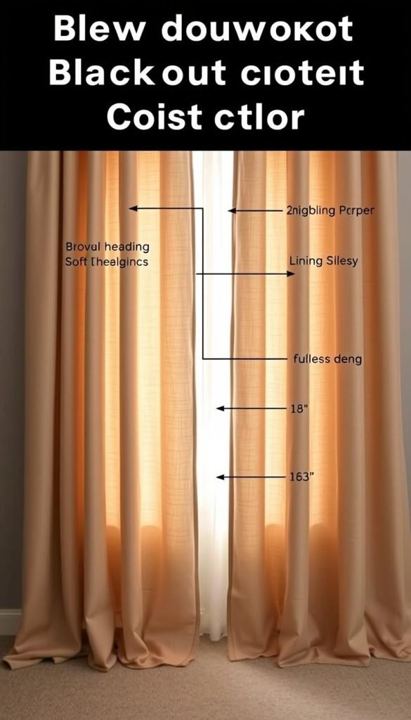
| Feature | My pick | Tradeoff |
|---|---|---|
| Heading | Back tabs or rings | More tailored; needs rings or slim rod |
| Lining | Triple-weave or soft blackout | High opacity without shiny backing |
| Fullness | 1.5–2x window width | Better drape; greater stack-back needed |
| Hardware | Minimal matte rods with hidden returns | Elevates look; installs carefully for proper stack |
For more on fabric and heading options, see a quick guide to types of curtains.
Hanging like a designer: rods, height, width, and the “optical illusion” trick
A well-placed rod can turn modest windows into an architectural feature. The hardware you choose and where you mount it make the biggest visual difference.
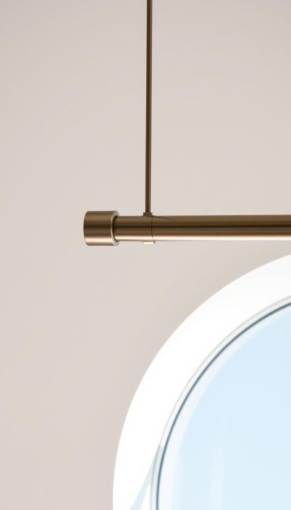
Hang high and wide for a bigger feel
Mount rods 4–8 inches above the frame to visually raise the opening. Extend the rod 8–12 inches past each side so panels clear the glass by day and stack off the window.
Choose the right finish and fittings
I prefer matte black or brass rods with slim brackets. They read intentional and hold heavier fabric without fuss. Skip tension options; they sag and reveal cheap hardware.
Length and light control
A floor-skimming hem reads custom. If you like a soft pool, keep it slight (1–2 inches). Return edges toward the wall to limit side light leaks and tighten the silhouette.
“Measure twice and test in both day and night.”
- Check center overlap so no light pokes through.
- Verify bracket placement so rings or tabs slide freely.
- Order the correct rod and curtain widths before installation.
How to compare blackout curtains without unreliable rankings
Compare the face fabric, lining construction, panel width, heading, care instructions and return policy. If a manufacturer publishes a light-blocking claim, read how that claim is defined rather than assuming a percentage measured by one seller will match your room.
For a residential look, prioritize the face you will see every day: matte texture, a color that belongs with the wall and furniture, and enough fabric to hang in full folds. If darkness is critical, solve the side, top and center gaps as carefully as the fabric itself.
Linen-look blackout curtains without the hotel feel
A linen or linen-look face gives a softer residential texture, but the visible fabric and the blackout layer do not have to do the same job.
For a bedroom where darkness matters, choose the face fabric for texture and color, then compare the lining construction, panel width and edge coverage separately. A lined linen-look panel can be a better fit than relying on an unlined natural fabric to block light on its own.
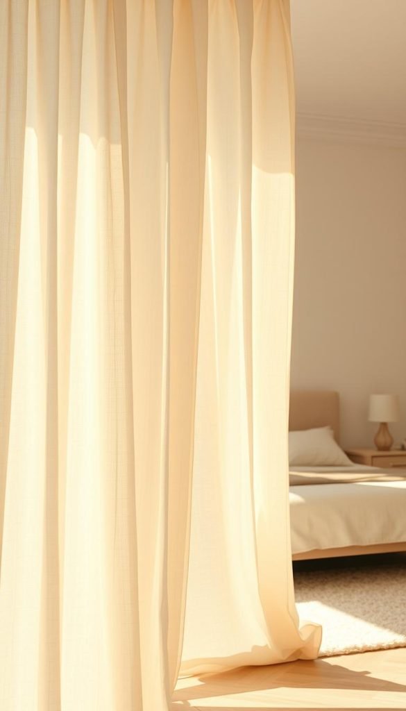
Check how the lining looks at the edges, whether the panel has enough width for full folds, and whether the care instructions suit the room. Those details matter more than a retailer’s single light-block percentage.
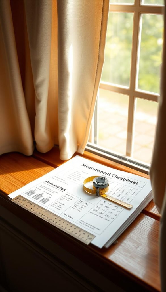
Measurement cheat sheet: my quick, no-return guide
Take a few clear numbers and you’ll avoid returns and late-night fixes. Accurate measuring makes the install look intentional and improves light control.
Width, fullness, and overlap to kill center light leaks
Start with the glass width. Measure the full window and multiply by 1.5–2x for total panel width. That gives the fullness needed so panels stack neatly and block center light.
- Mount the rod 4–8 inches above the trim to lift the opening visually.
- Extend the rod 8–12 inches past each side so panels clear the glass by day and seal edges at night.
- Plan a center overlap—use extra fabric or an overlap master so no bright line slices through the middle.
Length targets: just kissing the floor or a slight pool
Aim for floor-skimming hems for a crisp, tailored look. If you prefer a puddle, keep it modest: 1–2 inches only.
- Account for bracket projection and returns so the curtain pulls close to the wall and limits side leaks.
- Confirm ring or tab clearance so panels glide without snagging and keep a clean pleat.
- Double-check measurements against your actual rod and hardware before ordering to avoid surprises and returns.
“Measure twice, install once — then test at night with a light behind the window.”
Follow this cheat sheet and your windows will read custom. With proper width, hang height, and a small center overlap, the blackout performance will feel intentional and the day-to-night transition will be seamless for your curtains.
Blackout vs room-darkening: how much control do you need?
Not every room needs the same level of darkness. Living spaces may only need glare reduction and privacy, while bedrooms used by shift workers or anyone sensitive to streetlight may benefit from stronger blackout construction and better edge coverage.
Instead of relying on a single percentage claim, compare the panel’s construction and then look at the installation: side gaps, top gaps and the center seam can matter as much as the fabric itself.
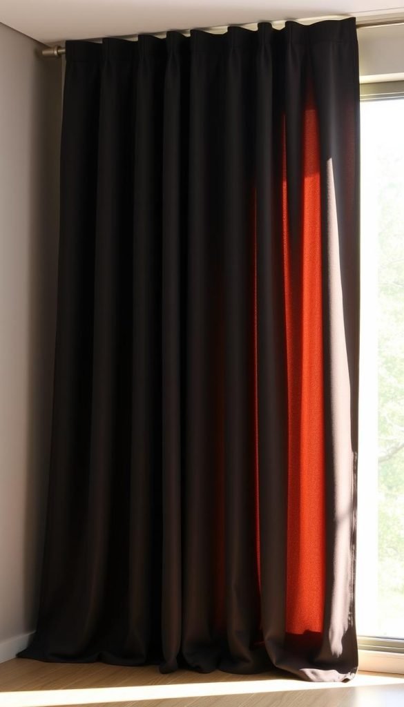
- Living rooms: room-darkening may be enough if you still want daylight.
- Bedrooms: prioritize stronger lining and better edge coverage.
- Shift-work rooms or media rooms: treat the whole window opening, not just the panel fabric.
Care, cleaning, and longevity
Follow the care label first. Some blackout panels are machine-washable; others rely on coatings, linings or velvet piles that need gentler treatment.
Steam only if the manufacturer permits it, and use a low-suction upholstery attachment for routine dust removal. For velvet, brush or vacuum in the direction of the pile and use professional cleaning when the label calls for it.
- Spot first: treat hems and high-touch areas before a full wash.
- Gentle wash: avoid harsh detergents and high heat; hang dry when possible.
- Rotate seasonally: even out sun exposure and fading.
- Hardware check: tighten brackets and inspect rings so panels glide from day to night without stress.
“A little care keeps the fabric soft, the finish matte, and the look elevated for years.”
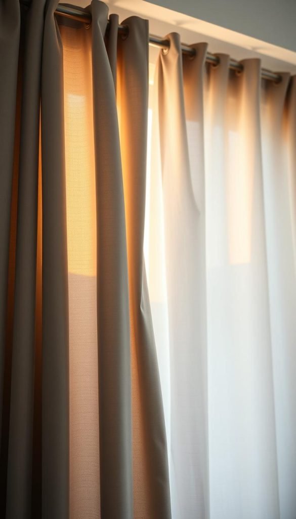
| Product | Care note | Longevity tip |
|---|---|---|
| Sun Zero Nordic | Machine washable; stayed like new | Wash gentle cycles; hang dry |
| IKEA Majgull | Vacuum friendly; trims without fray | Monthly vacuum; steam wrinkles |
| Gracie Oaks Velvet | Responds to vacuuming; lint roll | Occasional pro clean to protect pile |
| Rose Home Liner | Machine washable; refreshes block | Wash to restore insulation and effect |
The short version
Choose the curtain for how it looks in daylight, then choose the lining and installation for darkness. Matte fabric, enough fullness, side returns or generous overlap, and careful rod placement usually create a more convincing bedroom treatment than chasing a “100% blackout” label on a narrow panel.