The best grout color for white subway tile depends on how much contrast you want, the undertone of the tile, the room’s lighting and finishes, and how visible you want the tile pattern to be. There is no single best color for every installation.
The useful relationship is white tile → tile undertone → grout color → joint width → pattern contrast → surrounding finishes → maintenance.
Start with the tile’s actual white
“White” tile can lean cool blue-white, neutral white, warm ivory or cream. Place the tile beside the countertop, cabinet, wall paint, plumbing fixtures and floor before choosing grout.
A grout that looks neutral on a sample card can appear cool or warm once it sits between dozens of tiles. Test the real combination rather than choosing from the grout name alone.
White grout: the lowest-contrast option
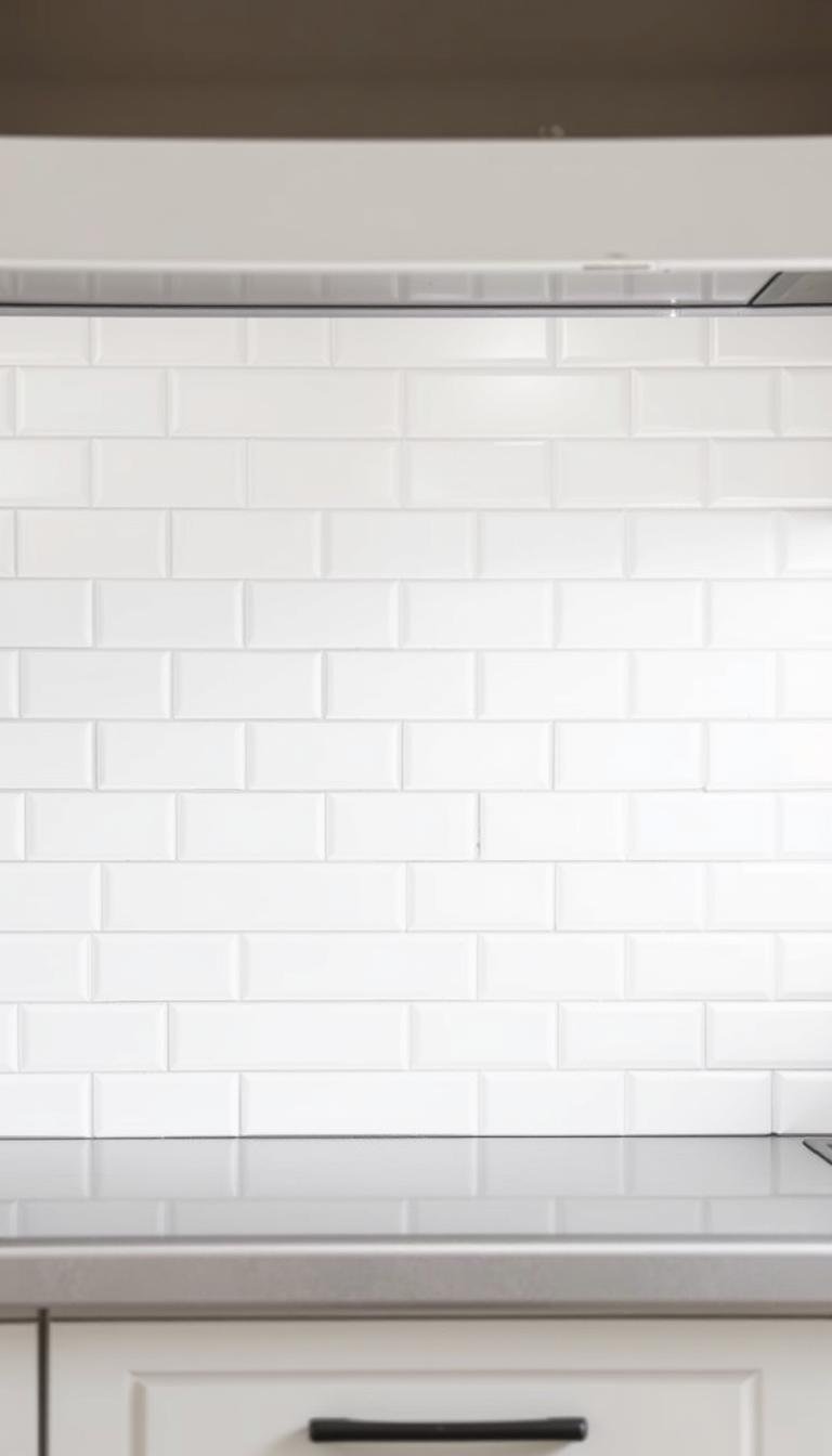
White or near-white grout minimizes the visual grid and lets the tile surface read as one larger field. This is useful when you want the backsplash or shower wall to feel quiet and when other materials—stone, cabinetry or wallpaper—should carry more of the room’s visual attention.
The tradeoff is visibility of discoloration. Whether white grout is practical depends on the grout product, room conditions, cleaning routine and installation quality. Do not assume every white grout requires the same sealer or care process; follow the manufacturer’s instructions for the exact product.
Light gray: subtle pattern definition
Light gray creates enough contrast to reveal the subway-tile layout without turning every joint into a strong graphic line. It is one of the easiest choices to coordinate with stainless steel, chrome, marble-look surfaces, cool stone and many neutral cabinets.
Compare warm gray and cool gray samples. A cool gray can make warm-white tile look creamier, while a warmer gray can soften a bright blue-white tile.
Warm gray, greige and taupe: connect white tile to wood and warm finishes
Warm gray, greige and taupe are useful when the room includes oak, walnut, brass, beige stone, cream paint or other warm materials.
These colors create a visible but softer grid than charcoal. They can act as a bridge between a cool white tile and warmer room elements, but the effect depends on the actual undertones.
Medium gray: more structure without maximum contrast
A medium gray makes the tile pattern clearly legible and can be practical in high-use areas where a very pale joint would show every mark.
It works particularly well when the room already contains gray veining, dark hardware or concrete-like finishes. In a small wall area, the pattern can become more prominent, so test the joint width and color together.
Charcoal: graphic but softer than pure black
Charcoal creates a strong grid and works when the tile layout is intended to become part of the design. It can connect white tile to black window frames, dark cabinetry, matte hardware or industrial details.
High contrast also makes inconsistent joint width, lippage and alignment easier to notice. A dark grout color should be chosen with the installation quality and tile variation in mind.
Black grout: maximum pattern contrast
Black grout turns white subway tile into a highly graphic surface. Use it when that grid is intentionally one of the room’s main visual features.
Do not assume dark grout means “no maintenance.” Dark surfaces can show mineral residue, soap film or cleaning-product haze differently from pale grout. Care requirements depend on the grout chemistry and room conditions.
Colored grout: use it as an accent, not a default
Muted blue, green, terracotta or another colored grout can create a distinctive accent, but it is less flexible if the room’s palette changes later.
Test a colored joint beside the permanent materials in the room. A color that looks subtle on a sample may become much stronger once repeated across the entire tile field.
Joint width changes the color effect
The same grout color can read very differently in a narrow joint and a wider joint. More visible grout area means more visual contrast.
Do not choose joint width purely for appearance. The tile manufacturer, tile dimensional variation, installation standard and grout product all influence the appropriate joint. Some handmade or intentionally irregular subway tiles require more room to absorb variation than precisely rectified products.
Do not use a universal sanded-vs-unsanded rule
Modern grout products include cementitious sanded and unsanded formulas, high-performance cement grouts, epoxy systems and premixed/single-component products. The correct product depends on the tile material, joint-width range, location and grout manufacturer’s instructions.
Some abrasive aggregates can scratch delicate polished surfaces or glass, while some grout products are engineered for a wide joint range. Check both the tile maker’s and grout maker’s compatibility guidance instead of relying on a blanket “under 1/8 inch = unsanded” rule.
Does grout need to be sealed?
Not every grout product has the same sealing requirement. Some cementitious grouts may be compatible with or benefit from an appropriate penetrating sealer; other grout chemistries may not require or recommend one.
Follow the exact grout manufacturer’s instructions. If a sealer is used, test it on the actual grout and adjacent tile because sealers can affect appearance and may not be compatible with every surface.
Choose differently for a kitchen backsplash and a shower
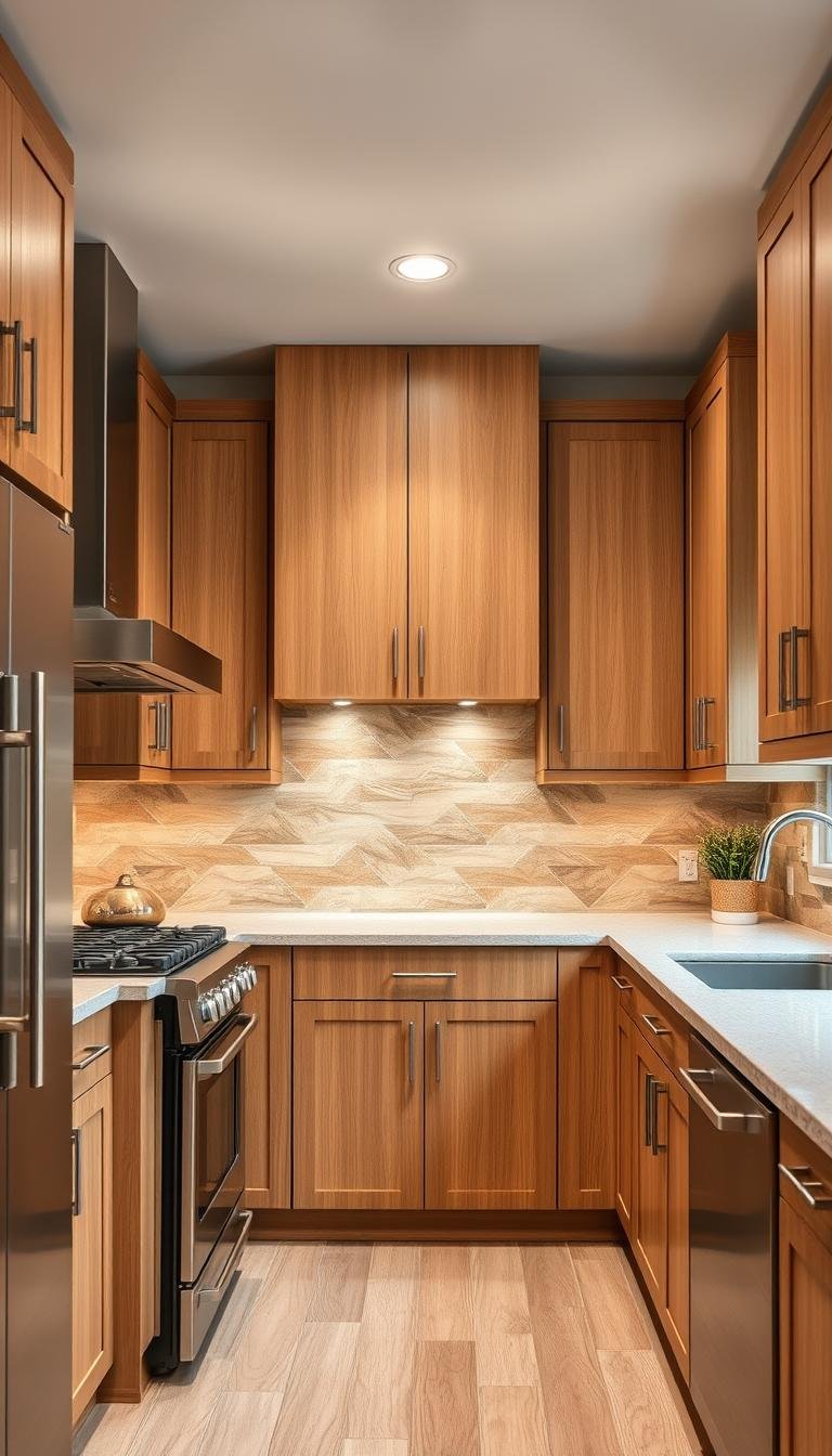
Kitchen backsplash: consider grease, food splashes, cleaning products, countertop color and cabinet finish. A mid-tone joint may make everyday marks less obvious, but cleanability depends on the grout product.
Shower wall: consider water exposure, soap residue, ventilation, tile system, cleaning chemistry and waterproofing behind the finish. Grout color does not replace correct wet-area construction.
Powder room: because there is no shower, moisture exposure may be lower and the grout choice can lean more heavily toward visual composition.
How grout color changes common white-subway layouts
| Layout | Low-contrast grout | High-contrast grout |
|---|---|---|
| Running bond | Reads as a quiet continuous surface | Emphasizes the brick-like stagger |
| Stacked grid | Minimal modern field | Strong rectilinear grid |
| Vertical stack | Subtle vertical rhythm | Strongly emphasizes height |
| Herringbone | Pattern is softer | Pattern becomes a focal feature |
Match the grout to the surrounding materials
Think beyond the tile itself.
- Warm wood + brass: compare warm gray, greige or taupe.
- Cool marble + chrome: compare white, neutral gray or cool gray.
- Black fixtures: compare medium gray, charcoal or black if you want the tile grid emphasized.
- Colorful cabinetry: use grout either to recede and let the cabinet lead or to repeat one color intentionally.
Make a real mock-up before grouting the wall
Set several actual tiles with the planned spacing and apply the candidate grout products. Let them cure for the period specified by the manufacturer before judging the final color.
View the sample:
- in daylight and at night;
- beside the countertop or tub;
- under the actual bulbs;
- next to the faucet and hardware finishes.
Photography can shift white balance, so choose based on the room rather than an online image alone.
Quick decision guide
| Goal | Colors worth testing |
|---|---|
| Tile should visually recede | White or near-white matched to the tile |
| Soft definition | Light gray, warm gray, greige |
| Connect to wood/brass | Warm gray, taupe, greige |
| Clear architectural grid | Medium gray or charcoal |
| Maximum graphic contrast | Black |
| Deliberate accent color | Muted colored grout tested in a sample |
The Dwelanor approach
Choose grout color by deciding how visible you want the tile pattern to be, then verify the undertones against the actual room materials. After color, choose the grout chemistry and joint width based on the tile and manufacturer requirements.
Continue with our white-grout cleaning guide, bathroom tile guide, kitchen backsplash pattern guide, and powder room design guide.