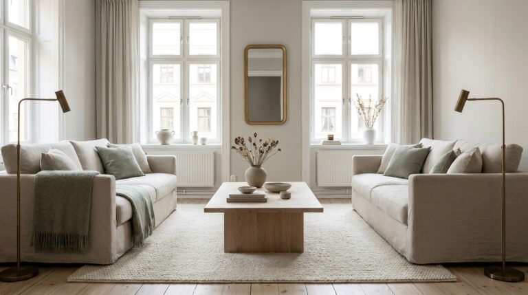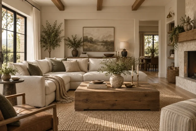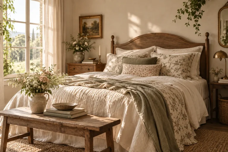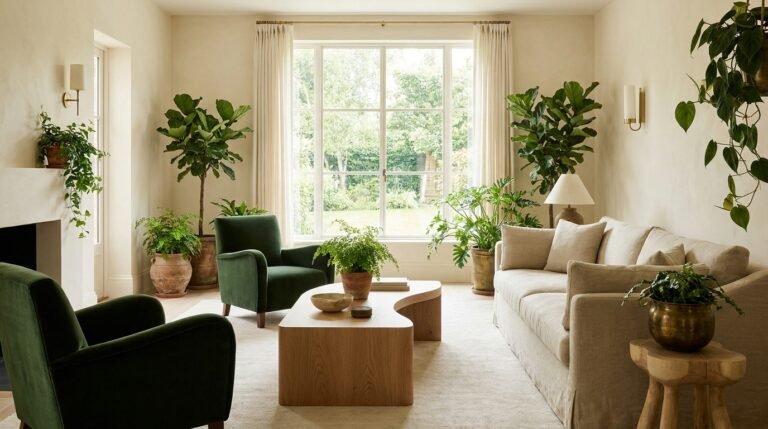

A coastal room starts to feel clichéd when the theme is carried by symbols—anchors, rope knots, ship wheels, shells on every surface—instead of by the qualities that actually make seaside interiors appealing.
Use light, relaxed textiles, weathered or warm wood, woven fibers and a restrained blue-green palette as the foundation. One obvious maritime reference can be charming; a room full of them starts to feel like a set.
Evoke the coast without spelling it out
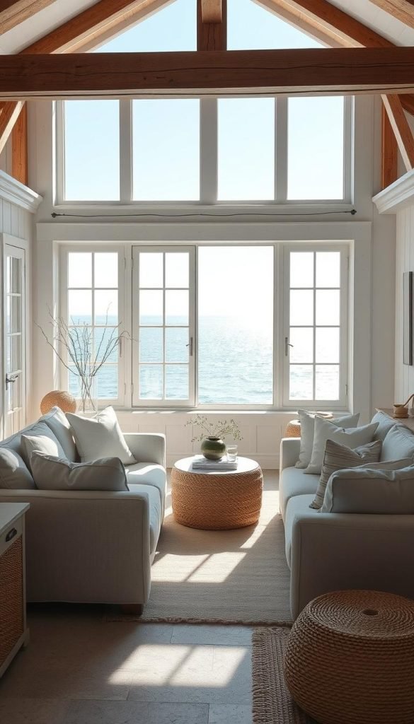
The strongest coastal rooms rely on atmosphere rather than props. Linen, warm wood, rattan, cane and softly glazed ceramics create enough texture and movement that the room does not need literal nautical symbols to make the point.
Sensation, texture, and light
I design for diffused light and breezy flow. Retractable louvers and sheers maximize cross-breeze, while aged metals and subtly glazed ceramics add a lived-in glow.
Room goals that avoid costume
- Bedrooms: calm, layered linens and soft sea-glass tones for rest.
- Living areas: tactile seating and curated trays for conviviality.
- Entryways: tailored, fresh elements that set the overall interior tone.
I set a strict editing rule: if a motif reads like a logo, it goes. Replacing literal anchors with layered elements keeps the decor lasting and adaptable across homes and seasons.
Color Done Right: A Refined Coastal Palette That Feels Authentic
A refined coastal palette is less about bright signals and more about quiet gradients. I start with a crisp, clean white base to bounce light and give the room a calm foundation.

Long‑tail hues—sea glass, misty gray, aged teal, sandy beige, and soft whites—layer together to produce depth. I pair pale pastels with one or two deeper blues or greens so the tones feel natural, not staged.
I use colors in materials—glazed ceramics, linen, and glass—so the palette looks lived-in. This adds texture and keeps the scheme from feeling like paint swatches on a wall.
- I keep sheen low to medium for a sun-washed finish that’s easy on the eyes.
- I avoid high-contrast nautical combos; instead I balance aged teal with soft whites for a timeless look.
- I distribute palette choices by function: restful tones for bedrooms, richer notes in living areas, and micro doses in small spaces for flow.
Design tip: use slightly desaturated colors to create a vintage, collected sense so the palette reads curated and enduring rather than themed.
Natural Materials That Read Nautical Without the Novelty
I build rooms using honest, tactile materials that suggest the shore rather than shout it. Choosing the right surfaces and weaves means the seaside mood arrives through touch and light.

Rope, cane, rattan, and seagrass bring grounded, organic texture to a home. I use these materials for lighting, mirrors, and placemats so the story is told by feel, not by gimmicks.
Rope, cane, rattan, and seagrass for organic texture
I mix tighter braids—wrapped lamps and braided trays—with looser weaves like cane panels and seagrass baskets. This balance creates natural textures that age well and stay useful.
Linen and cotton for breathable, relaxed coastal textiles
Linen gives a lived-in, breezy hand; crisp cotton reads tailored when I want a preppy note. Both are classic natural fibers that anchor a relaxed scheme across homes.
Handcrafted ceramics and glass for subtle seaside shine
I add handcrafted ceramics and glossy glass pieces to catch light like sea spray. Small, thoughtfully made objects elevate the decor without resorting to novelty shapes.
“Use real fibers and warm finishes so pieces patina, never plasticize.”
- Placement matters: put tactile elements where you touch and see them most—entry consoles, coffee tables, nightstands.
- Finish choices: warm brass and natural wood tones keep the palette grounded and prevent kitsch.
- Durability: choose real fibers and quality glazes so your elements patina beautifully over time.
Wood, Not Driftwood: Bringing Character with Grain and Live Edges
I favor wood that reads crafted and purposeful, not weather-beaten and literal. Live-edge pieces echo surf-worn forms while feeling architectural and intentional. Kristen Peña’s wave‑reminiscent headboard is a good example: a subtle nod to the ocean that lifts the bedroom without resorting to motifs.
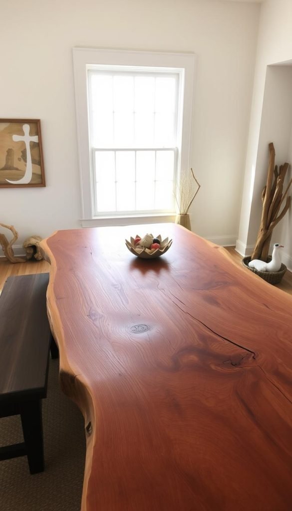
Live‑edge furniture as an elegant nod to the shoreline
I choose live-edge furniture to hint at wave forms and shoreline erosion in a refined way. The grain, slight knots, and sculpted silhouette give a natural charm that feels personal and earned.
Warm finishes that balance blues and cool tones
Warm wood finishes balance cool blues and greens so the house reads inviting, not cold. I favor low-sheen oils that keep surfaces touchable and alive.
- Varied silhouettes: sleek consoles, organic coffee tables, and sculpted headboards prevent repetition.
- Mixed materials: leather pulls and aged brass hardware enrich the palette and elevate the interior.
- Visible grain: use pieces with story—subtle knots and texture add charm without dominating the look.
| Piece | Finish | Role |
|---|---|---|
| Live-edge table | Low-sheen oil | Anchor focal point |
| Sculpted headboard | Warm walnut | Elevates bedroom |
| Console with brass pulls | Honey oak | Balances cool palette |
Textiles & Bedding: How I Layer Linen, Patterns, and Motifs
Layering textiles is my fastest route to a bedroom that breathes and belongs.
I begin with a linen duvet or coverlet to set a relaxed foundation. Then I add crisp cotton shams for a tailored counterpoint when I want a neater note. This swap helps the room shift between calm and preppy with very little fuss.
I keep patterns restrained: fine stripes, soft wave references, or a subtle coral print such as Serena & Lily’s Kimbe sheet set. These choices let motifs whisper instead of dominate the decor.
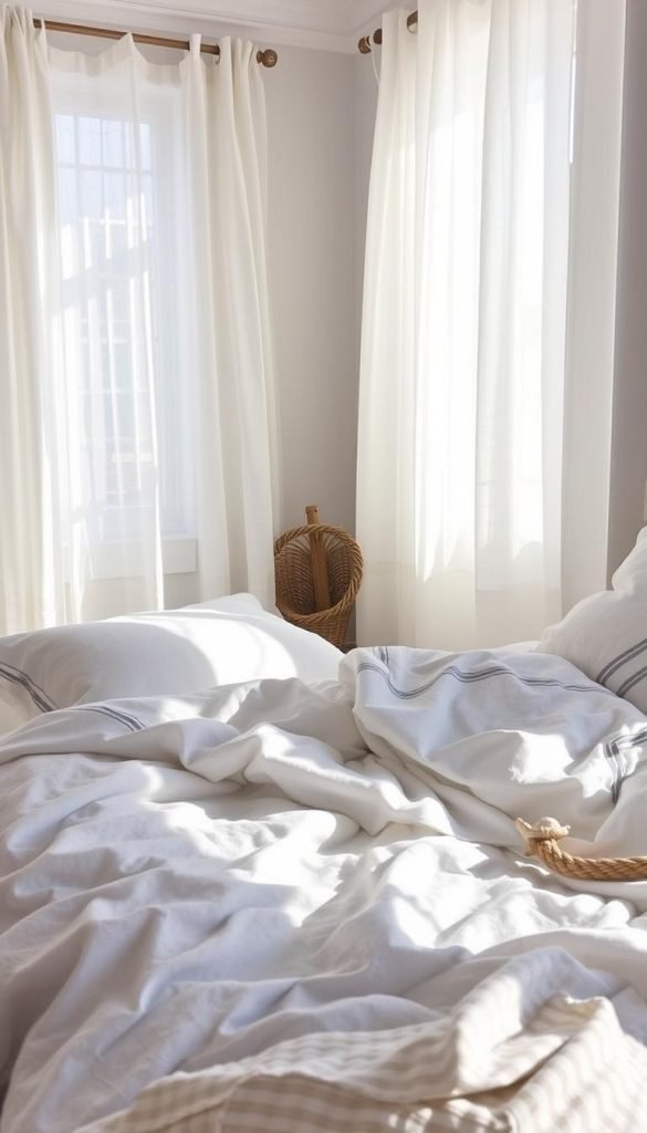
“Subtle prints and natural fabrics give a collected look that lasts across seasons.”
- Layer lightweight quilts, gauzy throws, and woven lumbar pillows to add varied textures.
- Choose breathable window treatments that move with the breeze and let light soften tones.
- Repeat one hue—perhaps sea-glass green—across two textiles for cohesion without being matchy.
- Favor easy-care fabrics so the layered bed stays beautiful in everyday homes.
| Element | Function | Choice |
|---|---|---|
| Base layer | Relaxed foundation | Linen duvet |
| Tailoring | Contrast and polish | Crisp cotton shams |
| Accent | Subtle motif | Kimbe coral-inspired sheets |
Decor Accents That Whisper, Not Shout
The right small pieces read like collected art, not stage props.
Choose one elevated accent at a time so the effect feels curated. I favor sculptural shell ceramics and embroidered palm pillows that act as focal notes rather than literal signs.
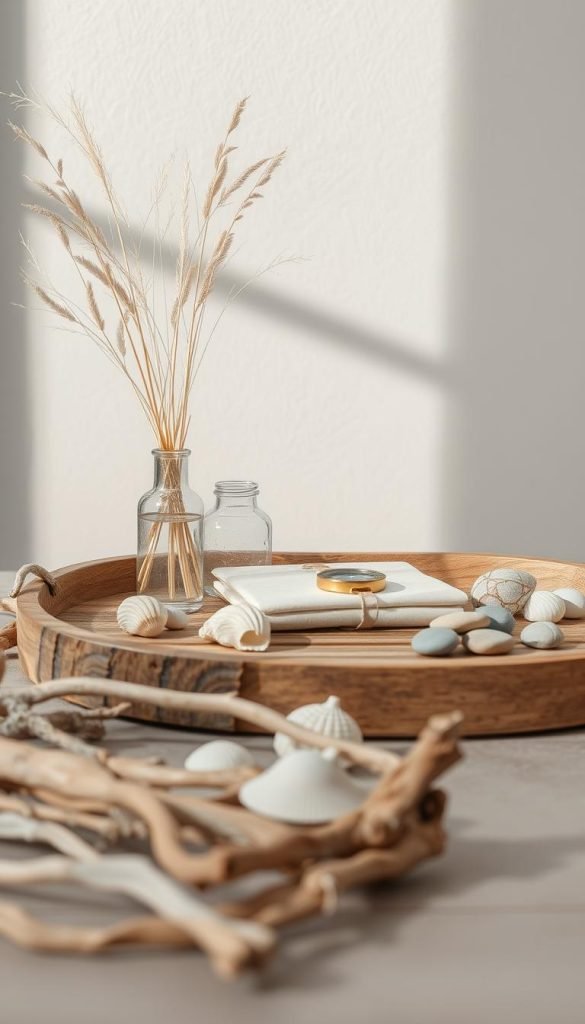
Small-scale motifs with intention
I select shells, palms, and subtle wave lines in refined pieces. A single shell ceramic, an embroidered palm pillow, or a wave-lined tray reads like design, not souvenir.
Art with story
I hunt for vintage restaurant ephemera and marine maps that carry narrative. A reimagined seafood matchbook print or an aged marina map adds vintage charm and a lived-in backstory.
Hardware and lighting
Update pulls and lamps with aged brass, jute wraps, and tailored rope details. Braided trays and rattan catchalls corral everyday pieces while adding warm texture.
- Limit motifs: one shell, one palm, one wave across the house keeps the style balanced.
- Material over logo: a sea-glass glazed vase or glass object ties the palette together through surface and light.
- Edited collection: keep accents grouped and palette-tight so the house reads thoughtful and design-forward.
“Small, well-made pieces give a room personality that lasts longer than trends.”
Space Planning for a Coastal Feel: Light, Flow, and Function
Good spatial planning lets light and air do most of the decorating work. My goal is to shape spaces that feel open and effortless, so each room reads calm and connected to the seaside rather than literal.

Designing breezy corridors, reading nooks, and window moments
I map circulation so corridors feel breezy and uncluttered. This creates a gentle flow that mirrors a walk along the beach.
I carve out reading nooks by windows with a low-profile chair, a small table, and a focused lamp. A daily reading ritual ties the view to use and makes interior life feel considered.
Maximizing natural light with louvers, mirrors, and reflective textures
Floor-to-ceiling wood louvers that retract into the wall fully open an ocean-facing room to breeze and light. Scott Specht’s work shows how this makes indoor and outdoor spaces become one.
I place mirrors on the wall opposite windows to boost daylight. I layer reflective textures—glazed ceramics, soft metals—so rooms feel brighter without glare.
- Float furniture off walls to keep air around pieces and improve breathing space.
- Use louvers or light-filtering shades to modulate sun and privacy while keeping that beach openness.
- Align functional zones—entry drops, consoles, bar carts—so homes work hard and feel collected.
For more on subtle coastal design that avoids kitsch, see coastal decor beyond the obvious.
“Plan circulation first; light and small rituals make a house feel like a home.”
How Can I Incorporate Nautical Themes Without Clichés? My Room‑by‑Room Playbook
Rooms should feel edited and lived-in, not like a seaside showroom. I write a short checklist for each space so the effect stays intentional and useful.
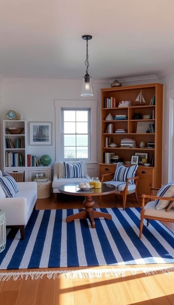
Living room: layered textures and tailored blues
I start with a layered tray on the coffee table, add a rattan or rope-accent lamp, and use a couple of tailored blue cushions. These small moves give the space coastal cues without costume pieces.
- Ground seating with warm-wood furniture so colors feel balanced and elevated.
- Repeat elements such as a braided tray, woven basket, or ceramic vase to tie the room to adjacent spaces.
Bedroom: linen layers and subtle reef references
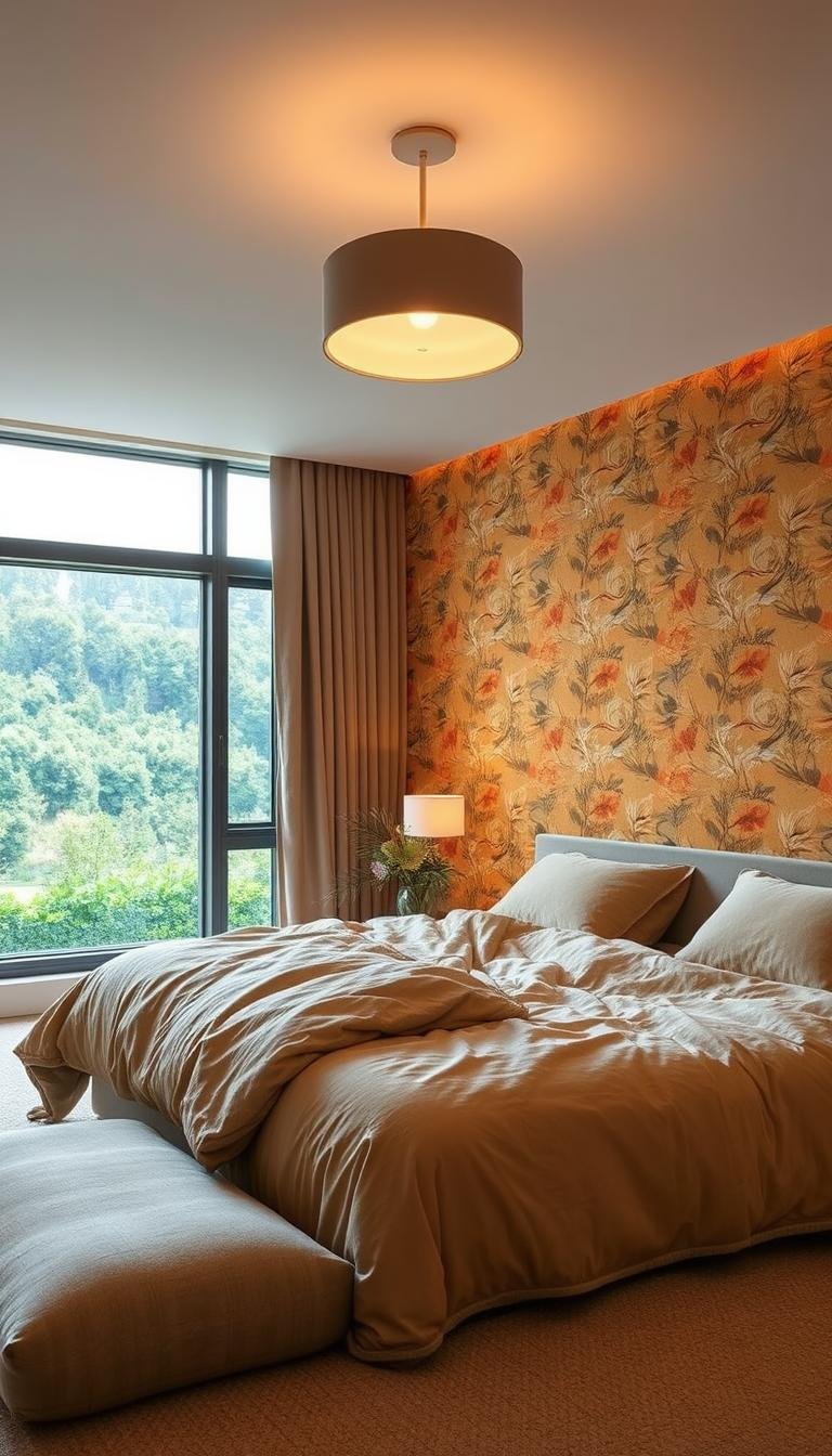
The bedroom gets linen bedding, a cane headboard or nightstand moment, and reef-coded sheets for calm rhythm. I keep patterns restrained so rest feels effortless.
- One new functional piece—a side table or lamp—makes the change visible and useful.
Powder room: artful nods and small hardware
For a playful yet polished powder room, I add a vintage restaurant print, a moody coral candlestick, and a single aged-brass shell accessory. These vintage touches read intentional, not literal.
- Color continuity: use a tight set of colors that drift from living room to bedroom, adjusting intensity but preserving flow.
- Design tip: specify one useful upgrade per room—a mirror, lamp, or side table—to advance the story.
“Subtle, well-chosen elements make a house feel like a thoughtful, lived-in beach retreat.”
Budget‑Friendly Ways I Add Coastal Texture and Color
Small, targeted swaps give rooms an instant coastal feel without a big budget. I lean on tactile accents and materials that read natural and relaxed.
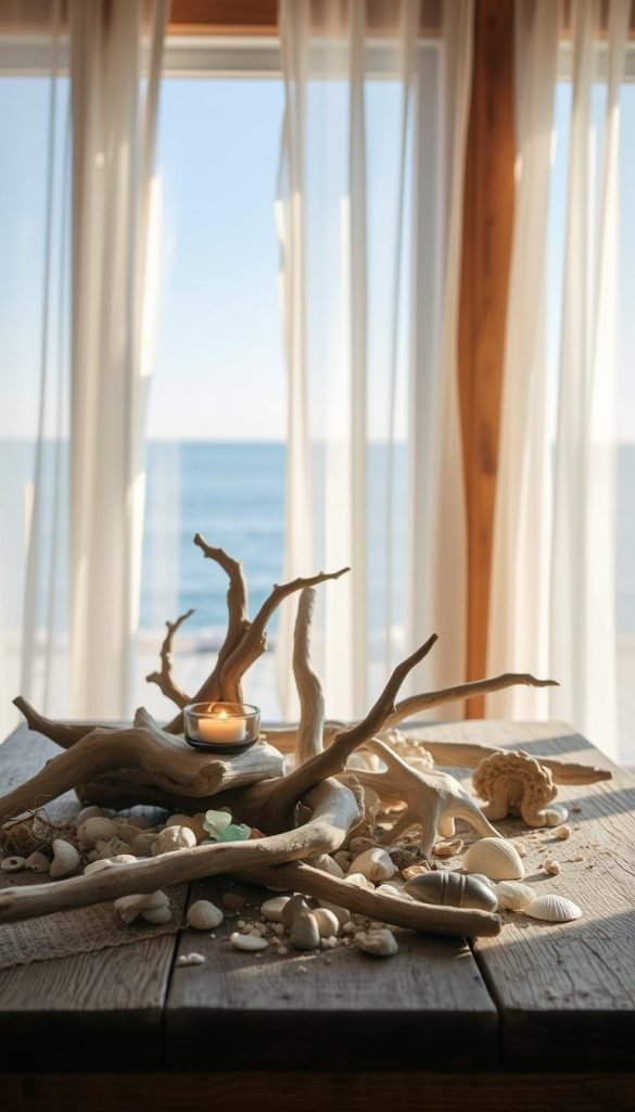
Start small. Swap watery-blue pillow covers and add a patterned option or two that still feels elevated. Pillow covers refresh the look of seating fast and cheaply.
- Pillow covers: sea‑glass hues for an immediate color lift.
- Seagrass placemats & straw baskets: bring natural fibers into daily routines with low cost.
- Throws and slipcovers: align them to the palette so the style shift looks intentional.
- Braided tray: repurpose one for an entry or coffee table to gather objects and layer texture.
- Budget sourcing: choose pieces that mimic designer materials—solid weaves and simple shapes—for seamless integration.
I prioritize small upgrades with big payoff: a mirror to bounce light, a lamp with a jute accent, or a single ceramic vase with a soft coastal glaze. These edits adjust the interior and make the space feel more vintage and lived-in without changing furniture.
“Low-lift accents transform a room when they echo the palette and materials already at play.”
| Item | Cost Range | Primary Effect |
|---|---|---|
| Watery-blue pillow covers | $15–$40 | Instant color refresh |
| Seagrass placemats | $10–$30 | Everyday texture |
| Straw storage basket (H&M style) | $20–$60 | Organizing + natural fibers |
| Braided tray | $25–$75 | Layering and entry styling |
| Slipcover / throw | $30–$120 | Palette alignment for seating |
Where to spend and where to keep it simple
Spend on the pieces that set the room’s texture and scale: a good rug, a substantial lamp, a well-made wood table or a woven chair. Smaller coastal references can stay inexpensive because they are easier to edit later.
If you want one literal motif, use it once—a vintage marine map, a shell-shaped ceramic, a striped textile—and let the rest of the room stay quiet. The restraint is what keeps the reference feeling personal rather than themed.
The simplest rule
If the room would still feel coastal after you removed every anchor, shell and rope detail, the design is working. Keep the palette soft, let natural materials carry the mood, and use obvious nautical references sparingly.