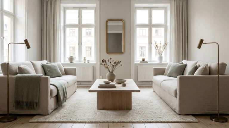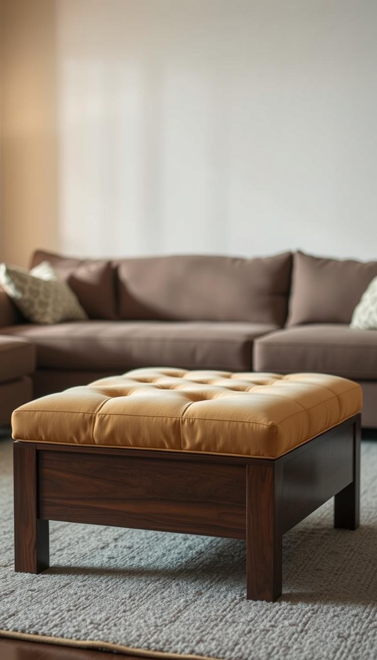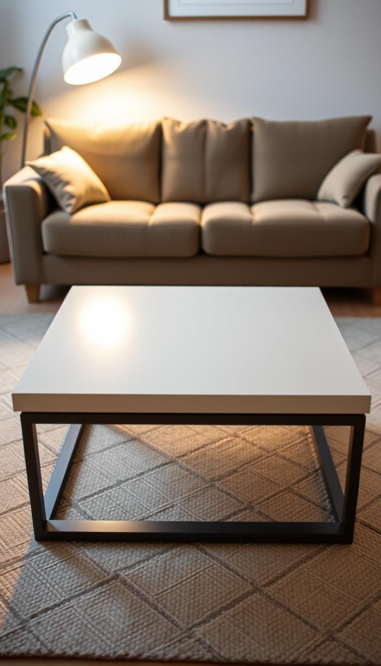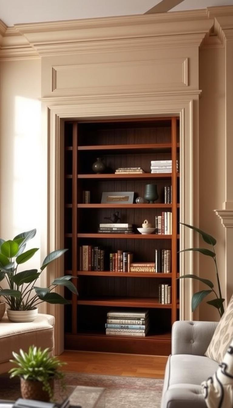
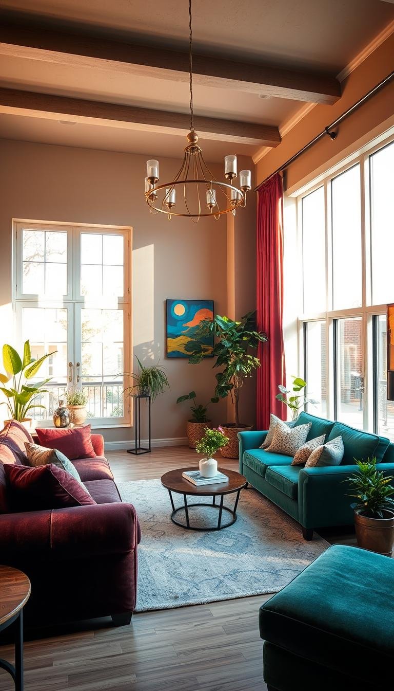
Color psychology can help you choose a living-room mood, but it should not be treated as a promise that a wall color will reliably change behavior, health or physiology. The strongest evidence supports recurring color–emotion associations, while also showing that culture, language, geography, brightness, saturation, lighting and personal experience all shape how color is interpreted.
For decorating, that makes color psychology useful as a decision framework: decide whether you want the room to feel quieter, warmer, brighter, more intimate or more energetic, then test actual colors in the room instead of relying on a universal “blue is calming” rule.
What does research actually support?
A large cross-cultural study published in Psychological Science in 2020 tested color–emotion associations in 4,598 participants from 30 nations speaking 22 native languages. It found strong shared patterns as well as meaningful variation related to nation, linguistic similarity and geographic proximity.
That supports statements such as “certain colors are commonly associated with particular emotions” much more strongly than claims that a paint color will cause a specific behavioral or physiological outcome.
Read the study abstract on PubMed.
Association: people may commonly connect a color with calm, warmth, joy or intensity.
Causation: that does not mean painting a room that color will reliably create the same emotional or physiological response in everyone.
How to use color psychology in a living room
Start with the atmosphere you want rather than with a color name.
| Desired atmosphere | Color direction to explore | What to test |
|---|---|---|
| Calmer and quieter | Soft blues, greens, muted neutrals | Undertone, saturation and how the room feels at night |
| Warmer and more sociable | Terracotta, rust, warm beige, muted orange | Whether the warmth complements wood and upholstery |
| Brighter and more open | Lighter values and lower contrast | Daylight, glare and how much visual separation the room still needs |
| More intimate or dramatic | Deeper greens, blues, browns or charcoal | Artificial lighting and whether the darker boundaries feel intentional |
| More energetic | Higher-saturation accents | Whether the intensity works better as a small accent than a full wall |
These are design directions, not prescriptions. The same green can feel quiet in one room and vivid in another depending on saturation, light, neighboring materials and scale.
Warm colors: red, orange and yellow
Warm hues are often associated with higher-arousal or more energetic feelings. In interiors, they also visually relate well to warm woods, leather, brass, terracotta and firelight.
Red
Red creates strong visual emphasis. In most living rooms it is easier to control as an accent—art, a chair, a rug detail or a small object—than as the dominant color across every surface.
Orange and terracotta
Muted orange, rust and terracotta can make a room feel warmer without the intensity of a saturated orange. They work particularly well beside oak, walnut, cognac leather and warm off-whites.
Yellow and ochre
Yellow is widely associated with joy and brightness, but highly saturated yellow can dominate quickly. Ochre, mustard and muted gold are often easier to integrate into an adult living room because they carry warmth with less visual intensity.
Cool colors: blue, green and purple
Blue and green are commonly connected with lower-arousal or calmer associations, but the specific shade matters more than the broad color family.
Blue
Pale blue can feel airy, while navy and inky blue create more visual weight. A cool blue beside gray flooring will read very differently from the same hue beside warm timber and brass.
Green
Green often connects visually with nature, but sage, olive, emerald and blue-green create very different rooms. Muted greens tend to integrate easily with natural materials; darker greens can make a room feel more enclosed and dramatic.
Purple
Purple ranges from quiet gray-lavender to deep plum. Because its red and blue undertones can shift dramatically under different bulbs, test it in the real room before committing.
Neutrals are colors too
White, cream, beige, gray, brown and black are not psychologically “neutral” in the sense of having no visual effect. They still change brightness, contrast, warmth and perceived visual weight.
White and light neutrals
Lighter surfaces generally reflect more visible light than darker ones. That can make boundaries feel less heavy and help a room appear brighter, especially when the palette has relatively low contrast.
White is not automatically the best choice for a dark room. A cool white in weak daylight can feel flat or gray. If the room naturally runs dark, a warmer light neutral or even a deeper enveloping color may create a more deliberate result. See our guide to making a dark room feel warm instead of gloomy.
Brown and warm neutrals
Brown, camel, taupe and warm beige often connect naturally with wood, leather, linen and woven textures. They can make a room feel grounded without requiring a strong chromatic statement.
Black and charcoal
Dark accents can create definition and visual anchors. Use them where the room benefits from contrast—frames, lamps, hardware, a console or one deeper surface—rather than assuming more black automatically means more sophistication.
Brightness and saturation matter as much as hue
Two colors can share the same basic hue while producing very different visual impressions.
- Lightness/value: a pale blue feels very different from navy.
- Saturation: muted sage and bright emerald do not create the same level of visual intensity.
- Contrast: a room with many sharp light-dark transitions can feel busier than one with closely related values.
- Surface finish: matte paint, glossy tile, velvet and linen reflect light differently even when their nominal colors are similar.
When you want a calmer room, reducing unnecessary contrast and saturation can be just as important as choosing a stereotypically “calm” hue.
Lighting can change the entire palette
Color perception depends on the light reaching the surface. Daylight direction, time of day, bulb color temperature, lamp placement and neighboring materials can all shift how a paint sample looks.
Before choosing a wall color:
- Place large samples on more than one wall.
- View them in morning, afternoon and evening light.
- Turn on the lamps you actually use at night.
- Compare the sample beside flooring, upholstery, curtains and woodwork.
- Check how the color looks both from inside the room and from adjoining spaces.
A paint chip viewed under store lighting is not enough evidence for an entire room.
Culture and personal experience matter
The cross-cultural research is useful precisely because it shows both shared patterns and variation. A color can carry cultural, religious, historical or personal associations that are stronger than a general design guideline.
If several people use the room, treat their reactions as real design data. The “right” color is not the one with the most persuasive psychology infographic; it is the one that supports the desired atmosphere and feels appropriate to the people living there.
How to build a living-room palette that works in real life
1. Choose the atmosphere
Use a few words—quiet, warm, airy, collected, dramatic, cheerful—to define the goal before opening a paint deck.
2. Start with fixed materials
Flooring, fireplace stone, large upholstery pieces and woodwork are harder to change than paint. Build the palette around them instead of choosing wall color in isolation.
3. Choose a dominant value and temperature
Decide whether the room should lean lighter or deeper, warmer or cooler. This narrows the palette much faster than browsing hundreds of unrelated paint colors.
4. Add one or two supporting colors
Use rugs, curtains, upholstery and larger accessories to repeat the palette. Repetition creates coherence more reliably than trying to make every object a new accent.
5. Use stronger color where it earns attention
Higher-saturation colors work best when there is a reason to notice them: artwork, a chair, a built-in, a fireplace surround or a focal wall.
6. Test before committing
Live with samples for several days. If the room feels wrong, adjust value, undertone or saturation before abandoning the whole color family.
Common color-psychology myths to avoid
- “Blue always lowers stress.” Blue is commonly associated with calmer emotions, but that is not a universal clinical effect.
- “Red makes everyone more social.” Red carries strong associations, but context and individual preference matter.
- “White always makes a room look bigger.” Light reflectance can help, but furniture scale, contrast, lighting and sightlines also shape perceived spaciousness.
- “Dark colors make small rooms feel smaller.” Dark surfaces can create visual enclosure, but a deliberate low-contrast dark palette can also make boundaries feel less obvious and more atmospheric.
- “One ideal palette works for every culture and person.” Research shows recurring patterns as well as meaningful cultural and geographic variation.
Frequently asked questions
What color is best for a relaxing living room?
There is no universal best color. Muted blues, greens and warm neutrals are sensible directions to test if you want a quieter atmosphere, but choose the exact shade around the room’s light, materials and occupants.
What living-room colors feel warm?
Terracotta, rust, warm beige, camel, ochre, muted orange and warm wood tones can all increase the visual sense of warmth. Lighting temperature and material texture matter too.
Should a small living room always be painted light?
No. Light colors can reflect more light, but a small room can also work well with a deeper color when the lighting and contrast are intentional. For layout and scale decisions, see our small living room guide.
Does color psychology really work?
Color–emotion associations are well documented, including across multiple cultures. Stronger claims about guaranteed behavior, health or physiological outcomes are much less defensible. Use color psychology as a design input, not a medical or behavioral prescription.
The practical takeaway
Use color psychology to define direction, not to outsource the decision. Research can help explain why certain colors are commonly associated with calm, warmth, intensity or joy. The room itself decides whether those associations translate successfully into an interior.
Choose the atmosphere first, test actual samples under real lighting, account for the fixed materials and the people who use the space, then edit the palette until it feels coherent.
For broader design direction, continue with How to Find Your Home Decor Style, the Dwelanor Style Library, or the Room Guides.