What Are the Benefits of Using Color Psychology in Living Room Design?
I use color psychology to shape a living room’s mood and function. My goal is simple: make a space that feels right for daily life, conversation, and rest.
I focus on three clear gains: better sociability, less stress, and smarter use of space through light and hue. Research shows certain tones change perception and even physical reactions like heart rate and tension.
Warm hues bring energy for lively evenings. Cool tones calm and help people unwind after a long day. Lighter paints and smart lighting make small rooms feel more open, while richer shades add intimacy to large areas without remodeling.
I also adapt palettes to personal taste and culture so the impact feels natural, not forced. In this guide, I blend evidence with practical steps so you can choose a palette that matches your home, the room’s light, and the mood you want to set.
Key Takeaways
- Color choices shape mood: tones can energize or soothe.
- Light shades expand space; dark hues add warmth.
- Some physiological effects—like heart rate—respond to hue.
- Personal and cultural preferences matter; tailor palettes accordingly.
- Good design blends aesthetics with evidence for practical change.
Setting the Scene: Why I Use Color Psychology to Shape Living Room Mood and Behavior
My palette choices set the tone for daily life, from quiet mornings to lively evenings. I start by clarifying how I want a room to feel, then pick colors that support that goal.
Warm colors like red and orange spark energy and conversation. Cool hues such as blue and green help people unwind and restore balance after a long day.
I map the room’s daily rhythm—morning coffee, homework, movie night—and tune the scheme to that way of life. I always talk with household members to learn their emotions and preferences.
Small moves, like a colorful rug or an accent chair, let clients test a new direction with low risk. I also check furnishings, finishes, and the view to make sure the palette feels cohesive with the existing environment.
My goal is a living room that guides mood and behavior naturally: expressive yet balanced, lively or serene as needed.

| Focus | Typical Hue | Effect |
|---|---|---|
| Energy & Conversation | Red / Orange | Boosts interaction, raises alertness |
| Rest & Balance | Blue / Green | Calms, lowers tension |
| Space & Light | White / Light Neutrals | Visually expands space, reduces stress |
The Science and Psychology Behind Color in Interiors
I trace color from reflected light to retinal signals to the emotional cues people feel in a living space.
Reflected wavelengths hit the eye and cones translate those signals into what the mind names as hue. That process mixes physics and biology, so a paint sample can look different under varied light.
I always test swatches at morning, afternoon, and evening light to see how a shade changes with angle and temperature.

How light, cones, and wavelengths influence sight
Warm regions of the spectrum (reds, oranges, yellows) tend to raise energy. Cool regions (blues, greens, purples) often calm. Still, context matters: materials, texture, and lamps change the final read.
- I explain physics so design choices rest on fact, not guesswork.
- Test swatches across light conditions to avoid surprises.
- Use natural elements to boost a restorative shade; avoid harsh bulbs that flip that effect.
From trends to personal and cultural differences
Cross-cultural studies show many shared links (for example, red with love, yellow with joy), but responses vary by history and place. Psychological effects can be measured, yet they may be brief unless reinforced by setting and use. I combine data with on-site testing to shape a scheme that fits the people and the room.
What Are the Benefits of Using Color Psychology in Living Room Design?
I tune color and light so a space supports daily routines and social life. I explain practical steps that help a room feel inviting without overloading the senses.
Enhancing comfort and sociability for everyday living
I choose palettes that invite conversation and ease. Warm accents, used sparingly, spark connection while neutral backdrops keep energy steady.
Supporting relaxation by lowering stress and blood pressure cues
Cool hues like blue and green can lower heart rate and encourage calm after a long day. I balance these with small, friendly pops to keep the scene approachable.
Defining space, light, and perceived size with strategic shades
Lighter walls and ceilings lift a room and make it feel larger. Deeper tones add intimacy in big spaces. I use shifts in saturation to mark zones without building walls.
Guiding emotions for conversation, connection, and calm
Color can nudge behavior: gentle warm accents draw people together, cool backdrops steady breath and focus. When palette, light, and furniture align, the impact feels natural and supportive.

| Goal | Typical colors | Practical effect |
|---|---|---|
| Invite conversation | Orange, warm neutrals | Boosts engagement without overstimulation |
| Promote calm | Blue, green | Lowers tension, supports rest |
| Adjust perceived size | White, light neutrals, deep accent | Expands ceilings; deep tones add coziness |
| Zone open plans | Saturation shifts, contrasting accents | Defines areas for reading, media, or chat |
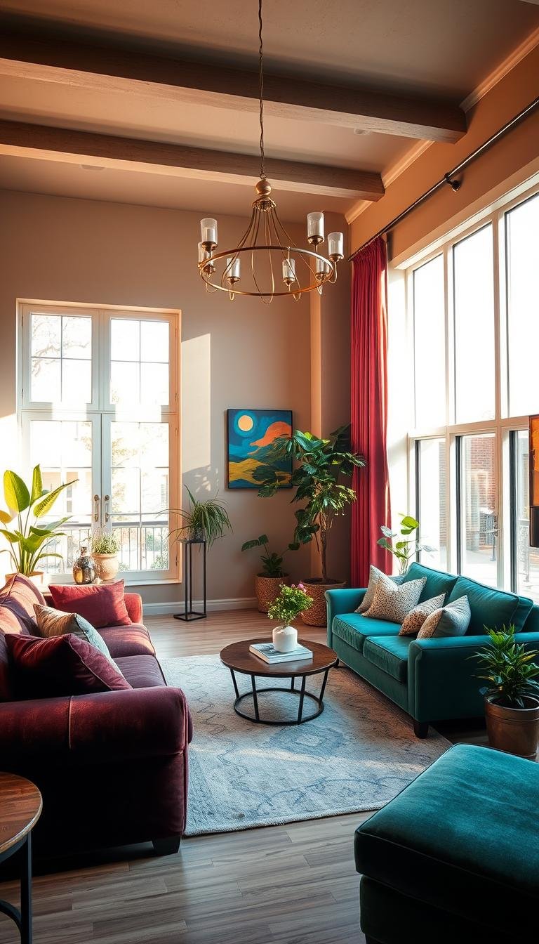
Warm Colors in the Living Room: Red, Orange, Yellow and Their Psychological Effects
A well-placed warm accent can lift a room without turning energy into overstimulation. I use warm colors to invite conversation and comfort, but I balance intensity with calm neutrals. I test swatches at different times so tones behave across daylight and evening light.

Red for energy, passion, and conversation — balanced to avoid overstimulation
I position red as a powerful accent to spark interaction. For example, a red accent chair against beige upholstery and white walls creates lively focus without constant arousal. Pairing red with soft white or greige keeps long gatherings comfortable.
Orange for warmth, creativity, appetite, and friendly vibes
Orange warms a cool backdrop and boosts creativity. I prefer burnt orange or terracotta to echo wood and leather. Use pillows, throws, or a rug to add friendly energy without committing to full walls.
Yellow for optimism and brightness — used sparingly to keep emotions steady
Yellow brightens dim nooks but can overstimulate if overdone. I recommend a soft golden throw or a sunny lamp base instead of wall-to-wall yellow. Muted saffron reads sophisticated; neon tones often feel harsh.
| Hue | Best use | Practical tip |
|---|---|---|
| Red | Accent pieces | Pair with neutral upholstery |
| Orange | Textiles, rugs | Choose terracotta or burnt tones |
| Yellow | Small accents | Use soft golds to avoid overstimulation |
Start small. I advise testing accessories first. Thoughtful warm hues make a living room feel welcoming and alive while protecting comfort over time. These choices follow basic psychology and good interior design practice.
Cool Colors in the Living Room: Blue, Green, Purple for Calm, Balance, and Creativity
When I want a room to feel like a sanctuary, I reach for blues, greens, and soft purples. These colors help lower tension and invite quiet focus while keeping a space polished for guests.
Blue calms the nervous system. I use airy blue on walls to reduce perceived stress and lower heart rate. Deeper blue works well as an accent to add depth without making a room feel cold. I pair blue with warm metals, wood, or textured textiles to keep the scene welcoming.
Green brings nature indoors. Soft sage feels spa-like; olive reads harmonious; emerald gives a luxurious pop. I weave green through upholstery, plants, or a feature wall to add freshness and restorative balance that can help reduce hypertension.
Purple adds elegance and creative energy. Lavender or mauve soothes and refines. A plum throw or art piece injects drama on a calm backdrop. I always test a few close shades and layer lighting so subtle undertones read right at night and day.
- Tip: Combine cool palettes with tactile fabrics—bouclé, linen, wool—for comfort.
- Tip: Add one warm accent, like a cognac ottoman, to avoid aloofness in darker months.

Neutrals and Balance: White, Gray, Brown, and Black as Living Room Anchors
I start with quiet shades so texture and patterns can do the expressive work. Neutrals give a clean stage where accents, art, and furnishings show their best.
White to expand space, reflect light, and reduce visual tension
White acts as a universal neutralizer. I use it on ceilings and trim to bounce light and make a small room feel larger.
To avoid a sterile look, I layer textiles and mixed finishes. This keeps the room calm and tactile rather than flat.
Gray, brown, and black for sophistication—paired to avoid gloom
Gray sits between modern and cozy depending on undertone. I match it to the room’s daylight and existing wood tones.
Brown brings warmth and security, so I pair large brown pieces with airy neutrals and fresh accents.
Black provides power and polish. I add it as thin frames, a lamp, or a console to anchor the scheme without closing the space.
- I balance matte and sheen finishes to keep neutral colors lively.
- I test whites side by side so the chosen tone complements evening and day.
- Neutrals are not no-color; they set the foundation for seasonal updates and bold art.

How I Build a Living Room Color Scheme That Works in Real Life
I map a palette around how people use the room so each choice earns its place. That way the design supports daily habits and feels effortless.
Choosing a dominant hue, secondary support, and accent pops
I start with one dominant color for walls, a secondary tone for big furnishings, and bold accents to anchor a statement. This keeps the scheme flexible and easy to update.
Working with natural and artificial light to tune color temperature
I test swatches at morning and evening light. Gray undertones can shift, so I check how blue or warm orange reads under bulbs and sun.
Using patterns, textures, and materials to add depth without chaos
I layer woven rugs, linen drapes, and soft throws so patterns add interest while the palette stays tight. Tactile mixes make the interior feel lived-in and calm.
Testing swatches and creating mood boards before committing
I shortlist 3–5 shades, place swatches on multiple walls, and build a mood board. This simple workflow saves time and prevents costly mistakes.

| Role | Typical choice | Practical tip |
|---|---|---|
| Dominant | Light neutral or soft blue | Opens space; keep ceilings lighter |
| Secondary | Warm gray or muted green | Anchors furniture; match wood tones |
| Accent | Yellow, orange, or deep blue | Use in pillows, art, or a single chair |
Research Realities: Psychological Effects, Personal Preferences, and Cultural Context
I read cross-cultural studies, then I ask about daily life before I suggest any palette. This keeps research useful and relevant to the household.
What studies show: a 2020 survey across 30 countries (4,598 people) found recurring links—red with love (68%), yellow with joy (52%), blue with relief (35%), green with contentment (39%), black with sadness (51%), white with relief (43%).
Psychology points to real, though often modest, psychological effects. Blue can lower arousal; red can quicken reactions or reduce test performance in some experiments.
I use these findings as a guide, not a rule. Cultural background, personal history, light, materials, and the surrounding environment change the final impact.
- I document preferences and test swatches with occupants before finalizing a scheme.
- I layer texture, lighting, and nature-inspired tones so effects last beyond first impressions.
- I caution other designers—and my clients—that claims can overpromise; color supports feelings and levels of arousal but is not a cure-all.

| Finding | Example | Design response |
|---|---|---|
| Cross-cultural links | Red-love, Yellow-joy | Use accents, test meanings with people |
| Measured effects | Blue reduces arousal | Use cool backdrops in relaxation zones |
| Context matters | Lighting, material, city environment | Layer texture and nature tones for balance |
My conclusion: color is a nuanced tool. I combine evidence, consultation, and on-site testing so interior design fits like a favorite sweater for the people who live there.
Designer Pitfalls to Avoid and Pro Tips I Rely On
I often see a promising palette undone by a single unchecked choice during execution. I write this short checklist so designers and interior designers can avoid common slips and keep a scheme feeling intentional today.

Overusing intense hues without neutral or natural anchors
Don’t saturate a room with continuous bold colors. Intense hues raise arousal and cause visual fatigue over time.
I anchor strong tones with wood, plants, or stone so the palette reads calm and rooted. That way a single statement piece keeps power without wearing out its welcome.
Ignoring undertones and shifts in light
Undertones make or break a scheme. A neutral can skew pink, green, or blue under different bulbs.
I test paint on multiple walls and view swatches across days. I finalize textiles first, then match paint to fabrics so the colors support one another.
| Common pitfall | Quick fix | Why it works |
|---|---|---|
| Too much black | Use as accent only | Preserves light and perceived size |
| Excess yellow | Limit to small accents | Avoids overstimulation |
| Untested swatches | Swap and photograph under varied light | Reveals hidden clashes |
Pro tip: edit accent colors down to one or two signature statements. Photograph the room under different light to catch clashes your eye misses. Disciplined base choices create freedom to rotate accents each season without repainting.
Conclusion
A smart mix of tones can quietly steer energy, focus, and comfort across daily life.
I recap that applying color psychology to interior work pays off with clearer mood cues and a more livable space. Cooler hues like blue and green encourage rest; warm accents such as orange or a hint of red invite connection. White opens and soothes when you need breathing room.
Success rests on balance: measured saturation, neutral anchors, and nature touches. I test swatches in real light, refine trim and bulb temperature, and start with a mood board before committing.
Use method over haste: dominant, secondary, accent; test under multiple lights; edit. Do this and your palette will shape mood and connection, turning an ordinary room into a favorite place at home.