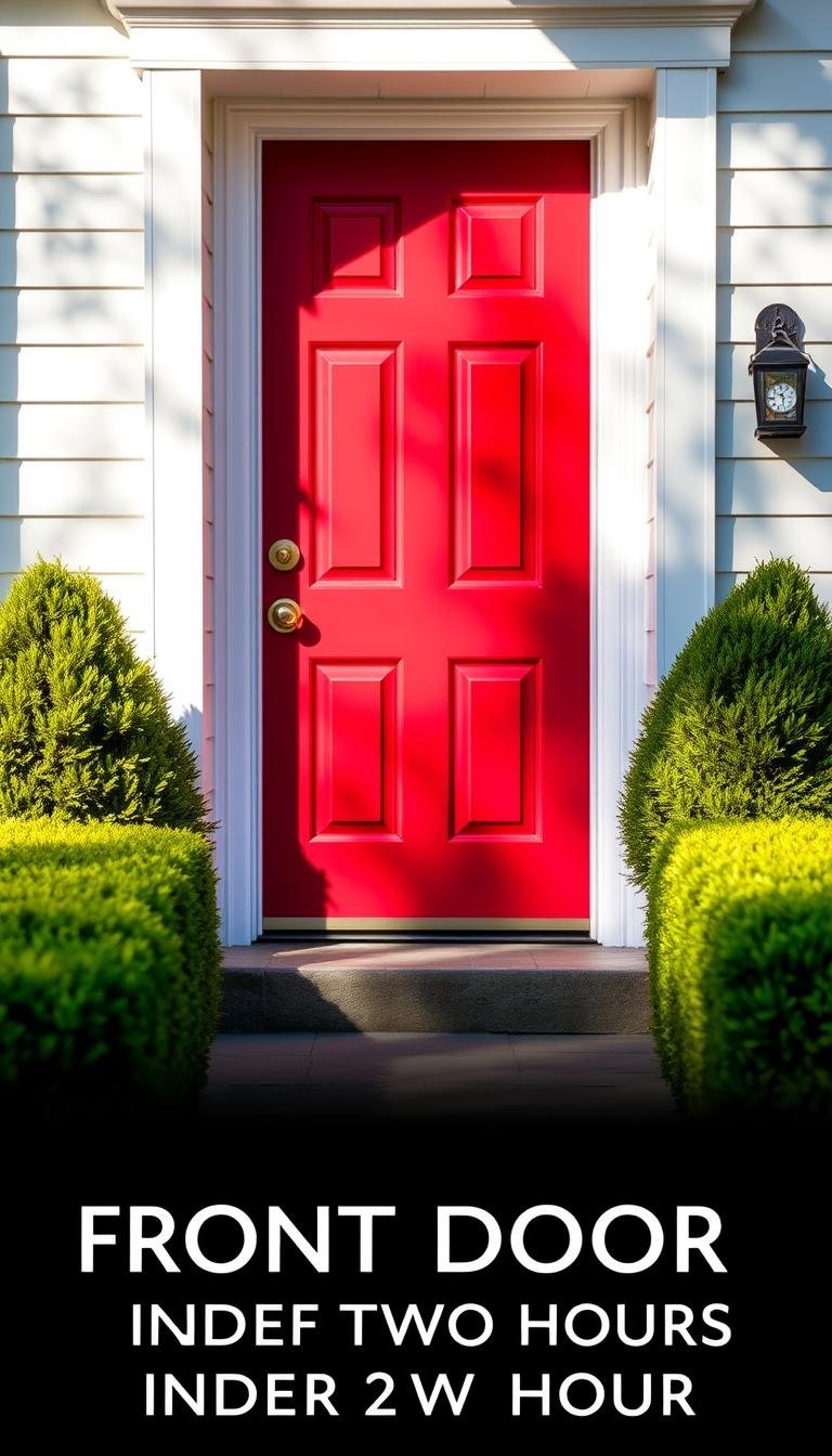
How do I pick a front-door color that raises curb appeal in 2026?
Your front door is the first thing people notice about your home. It sets the tone for your entire property. Choosing the right color can make a huge difference in your curb appeal.
In 2026, trends blend classic elegance with modern boldness. The perfect shade reflects your personality while boosting property value. It creates a welcoming atmosphere for guests and potential buyers.
Lighting and seasonal changes affect how your chosen paint appears. This guide helps you navigate these factors with confidence. Your entrance becomes more than just a door—it’s a statement piece for your entire house.
Key Takeaways
- Your front door color significantly impacts your home’s first impression
- 2026 trends combine timeless elegance with contemporary boldness
- The right color choice can increase your property’s value
- Lighting and seasons affect how your door color appears throughout the year
- Color psychology plays a crucial role in creating welcoming entrances
- Your door should complement your home’s exterior features and landscaping
- Personal style can be expressed while maintaining broad appeal
Why Your Front Door Color Matters for 2026 Curb Appeal
A thoughtfully chosen entrance hue transforms your property’s exterior character instantly. Your front door serves as the visual anchor of your home’s facade, setting expectations before anyone crosses the threshold. This focal point creates lasting impressions that influence how people perceive your entire property.
Real estate studies reveal that the right color choice can boost your home’s value by up to 7%. This simple update delivers exceptional return on investment compared to major renovations. Potential buyers often make subconscious judgments based on entrance aesthetics alone.

Color creates immediate emotional connections with visitors and prospective buyers. Warm tones suggest welcoming hospitality, while bold shades communicate confidence and style. The psychology of your entryway shade speaks volumes before anyone rings the bell.
Your selected hue dramatically affects perception of your home’s size and maintenance level. Lighter colors can make smaller homes appear more spacious, while darker tones add weight and importance to larger structures. The finish quality also suggests how well you maintain the entire property.
2026 trends emphasize making bold statements while maintaining timeless appeal. Vibrant yellows, lively coral shades, and eye-catching turquoise create memorable entrances. These contemporary choices blend excitement with enduring style that won’t feel dated next year.
Your door color interacts with architectural features to enhance or diminish their impact. The right shade highlights beautiful trimwork, complements brick or stone accents, and creates harmony with shutters. Contrast can emphasize unique details that might otherwise go unnoticed.
Seasonal changes affect how your color appears throughout the year. Summer sunlight intensifies vibrant shades, while winter grays might mute softer tones. Consider how your choice will perform across all four seasons in your climate.
The perfect entrance makes your home stand out in neighborhood comparisons. While coordinating with surrounding homes maintains community harmony, a distinctive shade creates individual character. Your entryway should reflect your family’s personality while respecting the neighborhood aesthetic.
Door color contributes significantly to your home’s exterior color palette harmony. It should complement siding, trim, roofing, and landscaping elements. A cohesive scheme creates visual appeal that feels intentional and professionally designed.
This improvement represents one of the most cost-effective upgrades available to homeowners. With proper preparation and quality paint, you can achieve dramatic transformation for minimal investment. The impact far exceeds the relatively small expense required.
For more inspiration on making your entrance stand out, explore our comprehensive guide to entryway transformations. Discover how vibrant shades can infuse personality and elevate your home’s overall appearance instantly.
Understanding the 2026 Color Trends for Front Doors
Your entryway makes a powerful style statement before guests even step inside. The coming year brings exciting combinations of timeless elegance and fresh, bold expressions. These trends balance personality with lasting appeal that won’t feel dated next season.

Design experts predict several standout directions for entrance aesthetics. Each option offers unique character while enhancing your property’s overall appearance. Let’s explore the most compelling choices gaining momentum.
Classic Blues: Timeless and Versatile
Deep navy shades remain perennial favorites for good reason. Designer Jaime Dupes notes, “A shade of blue is a timeless choice for a front door, and I see this trend more in 2026.” These hues complement various architectural styles beautifully.
Benjamin Moore’s Hale Navy creates sophisticated contrast against light exteriors. It pairs wonderfully with white trim and natural landscaping elements. This versatile shade works equally well on colonial and contemporary homes.
Playful Blue-Greens: Beyond the Basics
2026 introduces refreshed interpretations of aquatic-inspired tones. Turquoise, teal, and sage green bring vibrant energy to traditional facades. These playful shades feel both current and classic simultaneously.
Designer Debbie Mathews observes these aren’t your grandmother’s colors. They offer modern sophistication while maintaining approachable warmth. These hues create memorable first impressions without overwhelming other exterior elements.
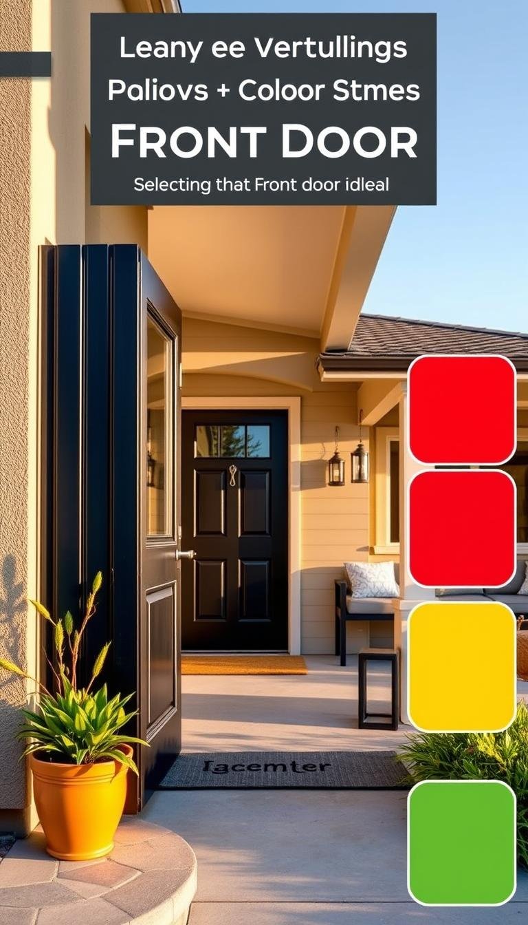
Saturated Hues: Ochre, Red, Plum, and Purple
Bold, saturated colors make dramatic statements for confident homeowners. Rich ochre delivers sunny warmth throughout all seasons. Deep plum and purple shades add regal elegance to traditional architecture.
These colors work particularly well on homes with neutral siding and trim. They create focal points that draw attention to beautiful entryway details. These choices showcase personal style while maintaining broad appeal.
Bold Black: Warm and Welcoming
Black continues its popularity but with warmer, richer undertones. Designer Steph Schlegelmilch notes increasing client requests for this classic option. Modern black finishes feel inviting rather than stark or cold.
This sophisticated choice complements various exterior materials beautifully. It creates striking contrast against light siding and natural stone accents. Black doors lend architectural importance to any home style.
Warm Wood Stains: Natural and Inviting
Natural wood grains make a strong comeback with cottage-style popularity. Stained doors highlight beautiful organic patterns and textures. They bring warmth and character that painted options cannot replicate.
These finishes work exceptionally well with traditional and craftsman homes. They complement natural landscaping and stonework beautifully. Wood stains offer timeless appeal that only improves with age.
Timeless Materials: Steel and Glass Statements
Homeowners increasingly choose materials that make architectural statements. Steel doors offer security and modern industrial appeal. Glass elements welcome natural light while maintaining privacy.
These options work particularly well on contemporary and mid-century homes. They create clean lines and interesting visual textures. Material choices become the star rather than color alone.
Each trend offers unique advantages for different home styles and personal preferences. Consider your architecture, surroundings, and desired statement when selecting. The perfect choice reflects your personality while enhancing your home’s best features.
How to Coordinate Your Door Color with Your Home’s Exterior
Creating harmony between your entrance and surrounding elements transforms ordinary exteriors into extraordinary statements. The right coordination makes your entire property feel intentional and professionally designed. Let’s explore how to achieve perfect balance with your home’s unique features.

Matching with Siding and Brick
Your siding material determines your ideal color approach. Brick homes often benefit from picking up subtle tones within the masonry. Look for earthy reds, warm browns, or soft grays already present in your brickwork.
Wood siding offers natural warmth that pairs beautifully with many shades. Consider whether you want complementary or contrasting effects. Light siding creates stunning contrast with deep, rich door colors.
Vinyl and stucco exteriors provide clean backdrops for bold statements. These materials work well with vibrant blues, greens, or classic black. Always test samples against your actual siding in different lighting conditions.
Complementing Trim and Shutters
Your trim and shutters provide crucial connecting elements between door and siding. They create visual pathways that guide the eye around your home’s facade. Coordinate rather than match exactly for the most sophisticated look.
White trim remains a timeless choice that works with virtually any door color. It creates crisp definition that highlights your entrance beautifully. Darker trim adds depth and sophistication to lighter exterior schemes.
Consider your shutter color when selecting your perfect shade. Your door can either match shutters for cohesion or contrast for emphasis. Both approaches create intentional, well-designed exteriors when executed thoughtfully.
Considering Landscaping and Surroundings
Your garden palette influences how your door color appears throughout the year. Lush green landscaping makes red and blue doors pop beautifully. Autumn foliage creates warm backdrops for deep green or navy entries.
Hardscaping elements like stone pathways or wooden decks contribute to your overall color story. Designer Tanya Smith-Shiflett demonstrates this perfectly with warm brown French doors that complement surrounding wood elements. These connections create seamless transitions between nature and architecture.
Neighborhood context matters when making your final selection. You want your home to stand out while maintaining community harmony. Observe surrounding homes to understand local color preferences and architectural styles.
| Exterior Element | Coordination Approach | Recommended Colors |
|---|---|---|
| Red Brick | Pick up subtle tones | Deep navy, forest green, warm black |
| White Siding | Create contrast | Bold blue, classic red, sophisticated black |
| Wood Siding | Complement natural tones | Sage green, warm brown, soft blue |
| Gray Siding | Add warmth or cool contrast | Yellow ochre, deep plum, bright white |
| Stone Accents | Match natural elements | Earthy green, warm brown, stone gray |
Natural light patterns dramatically affect color perception throughout the day. North-facing doors receive cooler light that can mute warm tones. South-facing entrances get warm light that intensifies vibrant shades.
Create physical color boards with samples of all exterior elements. Include siding, trim, roofing materials, and landscaping elements. View these boards in different lighting conditions before making your final decision.
Remember that balance creates more impact than perfect matching. Your front door should feel connected to your home’s exterior while making its own statement. This approach ensures lasting beauty that enhances your property’s overall appeal.
The Psychology of Color: Making the Right Statement
Color speaks before words. Your entrance shade communicates volumes about your home and family. Different colors trigger unique emotional responses in visitors and neighbors.
Red doors traditionally symbolize warmth and welcome across cultures. This vibrant choice creates an inviting atmosphere. It suggests a lively, energetic household.
Blue conveys stability, trust, and calmness. A navy or blue door projects reliability and peace. It works beautifully on various architectural exteriors.

Green represents growth, harmony, and renewal. Sage and other green shades connect your house to nature. They create balanced, tranquil entrances.
Black projects sophistication and authority. Modern black finishes feel warm yet elegant. This shade adds dramatic contrast against light siding.
Yellow radiates cheerfulness and optimism. Sunny tones create happy first impressions. They work particularly well on north-facing entrances.
Cultural associations influence color perception regionally. New England homes often feature classic red entrances. Southern homes might embrace cheerful yellows or greens.
Your door color can enhance architectural details. Bold shades highlight beautiful trimwork. Contrasting tones emphasize unique design elements.
Lighter paint can make smaller homes appear larger. Darker colors add weight and importance to grand entrances. Consider your home’s scale when selecting.
Your front door color should reflect your personality while maintaining broad appeal. Vibrant choices showcase creativity. Classic shades communicate timeless taste.
Using the color wheel simplifies selection. Complementary colors (opposites) create energetic contrast. Analogous schemes (neighbors) offer harmonious beauty.
Monochromatic schemes use tone-on-tone combinations. They create sophisticated, cohesive looks. Contrasting palettes offer adventurous, dynamic appeal.
Your entrance makes a subconscious statement about your entire property. The right color enhances curb appeal instantly. It creates the specific atmosphere you desire.
Consider how light affects your chosen shade throughout the day. Test samples against your actual exterior materials. View them in different weather conditions.
Your final choice should feel authentic to your family‘s spirit. It should complement your home‘s architecture and surroundings. The perfect door color welcomes guests while expressing your unique style.
Practical Tips for Testing and Choosing Your Color
Finding your perfect entrance shade requires careful testing before final commitment. I always start by creating large sample boards that show potential colors against my actual exterior materials. This approach reveals how shades interact with siding, trim, and surrounding elements.
Testing at different times of day proves absolutely essential. Morning light creates cool tones while afternoon sun warms everything up. Evening shadows can completely transform how a color appears against your home’s facade.

Digital tools offer fantastic visualization options before buying paint. Many brands provide apps that show colors on uploaded photos of your actual door. These tools help narrow choices before investing in physical samples.
Weather conditions dramatically affect color perception. Cloudy days mute vibrant shades while bright sunlight intensifies them. Test your samples during various weather patterns common in your area.
I recommend getting sample sizes from multiple paint brands. Benjamin Moore, Sherwin-Williams, and Farrow & Ball all offer small quantities for testing. Compare how different formulations look on your specific surface.
Evaluate how potential colors work with architectural details. Your chosen shade should highlight beautiful trimwork and complement existing features. Consider how it interacts with brick, stone, or other exterior elements.
Landscaping and hardscaping elements influence color perception. Green foliage makes red tones pop while autumn colors enhance blue shades. Test samples against your garden’s seasonal variations.
Gathering feedback from family and trusted friends provides valuable perspectives. Sometimes others notice things we might overlook in our excitement. Their input can confirm or challenge our initial impressions.
If you’d like to use a similar color scheme throughout your exterior, test paint swatches against all elements simultaneously. This ensures harmonious blending between your entrance and other features. Consider extending the color onto nearby trim for cohesive beauty.
Take your time with this testing process to avoid costly mistakes. Rushing this decision often leads to disappointment and extra expense. Proper testing ensures you’ll love your choice for years to come.
| Testing Method | Best Time | What to Look For |
|---|---|---|
| Sample Boards | Multiple days | Color changes in different light |
| Digital Visualization | Daytime hours | How color fits overall exterior |
| Physical Samples | All seasons | Weather impact on appearance |
| Architectural Review | Morning light | Detail enhancement |
| Landscaping Check | Seasonal changes | Natural element harmony |
This careful approach ensures your final selection enhances your home’s character while reflecting your personal style. For more guidance on creating harmonious exterior schemes, explore our comprehensive resources on entrance transformations.
How do I pick a front-door color that raises curb appeal in 2026? A Step-by-Step Guide
Let me guide you through a proven process for finding your ideal entrance shade. This method combines practical assessment with creative exploration. You’ll discover a color that reflects your style while enhancing your property’s value.
Start by examining your home’s architectural character. Colonial homes often suit classic reds or blacks. Modern designs might embrace bold blues or vibrant yellows. Your existing exterior palette provides crucial clues for harmonious coordination.

Research upcoming trends while staying true to your home’s essence. 2026 brings exciting options from deep navies to warm woods. I recommend creating a physical mood board with samples of your siding, trim, and landscaping materials.
Consider how sunlight affects your entrance throughout the day. North-facing doors receive cooler light that mutes warm tones. South-facing entries get intense sunlight that amplifies vibrant shades. Test your top choices at different times before deciding.
Narrow your options using both digital tools and physical samples. Many paint brands offer apps that visualize colors on your actual door photos. Combine this with real paint samples viewed in various lighting conditions.
Evaluate each candidate color against this practical checklist:
| Evaluation Factor | Morning Light | Afternoon Light | Evening Appearance |
|---|---|---|---|
| Color Intensity | Subtle and soft | Bright and vibrant | Muted and shadowed |
| Trim Compatibility | Harmonious blend | Clear contrast | Balanced relationship |
| Landscaping Harmony | Natural integration | Dynamic interaction | Cohesive appearance |
| Architectural Enhancement | Detail highlighting | Full impact visible | Subtle feature emphasis |
Consider maintenance requirements and longevity when making your final decision. Some shades show dirt more easily than others. Quality paint ensures your choice remains beautiful for years with proper care.
Preparation proves essential for professional results. Clean the surface thoroughly and repair any damage before painting. Proper priming ensures your chosen color appears true and lasts longer.
You might choose professional help or embrace this as a DIY project. Professionals bring expertise and efficiency. DIY offers personal satisfaction and potential cost savings.
Here’s a realistic timeline for your transformation:
- Week 1: Research and color selection
- Week 2: Sample testing and final decision
- Week 3: Surface preparation and priming
- Week 4: Painting and clean-up
Your perfect entrance shade awaits discovery through this thoughtful process. The right choice enhances your home’s character while expressing your unique style. This transformation creates lasting beauty and increased property value.
Popular Paint Brands and Their Top Colors for 2026
Selecting the perfect paint brand makes all the difference in achieving lasting beauty for your entryway. Premium formulations offer superior coverage, durability, and color retention that withstands weather challenges. I always recommend investing in quality products that protect your investment while delivering stunning results.
Leading manufacturers introduce exciting new palettes each season while maintaining their classic favorites. These colors undergo rigorous testing to ensure they perform beautifully in various climates and lighting conditions. Understanding each brand’s strengths helps you make informed decisions for your project.

Benjamin Moore Favorites
Benjamin Moore consistently delivers exceptional quality with their advanced color technology. Their Aura® Grand Entrance line provides outstanding durability against harsh weather conditions. These paints offer excellent hide and coverage with minimal application effort.
Heritage Red (HC-190) creates a timeless, welcoming statement that complements traditional architecture. This rich, warm red works beautifully with brick and stone exteriors. It maintains its vibrancy even in direct sunlight.
Hamilton Blue (HC-209) offers a sophisticated mid-tone blue that feels both classic and contemporary. Designer Bella Mancini used Santa Clara for a charming entrance that perfectly complements the home’s character. This shade pairs wonderfully with white trim and natural landscaping.
Hale Navy (HC-154) remains a perennial favorite for its deep, versatile blue-black appearance. It creates striking contrast against light siding while maintaining warmth. This color works across various architectural styles from colonial to modern.
For dramatic impact, Plum Royale (2073-20) makes a bold statement that designer Jamie Drake selected for a country estate entry. This vivid plum shade adds unexpected elegance and personality to traditional homes. It creates memorable curb appeal that stands out in any neighborhood.
Sherwin-Williams Standouts
Sherwin-Williams offers exceptional exterior paints with advanced weather-resistant technology. Their Emerald® Rain Refresh line actually cleans itself during rainfall, maintaining beautiful appearance with minimal maintenance. These products provide excellent protection against fading and peeling.
Swimming SW 6764 delivers a refreshing aqua-blue that brings coastal charm to any entrance. This cheerful shade works particularly well on homes with white or light gray siding. It creates a vacation-like atmosphere that welcomes guests year-round.
Coral Reef SW 6606 offers a vibrant, energetic option for homeowners seeking personality. This warm coral-pink shade makes a joyful statement against neutral exteriors. It pairs beautifully with natural wood elements and lush green landscaping.
Their Duration® line provides superior adhesion and flexibility that resists cracking and peeling. These paints maintain beautiful appearance through temperature fluctuations and moisture exposure. The advanced acrylic formula ensures long-lasting protection for your investment.
Farrow & Ball Recommendations
Farrow & Ball brings British sophistication with their richly pigmented, environmentally conscious paints. Their Estate Emulsion line offers exceptional depth of color with a beautiful matte finish. These paints create luxurious appearance that feels both timeless and contemporary.
Hague Blue No. 30 delivers a deep, dramatic blue-green that works beautifully on period and modern homes. This sophisticated shade creates architectural importance and pairs wonderfully with brass hardware. It offers rich color that changes beautifully throughout the day.
Card Room Green No. 79 provides a warm, earthy green that connects your entrance to natural surroundings. This versatile shade complements various exterior materials from wood to stone. It creates harmonious transition between architecture and landscaping.
Their Full Gloss finish offers brilliant shine that highlights architectural details beautifully. This finish provides excellent durability and easy cleaning maintenance. It works particularly well on paneled doors where it enhances depth and dimension.
| Brand | Top Color | Finish Options | Best For |
|---|---|---|---|
| Benjamin Moore | Hale Navy | Matte to High Gloss | Traditional Homes |
| Sherwin-Williams | Swimming SW 6764 | Satin to Semi-Gloss | Coastal Properties |
| Farrow & Ball | Hague Blue | Estate Emulsion | Luxury Finishes |
Premium brands typically cost more but deliver better coverage and longevity. Benjamin Moore and Sherwin-Williams offer excellent mid-range options that balance quality and affordability. Farrow & Ball provides luxury finishes for homeowners seeking exceptional depth and sophistication.
Always use high-quality primers specifically formulated for exterior surfaces. Stain-blocking primers prevent tannin bleed from wood substrates and ensure true color representation. Weather-resistant topcoats provide additional protection against moisture and UV damage.
Most brands offer convenient sample sizes for testing colors on your actual surface. Benjamin Moore’s Color Samples provide generous amounts for thorough testing. Sherwin-Williams offers Color-to-Go samples that cover approximately 12 square feet.
Professional paint stores provide expert advice and color matching services. They can create custom matches for specific shades you’ve seen elsewhere. Many offer free color consultations to help you make the perfect choice.
Consider the environmental impact of your paint selection. Many brands now offer low-VOC options that are safer for your family and the environment. These products provide excellent performance while reducing harmful emissions.
For more guidance on selecting the perfect products for your home’s exterior, explore our comprehensive resources at Dwelanor’s mission page. Discover how quality materials transform ordinary entrances into extraordinary statements that enhance your property’s value and beauty.
Real-Life Examples: Inspiring Front Door Transformations
Seeing actual projects brings color concepts to life beautifully. These real-world examples showcase creative solutions from top designers. Each transformation addresses unique challenges while enhancing curb appeal.
I find studying completed projects provides the best inspiration. You see how colors interact with actual materials and lighting. These examples demonstrate practical applications of the trends we’ve discussed.

Red and Black Contrast
Designer Amanda Greaves created a stunning visual dialogue between two entrances. Her client loved Ralph Lauren’s aesthetic and wanted a red door. The solution involved both practical and decorative elements.
She used Benjamin Moore’s Heritage Red on the barn door for dramatic impact. The actual entrance remained black for functional reasons. This combination created exciting contrast while maintaining practicality.
The red makes a bold style statement against the property’s exterior. Meanwhile, the black entrance provides timeless elegance. This approach satisfies both aesthetic desires and practical needs beautifully.
Stony Blue Soft Welcome
Elizabeth Pash chose Hamilton Blue by Benjamin Moore for her vacation home. This stony blue shade creates a gentle, inviting entrance. It works perfectly against the white wavy siding.
The color appears throughout the interior, creating cohesive flow. This connection between exterior and interior design feels intentional. Guests experience color continuity from the moment they arrive.
The blue tone offers softness without sacrificing character. It provides just enough color to stand out against the white background. This choice demonstrates how subtle shades can make significant impact.
Subdued Green Earthy Tone
Kate Marker selected a gray-green shade that brings nature closer to the home. This earthy tone complements the natural wood siding beautifully. It adds color without overwhelming the exterior palette.
The green connects the architecture to its surroundings organically. It picks up tones from the landscaping and natural elements. This creates harmonious blending between built and natural environments.
This approach works particularly well for homes seeking earthy elegance. The color feels both current and timeless simultaneously. It demonstrates how green can enhance without dominating.
Warm Brown Richness
Tanya Smith-Shiflett transformed an entryway with custom French doors in warm brown. The original solid wood door with sidelights felt heavy and dark. The new design welcomes abundant natural light while maintaining warmth.
The rich brown tone complements beautiful brickwork perfectly. It doesn’t compete with the stunning façade but enhances it. This choice shows how doors can highlight architectural features.
The French door design modernizes the entrance while respecting traditional elements. The warm brown stain adds depth and character. This transformation proves sometimes the best choice isn’t paint but beautiful materials.
Very Dark Green Depth
Emilie Munroe of Studio Munroe selected a deep green that almost reads as black. This sophisticated choice refreshes a historical San Francisco townhome. The color adds gravity and importance to the architecture.
The nearly-black green provides dramatic contrast against lighter elements. It creates a striking focal point that draws the eye immediately. This approach works beautifully for historical properties seeking modern updates.
The depth of color adds dimension to the flat façade. It creates shadows and highlights that enhance architectural details. This transformation shows how dark colors can actually enhance rather than diminish.
Clear Glass Elegance
Phoebe Howard chose a glass door with white trim for a seamless aesthetic. When architecture and landscaping already create beauty, simplicity often works best. The clear glass allows the home’s features to shine.
The transparent design maintains an open, airy feeling at the entrance. It doesn’t compete with stunning surroundings but complements them. This approach proves that sometimes less color creates more impact.
The white trim matches the home’s existing color palette perfectly. This creates cohesion rather than contrast. For homes with strong architectural presence, this understated choice often delivers maximum elegance.
Each example demonstrates thoughtful problem-solving through color and material choices. These designers considered architecture, surroundings, and client preferences. Their solutions provide inspiration for your own entrance transformation.
For more innovative ideas on enhancing your home’s first impression, explore these five ways to amplify curb appeal through thoughtful door design.
Budget-Friendly Ideas for a High-Impact Look
Great curb appeal doesn’t require a huge budget. I’ve discovered smart approaches that deliver stunning results without breaking the bank. These techniques focus on strategic enhancements rather than complete overhauls.
Extending your door’s paint to the trim creates a cohesive, custom appearance. This simple trick makes the entire entrance feel more intentional. It frames your entryway beautifully while maximizing color impact.

Strategic color placement offers another cost-effective solution. Instead of painting the entire surface, focus on panels or specific details. This approach creates visual interest while using less material.
Repurposing leftover paint from other projects saves money and creates harmony. That partial can of navy from your living room accent wall might work perfectly. This method connects your interior and exterior color stories beautifully.
“The stain on this door highlights the wood grain and makes the entry oh so cozy.”
DIY staining techniques preserve natural beauty at minimal cost. Quality stains enhance wood grain while providing protection. This approach maintains character that paint sometimes covers up.
Updating hardware delivers instant transformation without painting. New handles, knockers, or house numbers refresh your entrance dramatically. These changes make older doors feel current and cared for.
Seasonal decor complements your existing color scheme temporarily. Wreaths, planters, or door mats add personality without permanent commitment. These elements let you experiment with different looks throughout the year.
Strategic landscaping enhancements make your entrance color appear more intentional. Planting complementary flowers or shrubs frames your door beautifully. This natural framing draws attention to your chosen shade.
Budget-friendly paint alternatives deliver quality results without premium prices. Many store brands offer excellent coverage and durability. These options work wonderfully for homeowners watching their expenses.
| Budget Solution | Approximate Cost | Impact Level |
|---|---|---|
| Trim Painting Only | $20-40 | High |
| Hardware Update | $50-150 | Medium-High |
| DIY Staining | $30-60 | Medium |
| Seasonal Decor | $25-75 | Medium |
| Strategic Planting | $40-100 | Medium-High |
These approaches prove that dramatic improvements don’t require massive investments. Thoughtful, targeted changes create significant visual impact. Your entrance can feel fresh and inviting without straining your budget.
Remember that preparation matters most for professional results. Proper cleaning and priming ensure your budget-friendly paint job lasts. Taking time with these steps makes even inexpensive materials perform beautifully.
The right combination of these techniques transforms ordinary entrances into extraordinary statements. Your home’s exterior gains character and charm through smart, affordable choices. These solutions deliver maximum curb appeal for minimal investment.
Maintaining Your Front Door Color for Long-Lasting Appeal
Protecting your entryway investment ensures lasting beauty for years. Proper care keeps that perfect shade looking fresh through all seasons. I follow a simple maintenance routine that preserves my door’s vibrant appearance.
Regular cleaning prevents dirt buildup that can damage finishes. Use mild soap and warm water with a soft cloth. Avoid harsh chemicals that might strip protective coatings.

Seasonal changes demand different care approaches. Spring cleaning removes winter grime and salt residue. Summer sun requires UV protection for vibrant colors.
Fall maintenance prepares your entrance for harsh weather ahead. Winter care involves checking for moisture damage and ice buildup. Each season brings unique challenges for exterior surfaces.
“A well-maintained front door speaks volumes about how you care for your entire home.”
Address common issues before they become major problems. Fading occurs from sun exposure and requires protective coatings. Chipping often starts at edges and corners where wear happens first.
Weather-related wear includes moisture damage and temperature expansion. These factors affect different materials in various ways. Wood doors might warp while steel can develop rust spots.
Touch-up techniques maintain seamless beauty between full repaints. Keep original paint for perfect color matching. Feather edges carefully to blend new applications with existing finishes.
Protective measures extend your color’s lifespan significantly. UV-resistant topcoats prevent sun fading on south-facing entrances. Quality weather stripping maintains proper sealing against moisture.
Regular inspections catch problems early when they’re easiest to fix. Check monthly for signs of wear or damage. Pay special attention to hardware areas and bottom edges.
Different materials require specific care approaches. Wood needs occasional resealing or restaining. Steel benefits from rust prevention treatments.
Fiberglass doors demand less maintenance but still require cleaning. Each material has unique characteristics that influence care routines. Understanding your door’s composition ensures proper maintenance.
Environmental factors in your region affect maintenance needs. Coastal areas battle salt corrosion and humidity. Desert regions face intense sun exposure and temperature swings.
Northern climates deal with freeze-thaw cycles and moisture. Southern states combat high humidity and insect activity. Tailor your maintenance schedule to local conditions.
Quality products make maintenance easier and more effective. I recommend specific cleaners designed for exterior surfaces. Protectants formulated for your door material provide optimal results.
Touch-up supplies should match your original paint brand and finish. Keeping these materials on hand lets you address issues immediately. Proper tools ensure professional-looking repairs.
Consistent maintenance extends your color investment significantly. A well-cared-for entrance maintains curb appeal for years. This attention to detail protects your home’s first impression.
| Maintenance Task | Frequency | Best Products |
|---|---|---|
| Surface Cleaning | Monthly | Mild soap solution |
| Hardware Check | Quarterly | Silicone lubricant |
| Weather Stripping | Twice yearly | Adhesive foam tape |
| Touch-up Painting | As needed | Original paint match |
| Full Inspection | Seasonally | Flashlight, putty knife |
This maintenance approach keeps your entrance looking its best. Your beautiful door color remains vibrant and welcoming. Proper care ensures lasting beauty that enhances your entire home exterior.
Conclusion: Your Perfect Front Door Color Awaits
Your home’s entrance sets the tone for your entire property. Choosing the right front door color combines personal expression with smart design.
Remember to test paint samples in your specific lighting. Your exterior conditions affect how shades appear throughout the day.
Coordinate with existing trim, siding, and landscaping. This creates cohesive beauty that enhances your whole house.
Trust your instincts while using these guidelines. Your perfect choice will boost curb appeal and reflect your family’s personality.
Now you’re ready to transform your entrance with confidence. Enjoy creating a welcoming statement that lasts for years!