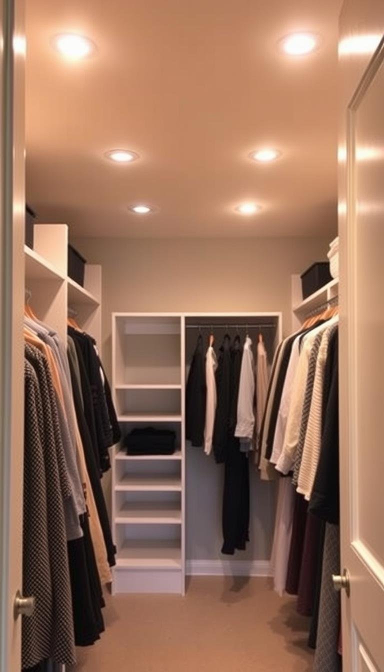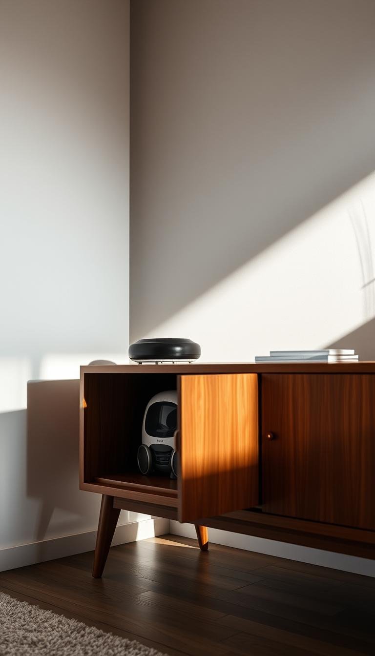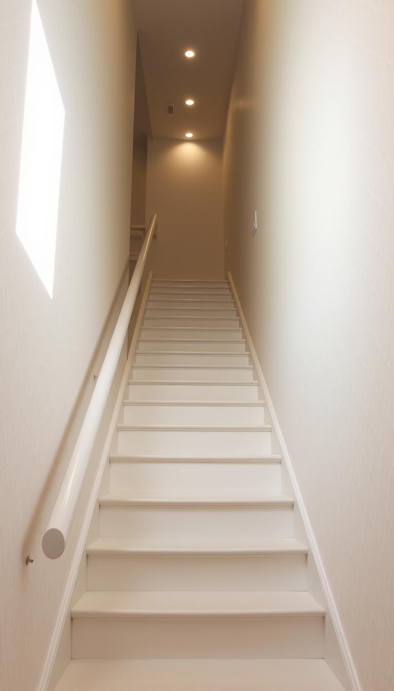
How can I make my staircase feel wider with paint alone?
I set a simple goal: use only color placement, finish, and continuity to shift how a narrow stair run reads. I treat the stair as a design driver for the whole home, choosing tones that boost reflected light and hide scuffs in high-traffic areas.
Off-white side walls, subtle vertical or diagonal stripes, and a bold end-wall pull the eye forward. These moves increase perceived space and cut the tunnel effect without changing structure.
I simplify outlines by matching skirting, trim, and doors to the walls so there are fewer hard lines. Mirrors or glazed panels opposite painted surfaces bounce light and amplify the bright effect. A single focal point steadies the view and makes the run look calm and open.
Key Takeaways
- Use high-reflectance palettes and subtle patterns to increase perceived space.
- Match trim and doors to walls to remove visual breaks.
- Paint an end wall as a focal point to draw the eye forward.
- Place mirrors or glass opposite bright walls to bounce light.
- Choose durable finishes where hands and feet touch to keep the look fresh.
My goal and plan: use paint to create the illusion of width
With selective color and continuity I turn an awkward stair run into a room that reads broader. I set a simple objective: by choosing tones, sheens, and placement, I’ll make the space feel wider on the stairs and through the hallway without altering structure.
Base choice: I choose a warm off-white on the walls because it reflects light and hides scuffs better than stark white. That choice helps the whole passage read as one brighter, more open zone.
Continuity and focal point: Matching trim and doors to the walls removes hard breaks, so edges don’t chop the view. Then I add one bold color at the end wall or landing to pull the eye forward and away from tight sides.

- Subtle shifts: light risers and slightly deeper treads clarify the profile without busy contrast.
- Sheen strategy: matte on walls, satin or semi-gloss on high-touch areas for durability.
- Coordinate the stair design with the adjacent hallway so the transition reads as a single, larger space.
Process note: I keep the work paint-first and weekend-friendly. My checkpoints—prime, paint, focal, finish—ensure each move supports light and width rather than adding clutter.
Prep that pays off in tight stairwells
A few precise prep steps make a narrow stair run read cleaner and more open. Proper prep reduces visual clutter and stops small flaws from stealing the effect of color and continuity.
Clean, fill, sand, and caulk for seamless lines
Deep clean walls, risers, treads, and trim so the finish bonds and does not telegraph dust or oils in this high-traffic zone.
- I fill nail holes and dings, sand smooth, and caulk seams to erase shadow lines that make the staircase look busier.
- I prime glossy or stained wood so topcoats lay flat and reflections stay even.
- I remove dark runners that visually chop the plane; clean, light surfaces help the space feel airier.
Choose durable trim and floor paints for heavy use
I pick washable, scuff-resistant wall paint and a tougher trim/tread coating so everyday traffic doesn’t dull the look.
“Durable finishes save time long-term; hard wax oil or a quality floor enamel is easier to refresh than brittle varnish.”

I protect hardware, stage tools on one landing, and work top-to-bottom so the floor and safety stay sound. Let each coat dry fully to avoid streaks that add unwanted lines in a tight visual field.
Light, off-white, and tonal palettes that bounce natural light
A soft off-white across a narrow run lifts natural light and hides traffic marks better than a clinical white. It brightens a dark hall while keeping the look warm and lived in.
Why off-white beats stark white in busy, high-traffic areas
Off-white reflects light without shouting glare. I choose a tone with a gentle undertone so scuffs do not read as loudly on walls. Testing swatches in morning and evening light shows which option lifts shadows on each stair and landing.
Color continuity across walls, trim, and doors to minimize visual breaks
Matching trim and doors to the same off-white creates continuous planes that visually stretch the hallway and staircase. Clear glazing and fanlights let natural light travel deeper into the circulation route.
- I repeat the wall color onto skirting to erase sharp edges and reduce visual noise.
- Use matte or eggshell on walls and satin on doors to balance reflection and cleaning needs.
- Consider a ceiling tint one shade lighter than the walls to boost overhead space.

How can I make my staircase feel wider with paint alone?
When the sides stay soft and the far wall hits a bold note, the eye travels forward and the hall breathes. This simple color strategy uses contrast and continuity to change how the space reads without new construction.

Quick checklist: color, contrast, sheen, and strategic focal points
Keep side walls pale so they visually push outward, and reserve a deeper hue on the end wall to act as a focal point.
- Light flanks: use off-white tones to amplify natural light and reduce glare.
- Unified trim: match trim and doors to the wall to erase busy outlines.
- Sheen: matte on walls, satin on rails and risers for durable reflection.
- Subtle runner: a painted center stripe widens the stair plane without sharp edges.
- Linear pattern: one set of vertical or diagonal stripes nudges the sides outward.
- Riser contrast: lighter risers and deeper treads improve step visibility and overall look.
- Mirror placement: place a minimal-frame mirror opposite the brightest wall to return light into the hallway.
- Step back after each coat to confirm the space still reads larger and tweak contrast as needed.
Painted stripes and linear patterns that expand space
A low-contrast stripe scheme nudges the eye sideways and lightens the corridor’s read.
Vertical and diagonal striping on walls to visually push sides outward
I favor gentle vertical or diagonal bands in off-white and a muted partner tone. These patterns lengthen perception and keep the side planes soft. Vary stripe widths slightly so the walls feel lively but never busy.
Herringbone or chevron effects on risers for depth without clutter
On stair risers I use a monochrome herringbone or chevron in soft grays. The motif adds depth and rhythm without stealing visual space. Keep borders minimal so the pattern flows and does not highlight the narrowest edges.
Tape techniques for crisp, clean lines
Measure, snap chalk lines, and apply delicate-surface tape for sharp results. I test a small run first, then seal edges if needed. Finish with a clear coat on risers to protect detail and keep the overall design calm.

Color drenching: one hue from baseboard to ceiling
Drenching a narrow run in a single hue blurs corners and lets the architecture read as one continuous plane. I use this when I want edges to vanish so the stair reads less interrupted and the overall space feels calmer.

When drenching works for narrow passages
Color drenching—covering walls, trim, doors, and ceiling in one tone—unifies planes so sightlines flow. In a well-lit hallway this trick can make the run appear endless rather than boxed in.
Choosing mid-tones or deep shades, and testing light
I prefer mid-tones for a softer result. Deep shades need strong layered light or they close a space down.
- I test a painted poster board across the wall to watch the hue change through the day.
- Keep sheen uniform so reflection shifts do not reintroduce lines.
- Match rails or choose near-matching tones to maintain the boundary-blurring effect.
- Tie the drenched stair color to nearby hallway tones for a connected style and design.
“One hue can quiet architecture and make a tight run read larger when lighting supports it.”
Sheen strategy: matte vs gloss to control light and width
A thoughtful sheen plan controls glare and boosts perceived depth on a narrow run. I use finish choices to steer attention, not to add visual clutter.
What I aim for: broad wall planes stay calm, while touchpoints catch and return light so steps read clearer and the route feels more open.
Selective gloss for edges and accents
I apply satin or semi-gloss on handrails, balusters, and risers so those elements reflect light and sharpen the stair profile. True high-gloss is reserved for small accents when natural light is limited.
Matte for broad areas
Matte or eggshell on walls absorbs glare and reduces visual chatter. That helps the sides visually recede and keeps the overall look calm.

- I select scuff-resistant, washable paints for high-touch areas in a high traffic staircase.
- I keep sheen transitions minimal so shiny lines do not break the visual plane.
- I test samples in place—stair lighting often shows flaws that a living room does not.
- I check handrail slip resistance when using a higher sheen; safety remains primary.
- I refresh glossy elements periodically to sustain their brightening effect.
“Balance reflectance: enough to spread light, not so much that the run looks patchy.”
Risers, treads, and trim: small painted changes, big spatial rewards
Small shifts on risers, treads, and trim yield a surprisingly roomy result on a narrow run. I focus on clarity and continuity so the flight reads lighter and safer.
Light risers, slightly deeper treads for lift
Light risers paired with slightly deeper treads improve step legibility and give the stair a lifted look.
I use stair risers one to two shades lighter than treads so each step reads clearly. Gentle contrast avoids hard lines that shrink the plane.
Match skirting and wall color to erase edge lines
Matching trim and skirting to the walls removes horizontal breaks. This lets the side view melt away and broadens perceived space.
- I keep tread contrast subtle; big value jumps create sharp outlines.
- Satin on treads gives cleanability and a soft glow; eggshell on risers avoids glare.
- Caulk trim-to-wall seams first to prevent shadow lines that clutter the stair.
| Element | Finish | Effect |
|---|---|---|
| Treads | Satin, gentle contrast | Durable, subtle reflectance for clearer steps |
| Risers | Eggshell, 1–2 shades lighter | Lifted profile and improved legibility |
| Trim & skirting | Match wall color | Edges disappear; side view widens |
| Landing | Coordinated tone | Smooth transition without a harsh break |

“Neat nosings and small touch-ups keep the bright, expansive effect working over time.”
Painted “runner” illusions for a wider look
A soft, pale middle stripe with feathered edges gives each tread a wider, more open profile. I use a lighter center panel and softened borders to read as a faux runner. This trick widens the visual plane without added materials.

Soft borders and lighter centers to widen the stair plane
I keep side margins balanced so the center strip reads intentional, not cramped. I avoid hard, dark lines that box the steps in. Instead, edges are blended to nudge the eye outward.
Coastal, pastel, and earthy schemes drawn from design sources
Coastal blues, soft pastels, or sand-and-forest pairings all work as runner stories. I pull tones from the adjacent floor and landing so the runner aligns with the wider palette and keeps the whole space coherent.
- Wrap the runner up the risers to hold the widened effect step to step.
- Use durable paint on the path and add a clear topcoat at wear points.
- Keep the interior of the runner simple — a solid or soft gradient keeps the look open.
“A painted runner broadens perception more than you expect — subtle edges are the key.”
| Element | Approach | Effect |
|---|---|---|
| Center panel | Lighter tone, soft edges | Expanded walking plane |
| Side margins | Muted, near-match tone | No boxed-in outlines |
| Risers | Continue center color | Consistent visual width |
| Finish | Durable topcoat | Wear resistance |
End-wall and door color tricks that redirect the eye
A richer hue on the far wall pulls focus forward so nearby planes read quieter and the whole hallway opens up. I place a deeper tone at one terminus to create a visual destination that distracts from narrow sides.
Choose a single focal point, then keep everything else calm.
Picking the end wall and door as magnets
I paint one end wall a deeper or brighter color so the eye aims at that point instead of lingering on the side walls. A bold interior door face creates a second point when approaching from the opposite direction, balancing the route.
- Keep side walls neutral and match skirting to walls so edges vanish.
- Test two shades deeper than the flanks for subtle drama, or pick navy, forest, or charcoal if lighting is strong.
- Use matte or eggshell on the focal wall to avoid glare and show less texture.
I adjust artificial light to softly wash the focal wall and prevent the sides from catching brighter highlights. Then I step back from entry, mid-stair, and landing to confirm the chosen color stretches the perceived space.

Mirrors, glass, and art: how I pair them with paint for maximum width
Reflections and glazing are my quickest tools to spread light and calm a tight run. Large mirrors opposite pale walls double the daylight and give the whole space more room to breathe.
I mount a slim, frameless mirror across from the brightest painted surface so the reflection feels like extra hallway. I keep frames minimal so nothing juts into the walking line. Where doors sit near the stair, I prefer clear or lightly frosted glazing to push natural light into deeper zones.
Where to place mirrors so painted walls reflect best
Opposite a bright wall: position the mirror across from your main light source to multiply glow.
Slim profiles: choose thin or frameless options to avoid bulk and maintain safe clearances near the handrail.
Gallery placement on one wall to avoid crowding
I build a small gallery on a single wall and leave the opposite side calm. Fewer, larger pieces in a coordinated palette add personality without enclosing the passage. Hang artworks on a steady centerline up the stair to guide the eye in a smooth, widening cadence.

| Element | Placement | Effect |
|---|---|---|
| Large mirror | Opposite bright wall | Doubles light; expands perceived space |
| Glazed door/panel | Transitional zones | Lets natural light travel; links hallway and landing |
| Gallery | One wall only | Adds style and art without crowding both sides |
| Lighting | Angled to graze mirrors | Maximizes glow; avoids hotspots |
“Fewer, larger pieces feel calmer and help the route read bigger.”
Troubleshooting: common small-space paint mistakes I avoid
When patterns are pared back and wires are hidden, the light and line do the widening work for you. Tight runs lose their impact when too many contrasts or heavy textures compete for attention.
Watch these pitfalls: dark rugs and bold borders outline edges and visually compress a hallway. Overused wallpaper or lots of mixed colors creates visual noise and cancels the calming effect of a single palette.
I keep furniture and storage to one wall in adjacent areas so the passage breathes. I also hide wires and remove small fixtures that snag the eye. For floors, I lay planks parallel to the longest dimension and avoid border patterns that highlight edges.
- I skip heavy borders on faux runners and avoid dark carpet runners that shorten the run.
- I limit wallpaper to an upper band or a single accent wall rather than both sides.
- I choose durable, washable coatings—quality finishes survive high traffic and keep the space looking fresh.
| Mistake | Fix |
|---|---|
| Busy borders or dark rugs | Light, simple center panels or painted runners |
| Wallpaper overload | Small doses or upper sections only |
| Cluttered hallway | One-side furniture; hide wires |
“Test small sections first; changes in high-traffic areas go smoothly when you iterate.”

Conclusion
Small, smart choices in tone and sheen deliver a big change in how a tight stair run reads.
I proved a practical way to widen a narrow hall: keep side walls pale, unify trim and doors, and place a single confident color at the end point. Use mirrors or clear glazing to return light and test riser and tread contrasts for safe legibility.
Skip dark runners and fussy borders, edit furniture to one side, and pick durable, quality coatings for wood and floor areas. A soft painted runner, a few pared-back patterns, and a couple of favorite art pieces finish the design so the whole home reads brighter and more like an open space.