What’s the best grout color for white subway tile in 2026?
I’ve helped many homeowners pick a final finish that holds up and looks intentional. My goal is to make this simple: match style, lighting, and upkeep before you commit.
White subway tile can read bright and open with light grout, but that pairing often needs extra sealing and regular cleaning to stay fresh. I’ll explain why light gray keeps a soft definition, why charcoal gives contrast without harsh flaws, and when warmer beiges suit wood or brass accents.
I recommend making mock-up boards and testing samples under your lights. Joint width and grout type matter: narrow joints favor unsanded mixes, wider gaps need sanded for durability. Later, I’ll share quick picks by room, maintenance tips, and a simple decision framework so your choice works and feels right.
Key Takeaways
- Pick a sample and view it under your room lighting before you commit.
- Light tones expand space but need more care; sealers help a lot.
- Gray shades offer subtle definition; charcoal adds refined contrast.
- Match warmer neutrals to wood and stone for cozy kitchens.
- Joint width guides grout type: unsanded for tight joints, sanded for wider ones.
Why grout color still makes or breaks white subway tile in 2026
A single grout decision shapes how your entire backsplash or shower feels, from airy to structured. I help you nail a practical, styled outcome without endless sample runs.
User intent and what I help you decide today
You want a white subway install that reads intentional, matches your style, and won’t become a maintenance headache. I clarify which tones widen space, which hide splashes, and which call attention to imperfections.
How this ultimate guide is structured for quick, confident choices
- I explain stakes: joint hue sets the visible grid and affects scale and brightness.
- I flag trends: softer contrasts—light gray and warm taupe—are the sweet spot in 2026.
- I map picks by room, design, and upkeep so you can skip to the right solution fast.
- I emphasize sampling under your lights and sealing wet areas to keep finishes durable.
“Mid-tone choices hide daily wear while keeping definition; very dark lines can draw the eye to tiny surface flaws.”

| Tone | Impact | Where I recommend it |
|---|---|---|
| Light (white/ivory) | Expands space, airy look | Small baths, spa kitchens |
| Mid (light gray, taupe) | Forgiving, hides splashes | Kitchens, busy showers |
| Dark (charcoal) | Structure without harshness | Accent walls, industrial design |
Next: I show how tone changes readability, maintenance needs, and pairing with fixtures so you can pick a confident, contractor-ready choice.
How grout color changes the look, feel, and performance of white subway tile
Place trial lines between a few tiles and watch how they read at noon and after dark. I want you to see how tone and joint width shape a finished run before you commit.
Seamless vs. defined: visibility of grout lines and pattern
White-on-white creates a near-continuous surface that expands space and softens the visible grid. Mid-tones and charcoal increase pattern readability and add rhythm to a wall.

Light, space, and undertones: reading white-on-white correctly
If your tiles lean warm, bright white can read icy. A warm light gray or soft ivory will sync undertones and keep the look cohesive.
Maintenance realities: stains, splashes, and everyday cleanup
White shows splashes and mildew faster in kitchens and bathrooms. Mid-tone grays and taupes hide daily marks better and cut upkeep.
“Seal lighter mixes in wet areas to limit staining and keep color integrity.”
| Joint width | Effect | Where I suggest it |
|---|---|---|
| 1/16 inch | Lines recede | Small baths, clean backsplashes |
| 1/8 inch | Pattern reads stronger | Kitchens, feature walls |
| Mid-tone grout | Hides stains | Busy rooms and showers |
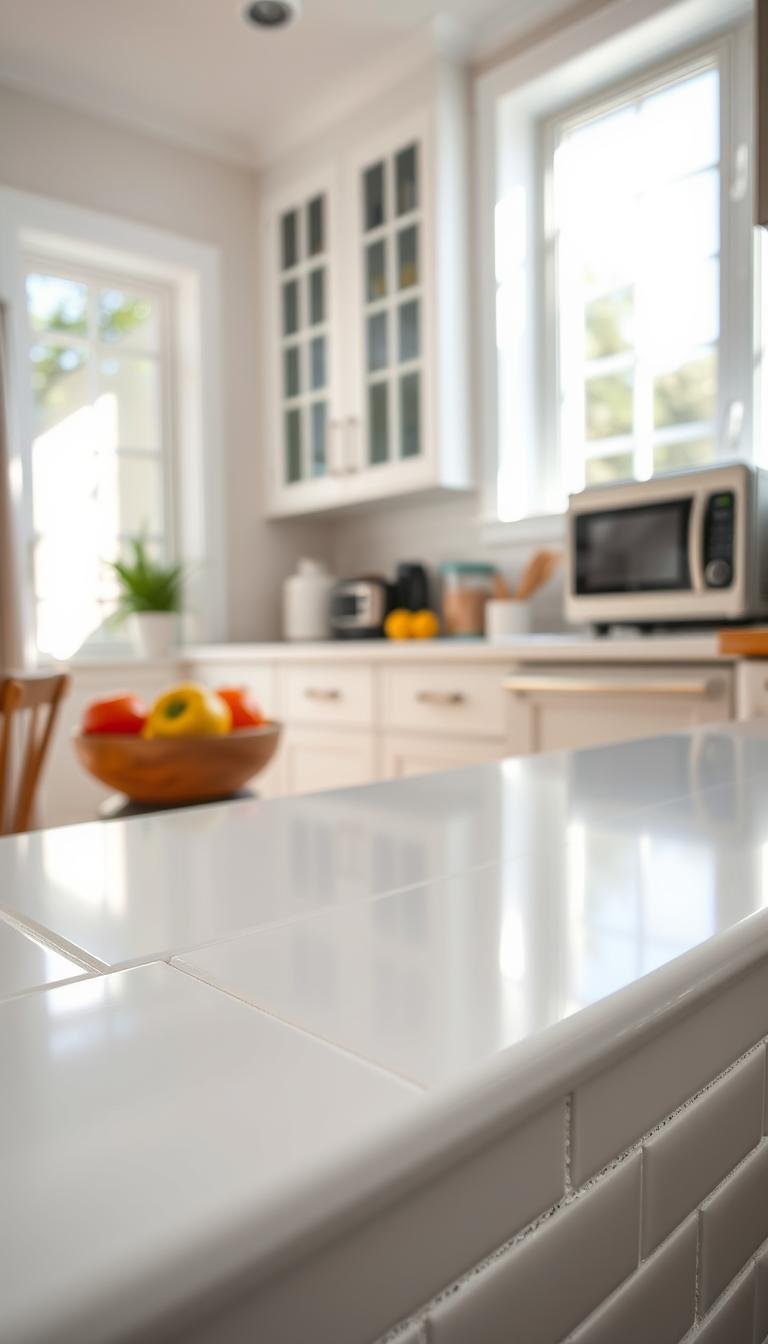
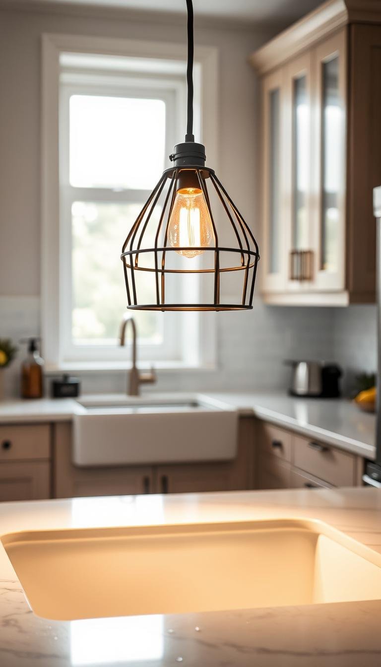
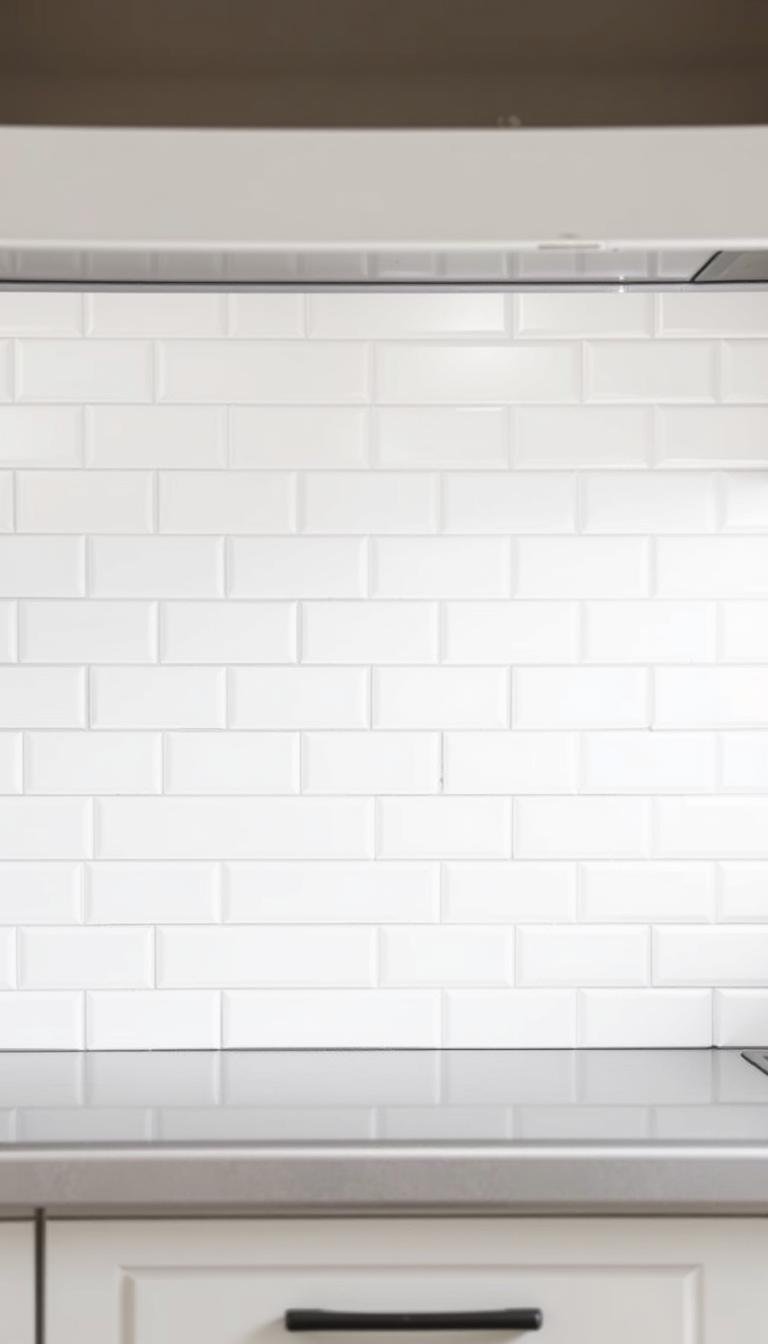
White grout with white subway tile: the clean, airy classic
I reach for bright white grout when I want a wall to read as one uninterrupted, airy plane. That effect opens tight rooms and makes a small bathroom or minimalist kitchen feel larger and more serene.

When I choose bright white vs. soft ivory
I pick bright white when fixtures and counters need to stand out. Narrow joints and glossy tiles will bounce light and keep the surface calm.
Soft ivory wins when tile or wood tones lean warm. It prevents an icy mismatch and keeps the palette cohesive as finishes age.
Pros, cons, and where it shines
- Pro: unmatched visual calm—counters and hardware take center stage.
- Con: true white shows splashes and mildew faster; plan for regular wipe-downs.
- Sealing is important in wet areas; it slows staining and preserves appearance.
- In showers, light gray gives nearly the same brightness with less visible buildup.
- I recommend tight joints (about 1/16 inch) and a mock-up board—white dries and can shift undertone.
“White grout delivers a seamless, larger-feel surface, but it demands a clear maintenance plan.”
Pair this approach with Shaker cabinetry or marble-look counters for a timeless, spa-like look. Expect periodic resealing and more frequent cleaning if you cook or steam often.
Light gray grout: subtle definition without visual clutter
Light gray draws a soft boundary that reads intentional without shouting contrast. It gives a gentle outline that keeps a run of white-looking tile coherent and calm.

- It supports clean lines and a soft, approachable style.
- Mid-tones hide everyday marks better than pure white, so kitchens and showers look fresher longer.
- It pairs naturally with stainless finishes, marble veining, and warm wood.
I favor 1/16-inch joints with this tone to keep lines understated while preserving pattern. Light grays can dry slightly cooler, so build a mock-up board and watch a 24-hour sample before committing.
“Seal light mixes in wet areas to lock color and cut water absorption.”
Quick note: This approach scales from small powder rooms to full backsplashes without overwhelming a space, giving you a soft, structured look that stays practical.
Medium to dark gray and charcoal grout: crisp structure and depth
Medium to dark grays bring a measured backbone to a wall, giving pattern and presence without shouting. I place these tones as a sweet spot: they add depth and structure but avoid the trap of pure black, which can emphasize tiny surface flaws and crazing.

Charcoal over black keeps contrast while softening harsh edges. Pros often pick charcoal because true black pulls attention to minor imperfections. Mid to dark gray also masks everyday splashes better than a pale mix.
Pairing with fixtures and finishes
This palette pairs beautifully with matte black faucets, black-framed shower glass, and steel accents for an industrial-leaning style. Satin or matte tiles reduce glare and let the lines read sophisticated instead of stark.
“With strong contrast, layout precision matters—ask your installer for clean, consistent lines.”
- I suggest 1/8-inch joints when you want the grid to read intentionally, or 1/16-inch for a refined pattern.
- Test at least two charcoal shades; they can dry lighter and a touch of warmth prevents a cold look.
- Seal even darker mixes to stabilize color and make cleaning easier near ranges and sinks.
Black grout: bold contrast and a grid-forward aesthetic

I treat black grout as a deliberate, graphic choice that makes a field of white tiles read like a bold grid. It turns a passive surface into a focal pattern and gives a modern, structured look.
Practical upside: dark joints hide stains and discoloration well in busy kitchens and mudrooms, so upkeep feels easier.
I also warn clients that heavy contrast can draw attention to crazing, tiny chips, or imperfect alignments. If that concern matters, I suggest charcoal as a softer option that keeps depth without the same risk.
- I favor black on accent walls, dining nooks, or open-shelf kitchens where the grid should be the star.
- Pair with matte black hardware or dark counters to keep the narrative cohesive.
- Ask for tight, consistent joints—sloppy lines become obvious with this much contrast.
“Do a mock-up. Scale and sheen change how the pattern reads in your room.”
| Feature | Benefit | Where I use it |
|---|---|---|
| High contrast | Makes pattern pop and defines layout | Accent walls, open shelving |
| Stain concealment | Practical in busy zones | Kitchens, laundry rooms |
| Risk | Emphasizes flaws and crazing | Consider charcoal alternative |
| Finish tips | Satin tiles soften graphic look; seal to stabilize pigment | Any wet area |
Long-term note: a bold grid can limit future style shifts. Confirm you love this look before you commit wall-wide.
Beige, taupe, and warm neutrals: softening the starkness
Warm neutrals gently pull a room together, marrying wood shelving and butcher-block counters with minimal fuss.

I favor beige, taupe, and warm gray mixes when a cozy, lived-in atmosphere matters as much as a clean look. These tones warm up white runs and link to wood or stone without shouting contrast.
Farmhouse, traditional, and wood-forward kitchens
In farmhouse or classic kitchens, mid-tone joints provide gentle definition. They outline tiles enough to read a grid while letting shaker fronts and marble counters take center stage.
Practical notes: mid-tones hide daily wear better than bright mixes. Satin or honed surfaces help this palette read calm and organic, not glossy.
- I recommend testing warmth—taupe that leans cool can clash with oak or walnut.
- Use 1/16-inch joints for subtlety, or 1/8-inch to add pattern without high contrast.
- Seal light warm tones near sinks and ranges to avoid uneven darkening.
These hues age well. Update hardware or paint later and the overall style still reads cohesive and timeless.
Blue grout for white subway tile: midnight, charcoal, and coastal tones
A midnight navy joint adds a tailored, editorial edge without feeling gimmicky. I use this option when I want refined contrast that reads rich and nuanced rather than stark.

When a refined navy reads better than jet black
Midnight and charcoal-blue shades work beautifully in high-end baths, creative kitchens, and feature walls. They frame tiles with personality while keeping a polished look.
Cool navies pair best with crisp whites and brushed nickel. A slightly inky charcoal blue can warm up off-white tiles and avoid a cold mismatch.
- Use: accent walls, fireplace surrounds, and small feature runs.
- Design tip: keep joint widths steady so the pattern feels intentional, not jittery.
- Practice: build a mock-up board — blue mixes often dry lighter or cooler than they look wet.
- Care: seal in steamy baths and behind cooktops to stabilize tone and ease cleaning.
“Navy lines give strong contrast but read more refined and less stark than jet black.”
What’s the best grout color for white subway tile in 2026?
Before you commit, I give quick, room-specific answers so you can choose confidently.

My short answers by space
Kitchens/backsplashes: I pick soft light gray or warm taupe. Mid-tones hide splashes and stain better than bright mixes, especially behind ranges.
Bathrooms/showers: Light gray keeps walls bright while easing upkeep. Seal in wet zones to guard against mildew and color shift.
Accent wall/fireplace: I lean high-contrast — charcoal, black, or navy — when you want a deliberate, photographed feature.
My short answers by style
Modern/industrial: Charcoal or deep gray pairs with matte black fixtures for crisp lines.
Traditional: Light gray or beige supports marble and shaker details without stealing focus.
Farmhouse: Warm taupe, beige, or a whisper of blue ties to wood and brass while staying cozy.
My short answers by maintenance level
- Low upkeep: Mid-tone gray or taupe—conceals wear and needs less cleaning.
- High-aesthetic, higher-maintenance: Bright white or true black—striking results that demand regular care.
Right grout is the one that matches your light, finishes, and tolerance for upkeep. Sample two options, watch them dry in your room, then seal your choice.
Room-by-room picks: kitchens, showers, and feature walls
Room function should steer your joint hue: kitchens need forgiving tones while baths benefit from brightness. I guide you through practical choices so each space looks intentional and cleans easily.

Kitchen backsplashes: forgiving mid-tones that hide splashes
I default to soft gray or warm taupe for a kitchen backsplash. These tones outline tiles gently and keep splashes from screaming for attention.
- I recommend 1/16-inch joints for a smooth, refined look.
- Use 1/8-inch if you want the layout to read more behind open shelves.
- For heavy-use cook zones, nudge toward a slightly darker mid-tone to mask stains near ranges.
Showers and bath walls: light, bright, and well-sealed
In bathrooms I choose white or light gray to keep walls bright and spa-like. Glossy tiles amplify light and make small rooms feel larger.
Seal early and often: a good sealer prevents mildew and color shift in steamy areas. Light tones need more frequent wipe-downs but reward you with a fresh look.
Fireplace surrounds and accent walls: go high-contrast
For feature walls I go bold—charcoal, black, or navy give expressive depth and turn grout lines into a design asset. High-contrast lines demand precise installation; straight, even joints are non-negotiable.
“Mock up joint width and shade together so you can preview how strong those lines will feel in each room.”
My final tip: always build a small mock-up and watch samples dry under your light. That preview will confirm whether the tone, joint width, and upkeep match your lifestyle.
Style matching: modern, traditional, farmhouse, and transitional looks
I look at each finish—cabinet faces, metals, and wood—to pick a joint tone that feels cohesive rather than accidental.
Modern and industrial: structure, symmetry, and darker tones
For a crisp, architectural design I choose charcoal, deep gray, or near-black. These shades outline each tile and reinforce symmetry without adding shine.
I coordinate with slab-front cabinets, black-framed glass, and brushed steel so the entire style reads deliberate. Strong contrast asks for precise installation; straight lines matter.
Classic and traditional: light gray that supports marble and shaker
Light gray keeps the look elegant and calm. It complements marble veining and shaker profiles while letting millwork and counters stay central.
I avoid stark contrast here so the pattern reads soft and the room feels timeless. This choice elevates a classic palette without competing with it.
Farmhouse and rustic: warm neutrals that tie to wood and brass
Warm taupe, beige, or warm gray blend white runs with wood shelves and brass hardware. These tones connect textures and make tiles feel like a quiet backdrop rather than a headline.
I use grout as a subtle link between finishes so the overall aesthetic stays cozy and lived-in.
Transitional: the mid-tone chameleon
For mixed finishes I often land on mid-tone gray. It pairs with modern fixtures and classic millwork, so future changes to paint or hardware remain easy.

“Test undertones and view samples with your exact finishes; small shifts in tone change the whole look.”
Testing before you commit: samples, mock-up boards, and lighting
Start with a small, practical mock-up so you can judge tone and scale in your actual room. A simple board saves hours of doubt and prevents costly surprises.
Build a sample board and watch it in changing light
I set three tiles on a scrap board and grout each joint with a different shade. Place that board near counters and fixtures so you see how finishes play together.

View your board morning, mid-day, and under evening lamps. Natural and artificial light will push undertones in different ways and draw attention to certain details.
Grout dries lighter: timing your color read correctly
Grout often looks darker when wet and eases up as it cures. Wait at least 24 hours before you judge the final color and note if grays pull cooler or beiges warm up.
“A sealed swatch can deepen tone — test sealed and unsealed patches to compare the effect.”
- I test joint widths so I can preview how bold the lines will read at a distance.
- I include a cool gray, a warm gray, and a taupe to cover likely shifts in undertone.
- I photograph samples in-situ to see how cameras render your chosen palette.
Bottom line: building and living with a small mock-up is the surest way to avoid mistakes. It helps you choose a grout that fits your tiles, your light, and how you want the finished look to read.
Grout lines and material choices: width, sanded vs. unsanded, and sealing
The right joint and mix can make tiles read like one surface or a deliberate grid with character. I focus on three practical choices that shape both look and long-term performance.

Joint width: why 1/16 vs. 1/8 inch changes the visual balance
1/16-inch joints keep grout lines minimal on standard 3×6 subway tile and give a smooth, continuous read across a wall. That helps small rooms feel larger.
1/8-inch joints add presence and make pattern more readable at a distance. Wider gaps amplify contrast colors, so they change the room’s visual balance.
Sanded vs. unsanded: durability, delicate tiles, and vertical installs
I use sanded mixes for joints wider than 1/8 inch to resist cracking and shrinkage in high-use areas. For narrow joints, vertical backsplashes, or polished surfaces I choose unsanded to avoid scratches and to give a cleaner finish.
Pro tip: always check manufacturer guidance for your specific tiles before picking a product.
Sealants that protect color and reduce staining
Sealing is essential in kitchens and bathrooms to protect color, resist stains, and simplify cleaning. A sealer can subtly deepen tone, so test a sealed swatch if precise color matters to your design.
“Reseal based on exposure—steamy showers and cook zones need more frequent attention.”
| Joint | Use | Why |
|---|---|---|
| 1/16″ | Typical 3×6 runs | Minimal lines, seamless look |
| 1/8″ | Kitchens, feature walls | Stronger pattern, hides wear |
| Sanded vs. unsanded | Wide vs. narrow joints | Durability vs. delicate finish |
Bottom line: choosing the right grout type and joint width matters as much as shade. Precise, consistent joints elevate the overall pattern and final effect—so plan samples and confirm installer technique.
2026 design signals: where grout color trends are heading
I see a clear move toward softer, livable contrasts that feel intentional and calm. Mid and light grays are winning in everyday rooms because they balance form and function.
Softer contrasts and charcoal over true black
Charcoal offers structure without magnifying tiny flaws. I prefer it to jet black when a refined, forgiving finish matters.
Intentional color pops in small doses
Designers lean into restrained accents—midnight blue lines on a feature run add drama without overwhelm.
- Mid-tones rule for daily use; they hide wear and cut upkeep.
- Warm neutrals pair well with wood and brass to create cozy cohesion.
- Matte or satin surfaces reduce glare and support subtle contrast.
- Always sample trend-driven mixes and seal wet areas to lock tone.

| Finish pairing | Suggested shade | Why |
|---|---|---|
| Brass hardware | Warm gray / taupe | Warms overall palette |
| Chrome or steel | Cool light gray | Keeps look crisp |
| Accent wall | Midnight blue or charcoal | High impact in small doses |
“Trend-right grout choices now favor comfort, coherence, and longevity over shock value.”
Avoid these common grout mistakes with white subway tile
Small missteps on shade and joint width can turn an intentional run of tile into a distracting grid. I see the same missteps often, and they are preventable with a few simple checks.
My quick checklist:
- Don’t skip mock-ups — test samples under your room light before you commit.
- Avoid true black if tiles show crazing or slight lippage; charcoal gives depth without drawing excess attention.
- Match undertones. A cool mix on warm tiles can make the whole look feel off.
- Seal in both kitchen and bathroom areas to protect pigment and fight stains and mildew.
- Use unsanded on glass or polished stone; sanded mixes can scratch delicate surfaces.
- Keep joint width tight for subtle lines; wider gaps magnify the pattern and color effect.
- Judge color after curing — wet grout darkens then lightens and may shift toward cool or warm tones.
- High-contrast choices demand perfect layout; uneven spacing or crooked lines call attention to flaws.
- Coordinate grout choices with counters, metals, and wood so the entire palette feels intentional. For more context on selecting wisely, see my recommended grout choices.
Pro tip: build a small mock-up board and live with it for a day — that beats an expensive redo later.

My quick decision framework: pick your grout color with confidence
Begin by noting undertones in your tiles and nearby finishes—this single check avoids many mismatches. I use three quick filters to narrow a confident, contractor-ready choice: undertone, light, and maintenance. Follow them in order and you cut indecision fast.
Start with undertones, then light, then maintenance
Step 1: Undertones. Decide if your tiles and finishes read warm or cool. Pick a grout color that harmonizes rather than fights that baseline.
Step 2: Light. Small or dim spaces benefit from lighter tones. Bright rooms can carry deeper shades without feeling heavy.
Step 3: Maintenance. Mid-tones lower upkeep and hide daily marks. Choose white only if you accept more frequent cleaning.
Match, complement, or contrast: a three-path shortcut
Path A — Match: Use a similar grout to create a seamless field and make the room feel larger. Subtle lines minimize pattern visibility.
Path B — Complement: Pick warm neutrals or soft grays to tie wood, stone, and metals together. This way warms and coheres finishes.
Path C — Contrast: Choose charcoal, black, or navy to define the pattern and add architectural clarity. High contrast demands precise joints.
Practical wrap-up: opt for 1/16-inch joints for subtlety, 1/8-inch for stronger lines. Build a small sample board, evaluate after 24 hours of drying, then seal as recommended for your room. That simple process will help you land the right grout and a final look you can live with every day.

Conclusion
I’ll close by reminding you that shade choice should serve light, finishes, and daily life — not a trend sheet.
There’s no universal answer. My advice: match undertones first, then pick a hue that fits your style and upkeep tolerance. White creates a seamless, airy field but asks for more maintenance and sealing.
Mid-tone grays and warm taupes are forgiving and age well. Charcoal gives structure and drama with fewer pitfalls than pure black. Beige or taupe ties wood, brass, and traditional details into a cohesive design.
Midnight blue can be a refined accent on a single run. Whatever you choose, sample in your light, judge after curing, set the correct joint width, and seal to protect your investment.
Done right, your grout choice elevates a run of subway tiles from standard to standout and keeps that appearance for years.