What Are the Top Trends in Eclectic Mix-and-Match Decor for 2026?
I’m tracking a clear shift in how people shape rooms. Designers are moving away from flat, all-white schemes and toward layered, atmospheric spaces that feel lived in and personal.
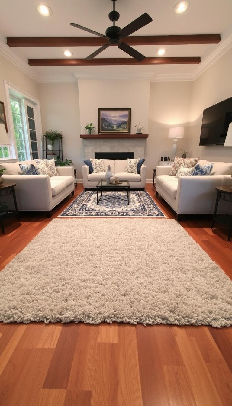
I see deep greens, inky blues, and soft taupes replacing bland neutrals. Materials get richer: limewash walls, stone surfaces, and textured fabrics like slub linen and matte chenille add warmth and depth.
Maximalism returns with restraint. Instead of oversized fixtures, lighting scales down to human size. Mixed woods and varied metals create a gathered, collected look that feels intentional, not cluttered.
Plaster, fluting, and wallpapers bring craft to walls and ceilings. Small-scale furniture and thoughtful lighting make rooms work for daily life, not just photos.
Key Takeaways
- Richer palettes and layered materials are replacing bland neutrals.
- Refined maximalism pairs bold color with careful restraint.
- Crafted walls, ceilings, and mixed woods add depth and warmth.
- Smaller, human-scale lighting supports daily life and architecture.
- Textured textiles and stone surfaces create mood without clutter.
How I See the 2026 Eclectic Landscape: Layered, Personal, and Confident
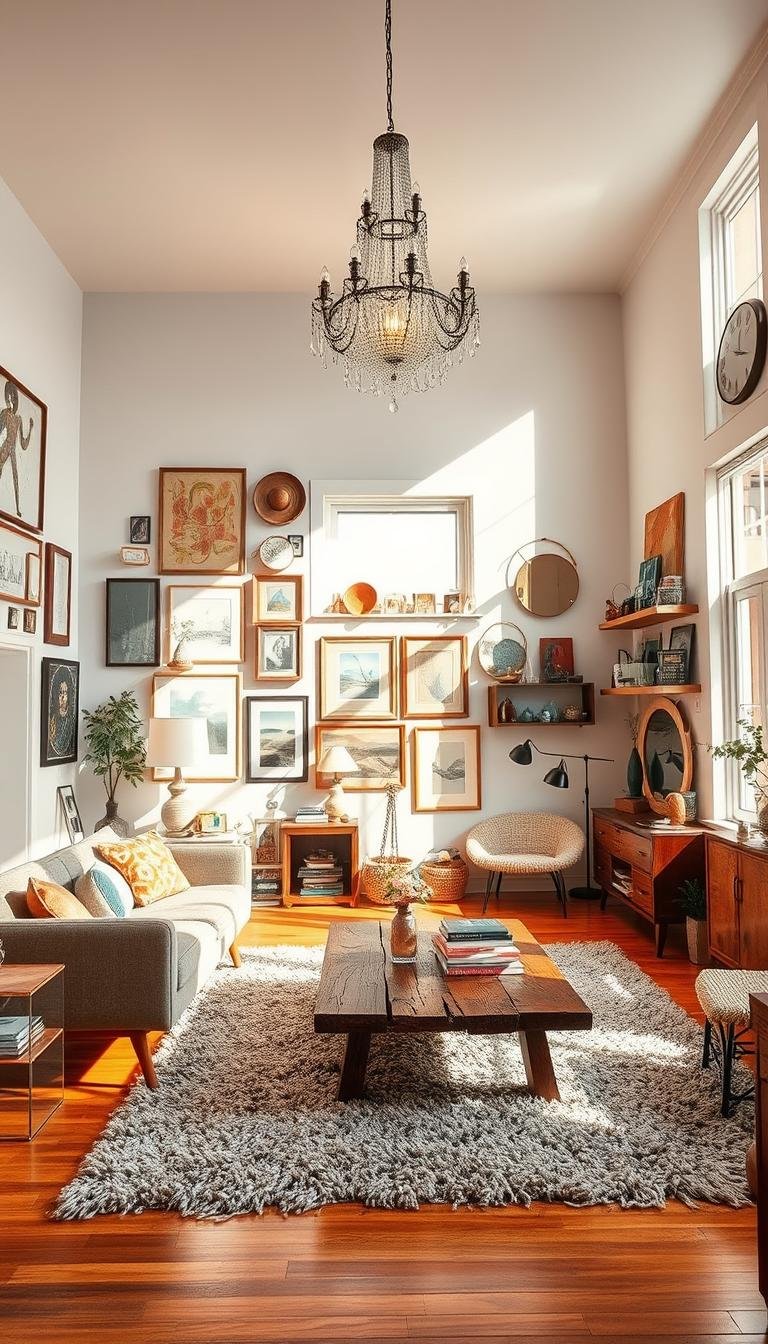
I’ve noticed clients choosing rooms that feel collected and calm, not catalog-perfect. I define this approach as a layered method where each space shows personality through a thoughtful blend of styles, textures, and eras.
Over years of projects I watch people curate designs slowly. Travel, heirlooms, and everyday finds guide what gets added. That slow accretion beats one-note schemes.
Restraint matters. Confident rooms favor fewer, better pieces and clear sightlines. Mixing clean-lined and classic silhouettes creates a timeless, grounded feel.
This direction pushes flexible spaces. Dining rooms become multi-use hubs for work, play, and daily life. I encourage a calm base—natural textures or soft neutrals—so expressive layers never overwhelm.
I suggest small rituals: collect one artwork at a time, rotate textiles, keep edited groupings. Watch for common pitfalls like too many smalls or clashing scale; I’ll show fixes in upcoming sections.

- Design slowly, let life inform choices.
- Design with restraint to keep rooms readable.
- Design for how people actually live in a space.
Color Gets Warmer and Deeper: From Millennial Gray to Saturated Sophistication
Rooms are shifting from washed-out neutrals to saturated hues that feel intentional and warm. I’ve noticed clients request richer choices—deep greens, inky blues, and earthy taupes—so the whole interior reads like a well-curated collection rather than a showroom.
Richer palettes: deep greens, inky blues, taupes, and earthy neutrals
Richer colors set mood fast. A single wall move from cool gray to a warm taupe can change perceived scale and soften light. I often recommend one dominant color, one supporting neutral, and two accents to repeat in textiles and art.
Limewash and natural stone tones for depth without stark whites
Limewash on walls adds quiet movement and a lived-in sheen that matte paint can’t mimic. Natural stone tones—tables, trays, and lamps—pair with saturated paint to ground a room.

“Shift one tone and the entire room will feel edited, intentional, and warmer.”
- Finish matters: matte softens, satin catches day-to-day light differently.
- Use ceilings, trim, or interior doors for high impact without repainting every wall.
- Test with sample boards and daylight checks before committing.
For more color inspiration and combinations I watch, see a helpful dispatch on designer-predicted palettes: designer color combinations.
Maximalism with Restraint: Mixing Patterns, Textures, and Global Influences
I favor bold layers that read curated, not chaotic, across every room I touch. Maximalism returns with editing: dramatic wallpapers or murals meet geometric throws and solitary floral accents so a space feels expressive but calm.
Pattern-on-pattern done right: pair a large-scale wall mural with smaller geometric cushions. Use one repeating color to link the family of patterns. Big motifs belong on walls; small repeats work best on pillows and stools.
Pattern play and placement
I balance strong prints with solids to let the eye rest. Entryways and powder rooms are where I go bold; circulation paths stay restrained so movement feels natural.
Texture story
Bouclé gives way to brushed wool, slub linen, and matte chenille for richer handfeel. These materials add depth without bulk and age well with daily living.
Global layers for soul
Suzanis, Indian block prints, and Moroccan rugs add provenance and warmth. I layer them sparingly to avoid a themed look and to preserve cultural integrity.

| Element | Where I Use It | Why It Works |
|---|---|---|
| Wall mural | Dining niche, powder room | Creates instant focal point and mood |
| Small geometric prints | Pillows, ottomans | Ties patterns together without overwhelming |
| Brushed wool / matte chenille | Sofas, throws | Richer texture, durable for daily living |
| Global textiles | Rugs, bed throws | Adds story and layered color |
- Palette plan: pick one dominant tone, two anchors, and an accent color.
- Step-by-step: start with a wall or rug, add medium-scale pieces, finish with smalls.
- Care notes: rotate rugs, vacuum with gentle attachments, spot-clean linens per label.
Vintage and Antique Comebacks That Anchor Eclectic Rooms
Mahogany and walnut are reappearing as the backbone of layered, modern interiors. Brown casework brings weight and warmth that contemporary upholstery often lacks. I use a single brown chest or table to ground a lively mix of textiles and lighting.
Mixing periods keeps things fresh: a Louis-style commode next to a mid-century lamp reads intentional, not staged. Scale matters—match leg heights and sightlines so legacy pieces feel part of the same conversation.

Asian antiquities and practical drama
Ming-style legs, Coromandel lacquer panels, and folding screens act as sculptural anchors. I use screens for zoning in open-plan layouts and to add depth without new walls.
Entertaining accents and British collecting
Depression-era glassware and sterling-collared match strikers make a simple bar vignette sing. A British-inspired shelf—edited, rhythmic, and cozy—gives a room instant character.
- Sourcing: estate sales, trusted dealers, vetted online marketplaces.
- Condition vs. patina: keep original finish when it reads honest; restore structurally compromised pieces.
- Care: gentle cleaning, wax touch-ups, and scale checks so finds age well in your home.
Craft, Character, and Architectural Detail Take Center Stage
A simple wall treatment can change a room from anonymous to thoroughly owned and lived in. I now recommend plaster finishes, fluting, and applied moldings to add immediate gravitas to interiors.

Goodbye flat drywall: plaster, fluting, and dimensional wall treatments
Plaster and fluting introduce shadow and movement where paint felt flat. Wallpaper or a mural can read like art and anchor an entire design.
Ceiling treatments, paneling, and crown molding return with flair
Ceilings act as a fifth surface: beams, coffers, or a wash of color transform rooms without changing footprint. Paneling and crown molding sharpen transitions and lend tailored details.
| Treatment | Best Use | Budget |
|---|---|---|
| Hand-applied plaster | Living rooms, entry halls | Mid–high |
| Fluted panels | Bedrooms, feature walls | Mid |
| Coffered ceiling | Dining or study | High |
| Limewash | Historic feels, stone accents | Low–mid |
- Materials roadmap: choose limewash for subtle texture, paper for pattern, and millwork for lasting structure.
- Sequencing: finish carpentry before paint; coordinate electrical and trim early to avoid rework.
- Care: use scrubbable finishes where kids live; spot-test plaster cleaning methods.
“Thoughtful details lift interiors from generic to genuinely lived in.”
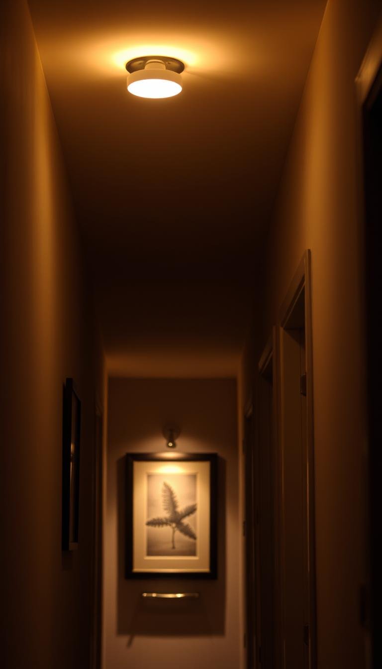
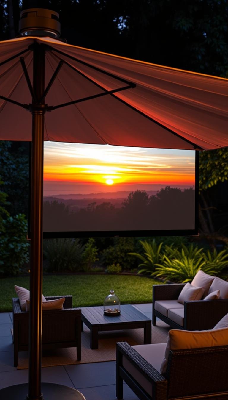
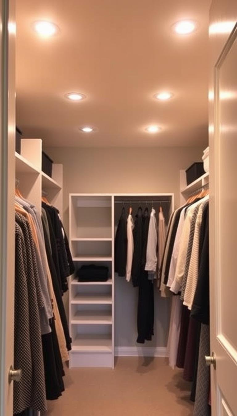
Lighting Trends: Smaller, Smarter Statements That Support the Space
I’m favoring smaller fixtures that honor a room’s bones rather than steal the spotlight. In my work, lighting now emphasizes proportion and placement so architecture and materials read clearly.
Layered lighting wins: ambient, task, and accent sources combine so every room functions day and night. I use dimmers and warm bulb temperatures to tune mood and color rendering across surfaces.
Scale rules of thumb help. Hang pendants at clear sightlines, keep chandeliers proportional to table length, and choose petite fixtures for nooks so the overall look stays balanced.

Practical choices I recommend
- Placement: let architecture guide fixture height and spacing.
- Metals: mix finishes subtly so elements relate without matching exactly.
- Controls: smart scenes for dinner, work, and movie time make lighting useful.
- Shades & diffusers: soft materials reduce glare and produce flattering light.
- Maintenance: keep glass clean and update dimmers to preserve crisp performance.
“Refined proportion and layered control let light support a room instead of shouting at it.”
| Focus | Application | Quick Benefit |
|---|---|---|
| Scaled pendants | Over islands, bedside | Keeps sightlines open |
| Layering | Living areas, kitchen | Function + atmosphere |
| Mixed metals | Fixtures, hardware | Visual cohesion without matchiness |
Historic Textiles, Gilded Touches, and Skirted Tables Add Soft Power
I’ve begun layering heirloom textiles with contemporary upholstery to give rooms a lived-in but edited feel. Small, curated touches bring warmth without clutter.

Needlepoint, quilts, and Aubusson-inspired layers
I fold needlepoint pillows and quilts over modern sofas and beds to add story and softness. Use one historic piece as a focal, then repeat its palette in small throws.
Gilded accents in moderation
One mirror, a small chandelier, or a brass tray adds sparkle. Keep gilded accessories edited so the room reads intentional, not ornate.
Skirted tables reimagined
Skirts in couture-level fabrics lend concealed storage and visual softness. Choose fabrics by weight and drape—linen for casual rooms, silk blends for formal nooks. Place a skirted round in an entry, beside a sofa, or as a bedside table for immediate impact.
- Pairing rule: historic textile with a clean-lined piece; patterned pillow on a streamlined chair.
- Care: vacuum low, spot-clean per label to keep layers lively in a busy home.
- Quick checklist: limit gilded items, mix matte and sheen textures, and let one narrative thread tie the vignette together.
What Are the Top Trends in Eclectic Mix-and-Match Decor for 2026?
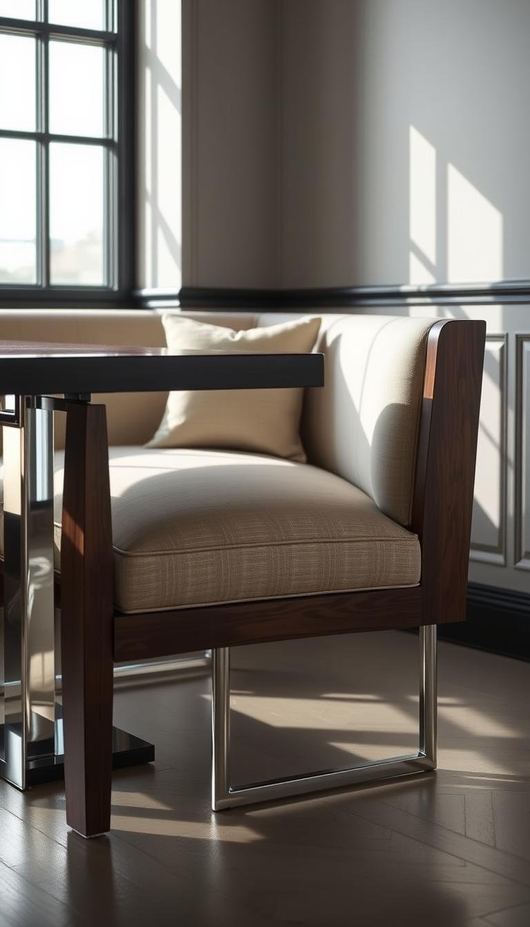
I favor pairing a sleek modern table with well-worn vintage chairs to make a dining area feel collected rather than staged. This simple swap updates a room fast and keeps comfort and scale front of mind.
Unique doors and antique hardware act like instant provenance. An ornate entry or a salvaged latch gives new build rooms immediate history and offers a talking point that outperforms generic fittings.
How to combine furniture and pieces
Pair one contemporary table with mismatched chairs to create rhythm. Keep seat height and comfort consistent so oddball pieces work together ergonomically.
Metals and materials that add warmth
Use a three-tone metal palette: brass, copper, and aged bronze. Repeating those finishes across lighting, pulls, and small accents ties varied materials into a cohesive look.
Balancing mixed woods and unifying details
Mixing wood tones gives layered warmth; avoid clashing undertones by echoing a single hue in textiles or small casegoods. I often repeat one paint or fabric color to unify diverse pieces.

| Room | Application | Quick tip |
|---|---|---|
| Kitchen | Vintage pulls on new cabinetry | Match screw spacing for simple install |
| Entry | Antique door or restored hardware | Seal finishes to protect patina |
| Living | Layered metals on lamps and trays | Limit one bright metal per vignette |
“A single heirloom detail can make modern interiors feel rooted and real.”
- Sourcing: look to architectural salvage, specialist dealers, and local metal fabricators.
- Care: polish selectively; let some patina evolve to keep character alive.
- Quick audit: remove duplicates, test scale, and repeat one color or texture to unify your interiors.
Materiality and Wood: Moving Beyond Matchy-Matchy to Layered Warmth
I’ve begun leaning on mixed wood pairings to give rooms a quietly collected soul. Using different species and finishes adds warmth and dimension that one uniform surface can’t achieve.
Try walnut with oak or mahogany with painted casepieces to balance richness and light. I recommend open-grain, wire-brushed, or hand-rubbed finishes; they sit well with saturated colors and natural textiles.
Do a simple undertone check: hold samples together in daylight. If the undertones read warm or cool in unison, they will read cohesive rather than clashy.
Durability matters. Choose harder woods for kitchens and high-traffic areas, and reserve softer veneers for low-use rooms. I note maintenance differences and pick finishes that fit daily life.
Echo primary tones in frames, small furniture, or trim for subtle repetition. A mixed-wood coffee table or sideboard is a small, high-return change that shifts how a home feels.
“Good joinery and honest materials make eclectic choices feel intentional.”

| Pairing | Best Use | Why It Works |
|---|---|---|
| Walnut + Oak | Living rooms, tables | Contrast of depth and warmth without heavy weight |
| Mahogany + Painted Finish | Entry, cabinetry | Anchors a room while painted pieces add light |
| Open-grain Finish | High-touch furniture | Tactile surface that wears gracefully |
- Start with one anchor piece in darker wood.
- Add a mid-tone item and a painted or light element.
- Repeat a small accent (frame or trim) to tie them together.
Conclusion
I’ve watched a warmer palette and careful layering give each space a clear personality. Color, texture, and crafted walls work together so a room reads lived in and intentional.
Start small: pick one area, test paint samples, swap an oversized pendant for a smaller fixture, or add a vintage side table and unique hardware to see change fast.
Designers and interior designers are converging on refined lighting, layered wood, and curated vintage as go-to elements. Let furniture and treasured pieces lead; use accessories and textiles to stitch the story.
Trends are tools, not rules. Take time, edit often, and enjoy how your home grows more personal over years.