How Can I Use Symmetry and Asymmetry in Room Layouts?
I start by naming what each approach gives a room. Symmetry offers calm, clear order through mirrored pieces. Asymmetry brings motion and personality so a place feels lived in, not staged.
My eye seeks harmony and surprise at once. I pick a focal point—like a fireplace, bed, or table—to anchor the layout. From there I balance scale, color, texture, and placement so the room reads as intentional.
I rely on radial moments around round tables or chandeliers to pull a scheme together. Odd-number groupings (3-5-7) and the rule of thirds keep things lively without clutter.
Along the way I flag common traps: mirror-image setups that feel stiff, or chaotic mixes that feel noisy. I’ll show simple fixes and step-by-step moves you can apply to living rooms, dining areas, kitchens, and entries.
For a deeper look at asymmetrical strategies, I link to a helpful guide on asymmetrical balance.
Key Takeaways
- Symmetry creates calm; asymmetry adds energy and character.
- Start with a clear focal point to organize the layout.
- Use scale, texture, and color to distribute visual weight.
- Odd-number groupings and thirds prevent monotony.
- Layer materials for emotional depth beyond placement.
Balancing a Room in the Present: Why My Eye Craves Order and Energy
Right now I design to balance calm with a spark of vitality so a space feels both secure and alive. My eye looks for a clear sense of stability, then I introduce a touch of motion to hold attention.
Our brains prefer symmetry because mirrored layouts read as safe and ordered. That predictability grounds a home and lets people relax.
Too much predictability flattens interiors. I add controlled asymmetry to create tension that sustains interest without breaking comfort. This keeps a room lively while preserving a sense of stability.

I pair architecture with organic elements as a biophilic design principle. For example, I center a composition on an architectural anchor, then layer expressive materials and art to tune visual weight.
Balance is not a formula but an experience. I read how a space feels, then tweak color, texture, or scale until the weight evens out for the intended mood of that home.
Symmetry, Asymmetry, and Radial Balance: The Core Design Modes I Rely On
I begin by anchoring a focal point and then select a balance mode to shape how the eye travels through the space. That decision guides the placement of objects, the choice of texture, and the overall composition.
Symmetrical balance: calm, order, and classic structure
Symmetry mirrors items on either side of a central axis. Matching nightstands or chairs flanking a fireplace read as stable and restful.
Radial balance: designing outward from a strong center
Radial arrangements radiate from a core. Think circular dining tables with evenly spaced chairs or a chandelier that pulls a foyer together.
Asymmetrical balance: movement, personality, and modern dynamism
Asymmetry balances contrast and proportion. A bold artwork on one side can offset clustered decor on the other, creating visual dynamism without chaos.
- I pick symmetry for restful rooms, radial for gathering zones, and asymmetry for expressive areas.
- Materiality and patterns matter: refined texture strengthens structure; bolder textures energize the arrangement.
- Example: a centered fireplace with built-ins holds order while an off-axis lamp adds personality to one side.

Reading Visual Weight so My Layouts Feel Right
I read visual weight like a map, letting scale and color guide every placement choice. This helps me tune a room so the eye moves naturally and the whole feels settled.
Size and Scale: Anchors, leverage, and proportional stability
I start with one substantial anchor to set proportion. A sofa, rug, or console defines the point around which other elements align.
Smaller pieces then balance that anchor by height, mass, or grouping until the weight reads even.
Color and Contrast: How hue, saturation, and temperature pull focus
Dark, warm, or saturated hues carry visual weight. A compact bold object can offset a larger neutral form.
I use contrast to steer attention without making a corner feel heavy or chaotic.
Texture and Complexity: Pattern, materiality, and layered interest
Highly textured surfaces demand more attention than smooth ones. I layer pattern and material to add depth.
Small textured accents can counterbalance size when proportion needs tweaking.
Placement and Distance from Center: Off-axis tension that still feels balanced
Moving a tall plant or mirror farther from the center increases its perceived leverage. I exploit that to counter a dominant focal point.
I test swaps—pillows, lamps, art—until the room’s weight settles from multiple viewpoints.

| Element | What Adds Weight | Quick Fix to Balance |
|---|---|---|
| Size | Large footprint or tall height | Group small items opposite or raise height |
| Color | Dark, warm, saturated hues | Add a vivid small accent or dark pillow across the room |
| Texture | Rough, patterned, tactile surfaces | Introduce a textured throw or rug to the lighter side |
| Placement | Far from center increases leverage | Shift piece closer or add counterweight opposite |
How Can I Use Symmetry and Asymmetry in Room Layouts?
I begin by naming the room’s strongest structural feature and let it set the axis for every placement choice. That anchor—fireplace, window, bed, or dining table—gives the composition a clear reference so paths and seating feel natural.
Start with an architectural anchor and clear focal point
Pick one dominant element to organize the scheme. Place major furniture first: sofa, table, or cabinet. This defines scale and traffic before art and accessories arrive.
Choose the balance mode that matches the room’s purpose and mood
I select an approach—symmetry for restful spaces, asymmetry for lively zones, radial where gathering centers matter. For more on the quiet power of these choices see the quiet power of symmetry and.
Layer furniture and art using the rule of thirds and odd-number groupings
Work in thirds and style with odd counts (3–5) to create rhythm. Hang art off-center, then balance with a cluster of objects on a shelf to steer attention without stiffness.
Tune the mix: pair big with clusters, bold with quiet, smooth with textured
Balance weight by countering a large sofa with grouped stools, a floor lamp, and a plant. Use bold accents sparingly and mix patterns with plain surfaces for cohesion.

| Task | What to place first | Quick fix if it feels off | Example |
|---|---|---|---|
| Anchor the room | Sofa, bed, or table | Move anchor closer to focal wall | Center sofa on fireplace |
| Balance weight | Large furniture | Add cluster opposite (stools, lamp, plant) | Sofa vs. grouped stools |
| Art and accessories | Major artwork | Counter with stacked objects or tall plant | Off-center art with vase trio |
| Rhythm and scale | Lighting or pendants | Adjust height or add odd-numbered grouping | Three pendants over island |
Room-by-Room Plays I Use to Get Balance and Interest
Every room starts with a single anchor, then small shifts create motion across the plan. That approach keeps the space readable while allowing personality to show.
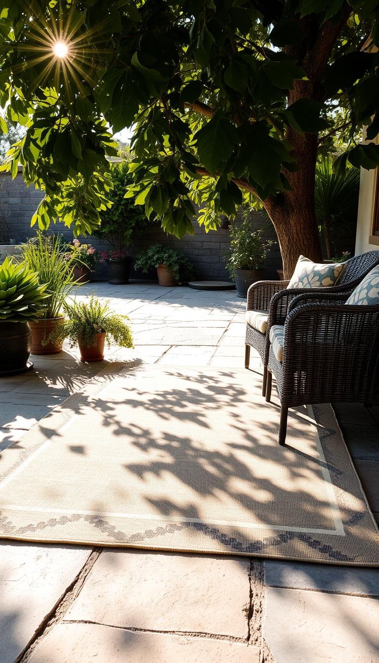
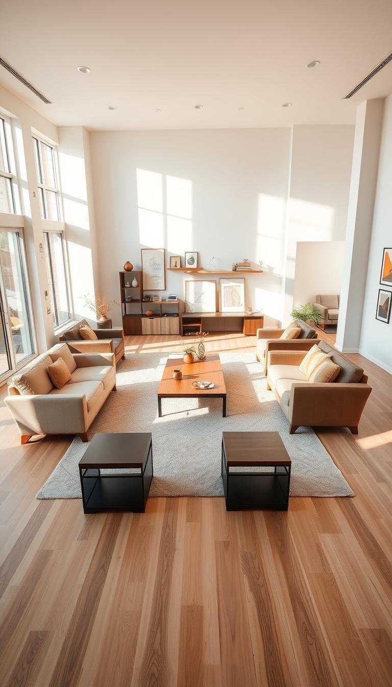
Living rooms
I center the composition on a fireplace, anchoring the sofa and main seating. Then I offset one side with art, a sculptural floor lamp, or a plant to break stiffness.
I often pair a heavy sofa on one side with a lighter chair, side table, and greenery on the other to keep the arrangement dynamic.
Dining rooms
Radial balance rules here: a round table plus a central chandelier make a clear focal point. I soften formality with an asymmetrical tablescape—mixed linens, odd-numbered centerpieces, or varied place settings.
Bedrooms
I mirror nightstands for calm, then add one standout piece to avoid a staged look. An oversized art panel or bold lamp gives the wall a focused voice without crowding the space.
Kitchens
Symmetrical cabinetry sets order. I create interest with an off-center island vignette: staggered stools, a branchy vessel, or a small textured runner to nudge asymmetry.
Entries and foyers
A statement chandelier brings radial focus while an asymmetric console vignette adds movement. This combo welcomes guests with structure and surprise.
- Patterns and texture in rugs, throws, and pillows help balance large furniture without overcrowding the room.
- When one side carries weight with dark finishes, I counter the other side with lighter pieces and tactile accents.
- Real examples from designers like Heather Kane show how asymmetrical art arrangements enliven otherwise symmetrical spaces.

Avoiding Common Pitfalls When I Balance a Space
A well-balanced room is less about perfect mirroring and more about intentional edits that guide the eye. I start by reading the architecture and then test small shifts before committing to big moves.
Over-symmetry: when calm turns static. Too much symmetry flattens personality and makes an interior feel like a showroom. I avoid mirror-image setups everywhere and add one expressive element to soften order while keeping the composition coherent.
Chaotic asymmetry: managing visual noise. Poorly handled asymmetry leaves the eye with no landing spot. I reduce clutter, calm sharp contrast, and rebuild the composition with one strong asymmetric gesture rather than many competing pieces.
Proportion and scale mistakes: read the room first. I correct scale issues before tweaking color. Oversized furniture or too many small items ruins proportion faster than pattern does. I let ceiling height, window size, and focal walls decide how much dynamism the space can carry.
- I edit in passes: height, color depth, then texture.
- I soften extreme contrast with mid-tone bridges and repeated materials.
- When things feel off, I reset to a stable core, then add one element at a time.

Conclusion
, A successful finish ties structure and surprise so each space feels both lived in and intentional.
I reaffirm that beautiful interiors grow from balancing steady structure with expressive moments. This balance creates harmony across rooms and lets a home feel grounded yet lively.
Anchor each plan on a clear point, choose the approach that fits how you live, then tune visual weight through size, color, texture, and placement. Small shifts—raising height, softening color, adding texture—restore harmony faster than big changes.
Practice the rule of thirds and odd-number groupings to keep rhythm without clutter. Read the architecture first, then layer personality until the space feels intuitive. When a room is restful and engaging, the design has done its job.