How Can I Select Backsplash Patterns That Tie a Kitchen Together?
I’ll help you pick a backsplash pattern that unifies your kitchen by reading the room, narrowing options, and matching design moves to your personal style and home. I use clear steps so tile and grout choices work hard for you.
A backsplash sits at eye level and connects uppers, lowers, and counters into one cohesive frame. That placement makes it the visual backbone of the space and the easiest place to create continuity.
You’ll see real examples, from full-wall diamond tiles by Mercury Mosaics to smart wrap-around runs, showing how coverage choices shape mood and flow. I balance style with function so selections consider cleaning, durability, and daily life.
Small shifts in layout, sheen, or scale can change how the entire room reads. I’ll point to the highest-impact options and end with a step-by-step plan you can use or pass to a contractor.
Key Takeaways
- Read fixed elements first: counters, cabinets, and flooring guide strong tile choices.
- Choose coverage—full-wall diamonds or wrap-around runs—based on how bold you want the room to feel.
- Balance style and function by considering grout, sheen, and ease of cleaning.
- Small changes matter: scale, layout, and finish can shift the whole design.
- Follow a clear plan so installation matches your vision and the options you love.
Start Here: My Criteria for a Cohesive, Beautiful Kitchen Backsplash
I start by setting clear criteria that balance durability, scale, and visual harmony so the wall feels intentional next to cabinets and countertops.
Durability and maintenance come first. I pick finishes that survive daily use and match your cleaning habits so the surface keeps its appeal over time.
Visual cohesion matters next. I evaluate cabinet tone, door style, and sheen, then compare those traits to countertop movement. That tells me whether the pattern should calm or energize the slab.
I check wall area and sightlines and adjust scale so the room stays balanced. Budget is part of the plan — sometimes a field tile plus a small feature panel gives big impact for less.
- Material fit: ceramic, stone, or glass chosen for lifestyle and look.
- Pattern role: decide if the tile will unify finishes or offer subtle contrast.
- Timeless backbone: start with long-lasting choices, then add personality.

Read the Room: Cabinets, Countertops, and Appliances Set the Direction
Before choosing tile, I read how cabinets, countertops, and appliances speak to each other in the space. That quick survey tells me whether the wall needs to fade back or become a focal point.
Cabinet color and door style
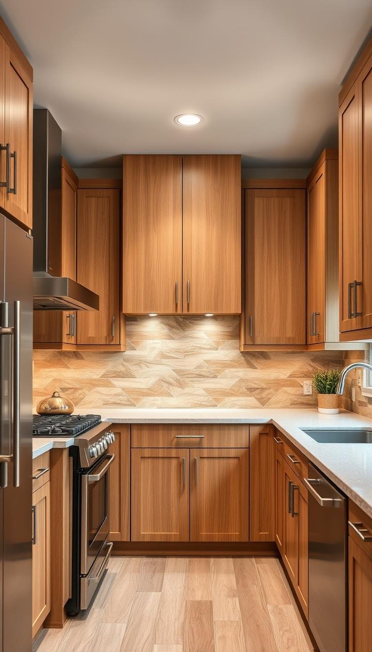
I check cabinet tone, sheen, and door type. Shaker doors favor classic subway and marble accents. Slab fronts lean modern and pair well with glass or minimal grout. Natural wood needs materials that respect warmth and grain.
Countertop movement
Busy marble veining or quartzite ribbons calls for simpler fields so surfaces do not fight. When counters are calm, I introduce pattern or texture to add rhythm without clutter.
Appliances and hardware
Stainless, black, or brass finishes shape grout choice and tile edge. Recessed pulls let bold tiles sing; polished hardware complements glossy marble or ceramic.

- Echo warm wood with earthy glazes like zellige.
- Contrast black cabinets with lighter or patterned tiles for balance.
- Match counters and wall scale to keep the overall look calm and usable.
Pattern Basics That Do the Heavy Lifting
Pattern choice determines whether the wall reads calm and wide or active and tall.
I break down classic layouts so you know what each one does in the room.
Core layouts and their roles
- Running bond: a classic, forgiving field that keeps texture without fuss.
- Herringbone: early 20th-century roots; it creates zigzag movement and historic charm.
- Chevron: a precise V that reads modern and directional.
- Vertical subway: lifts the eye and adds perceived height to the space.
- Diamond: geometric flair that gives a bold, structured look.

When geometric shapes make sense
Hex offers honeycomb order; triangles cut a sharp, graphic line; fish scale brings soft waves and texture.
Direction matters: vertical adds height, diagonal creates motion, and horizontal calms and widens the kitchen.
| Layout | Effect | Best use |
|---|---|---|
| Running bond | Calm, classic | Busy counters or small walls |
| Herringbone | Movement, historic charm | Feature walls or range surrounds |
| Chevron / Diamond | Graphic, structured | Modern spaces that welcome strong geometry |
| Vertical subway | Heightening, sleek lines | Tall ceilings or narrow walls |
Tip: Use bolder layouts in accent zones like behind the range, and match grout to either highlight geometry or soften the read for a quieter finish.
Color Strategy: From Monochrome Calm to Bold Statements
Color steers how a space feels — calm and collected or warm and dramatic. I start by testing samples near your natural light so tone and sheen read true in real life.

Classic white subway and monochrome palettes
Classic white subway keeps the room timeless. A running bond layout with slight sheen shifts adds depth without fuss.
Monochrome palettes use varied tones of one hue to create texture while keeping the wall serene.
Rich, cozy hues and terracotta warmth
Navy and burgundy bring depth and comfort when balanced with lighter counters or uppers. Terracotta glazes pair beautifully with wood and soft pastels for mid-century warmth.
Ombre, scattered gradients, and pop color
Ombre fish-scale gradients add gentle movement across the field and guide the eye toward a focal zone, such as behind the range.
Small pops — sunny yellow or sea foam green — inject personality without overpowering the room.
- Grout choice matters: match grout for calm fields, contrast grout to outline shapes.
- Sample board: place tiles and finishes together under your lighting before committing.
Finish and Texture: Glossy, Matte, and 3D for Depth and Light
Finish and surface texture change how walls read and how light moves through the room. I use sheen and relief to shape scale, balance cabinetry, and add tactile appeal.

High-gloss and mixed sheen
High-gloss tiles reflect light to brighten and visually expand small kitchens. I pair glossy fields with matte counters so one surface does the reflecting while the other grounds the space.
Artisan and three-dimensional options
Zellige and artisanal tiles bring pits, chips, and glaze variation for handmade character. Subtle 3D relief panels add shadow and sculptural interest without overwhelming daily life.
“Sheen choices should respond to lighting and use—gloss wipes clean, matte hides marks.”
| Finish | Effect | Best spot |
|---|---|---|
| High-gloss | Brightens, enlarges | Small or low-light walls |
| Mixed sheen (chevron) | Layered, rich | Feature bands or range surrounds |
| Zellige / artisan | Textured, soulful | Accent panels, islands |
- I test samples under my actual light at different times of day.
- I check grout sheen so joints support the intended texture story.
- I choose finishes that balance cleaning needs and long-term appeal.
How Can I Select Backsplash Patterns That Tie a Kitchen Together?
I recommend starting with one strong feature panel, then using small echoes around the room so the entire scheme feels deliberate. This approach keeps the composition balanced and easy to live with.

Match, echo, or contrast: choosing your unifying approach
Match materials for a seamless, calm field. Use the same tile or finish in reduced areas so sightlines flow.
Echo a color, shape, or sheen in trims, niche backs, or island faces to make the feature feel intentional.
Contrast with grout or a different tile to add energy—this works best when one element gets most of the attention.
Focal zones behind the range or sink that repeat elsewhere
I place the main focal panel where people look first, usually the range. Then I repeat that cue lightly—small returns, trim pieces, or a short wall—so the feature ties into the rest of the kitchen design.
- Use mix-and-match collections to guarantee coordinated color and finish.
- Apply contrast grout to outline hex or fish-scale shapes; match grout when you want a serene field.
- Keep a clear hierarchy: one star, one strong support, and a calm field for balance.
“A single repeated cue makes a bold panel feel like part of the whole.”
Smart Mixes: Two Backsplashes, Two Materials, or Two Colors
Mixing two materials lets you combine the calm of stone with crafted tile for a layered, usable wall.

When to combine slab with tile for balance
I use slab where cleaning matters most—behind ranges or sinks—and reserve tile for texture elsewhere. This way the work zones stay durable while accents add craft.
Pairing porcelain, ceramic, glass, and marble look-alikes
Match thickness and sheen so transitions look intentional. Porcelain that mimics marble gives the look of stone with less upkeep, and glass or steel-toned tiles introduce reflective or industrial notes.
Designing a feature panel with an echoing field tile
I create one strong panel, then echo its color or shape in the field tile. Repeat a grout tone or edge detail so the two-material story reads coherent instead of pieced together.
| Material Pairing | Effect | Best Use |
|---|---|---|
| Stone slab + ceramic tile | Calm utility + tactile pattern | Range slab with patterned field |
| Porcelain marble-look + wood accents | Durable elegance + warmth | High-traffic kitchens on budget |
| Glass + steel-tone tile | Reflective brightness + industrial edge | Modern designs, small feature zones |
| Ceramic field + patterned feature | Textured backdrop + focal drama | Repeat color in trims or island faces |
Scale and Coverage: From Small Statements to Full-Wall Drama
Scale changes the mood. Small tiles pack more grout lines, so the surface reads lively and textured. Large formats simplify the view and feel modern.
I choose tile size based on wall area and sightlines. For a narrow run, small modules hold interest. On wide walls, larger formats calm the eye and match long countertops.

Tile size, grout, and texture
Thicker or contrasting grout amplifies geometry. Thin, matched grout makes the field read seamless. For marble-look slabs, I favor minimal joints behind the cooktop to ease cleaning.
Full-wall and wrap-around coverage
Full-wall coverage with medium diamond tiles creates a dramatic focal point behind a hood or window. Wrap-around runs, by contrast, tie adjacent walls into one continuous look without tiling to the ceiling.
- Use slab or large-format where durability matters—behind ranges and sinks.
- Align scale to cabinet rhythm, hood width, and open shelving for balanced proportion.
- Plan terminations for weight and wall conditions; choose trim or painted edges for clean transitions.
Grout Is a Design Tool: Contrast, Match, and Maintenance
Grout is more than filler; it sculpts how tiles read and gives the wall its voice. A measured grout choice adds rhythm, highlights geometry, and supports long-term upkeep.

Outline or disappear: two clear directions
Contrast grout outlines fish scale, hex, and diamond shapes so geometry becomes the point of interest. I use this when a feature panel needs to pop.
Color-matched grout makes surfaces sleek and modern, letting glossy or marble-look materials read continuous and calm.
Practical choices that matter
- I size joints to control texture: wider for rustic charm, tight for a clean, contemporary feel.
- I test grout swatches on sample boards under real light before deciding.
- I choose grout compounds and sealers that resist stains and suit your cooking habits.
“A single contrast joint can turn subtle tiles into a deliberate graphic statement.”
| Strategy | Visual effect | Best use |
|---|---|---|
| Contrast grout | Highlights shapes and layout | Feature panels: fish scale, hex, diamonds |
| Color-matched grout | Seamless, modern surface | Glossy or large-format tiles in main runs |
| Split approach | Drama + calm balance | Contrast in panel, matched in surrounding field |
Tip: Coordinate grout with counters, cabinet tones, outlet covers, and caulk so the whole tile backsplash story reads intentional and durable.
Verticality and Direction: Layouts That Shape the Space
Strong vertical lines instantly lengthen a wall and give the room a modern, tailored edge. I use direction to change proportion without touching architecture.
Vertical subway placement lifts sightlines and creates a clean, contemporary look. I turn to subway when ceilings feel low or when I want crisp framing for a range hood.
Rotating classic rectangles or choosing specialized tall cuts makes the kitchen feel taller while keeping the footprint the same. Slim grout joints enhance the sleek effect.

Diagonal and diamond layouts for dynamic motion
Diagonal runs and diamond patterns inject obvious movement. I deploy these in zones that need energy or directional flow.
I balance bold geometry with simple counters and flat cabinet planes so the pattern remains the hero. I also test proportions: taller rectangles elongate more, while square mixes moderate the effect.
- Alignment at corners, windows, and upper cabinet bottoms keeps rhythm intact.
- Mixing directions—vertical field with a horizontal or herringbone band—adds nuance and focus.
- Use direction to guide sightlines toward focal points like a sculptural hood or window.
| Layout | Primary effect | Best use |
|---|---|---|
| Vertical subway | Heightening, modern lines | Low ceilings, hood framing |
| Diagonal / Diamond | Movement, geometric drama | Feature zones, range surround |
| Vertical + horizontal mix | Controlled drama, visual layers | Island faces with a framed panel |
“Mercury Mosaics’ Rise vertical tiles show how classic subway shapes update into a fresh, contemporary series.”
Designer-Level Focal Ideas I Love
I treat a focal wall like jewelry for the room—something to catch attention and reward close inspection.
Hand-painted murals by artists like Matthieu Cossé personalize a space with initials, landscapes, or motifs. Commissioning one gives your home a singular story and a permanent signature.
Brutalist artisan tiles from makers such as Catherine Carroll turn practical walls into sculptural panels. Their tactile, low-gloss surfaces add depth and a durable, artful presence for daily use.

Playful geometry and palette moves
Hex flower mixes and geometric blends create lively, repeatable shapes that pair well with calm field tiles. Gemstone green hex and deep blues anchor the design without cluttering sightlines.
- Talavera chevron brings timeless graphic punch; I balance it with warm wood or brushed steel hardware.
- I echo mural colors in narrow borders or niches to reinforce cohesion with cabinetry and counters.
- I mock up motifs at true scale—paper or digital—so shapes read correctly from normal viewing distances.
“A well-scaled focal tile gives the room identity while the surrounding field keeps daily life easy.”
| Focal Idea | Visual Role | Practical Note |
|---|---|---|
| Hand-painted mural | Personal storytelling | Seal finish; test cleaning before install |
| Brutalist artisan tile | Sculptural, tactile surface | Choose durable glaze for high-use zones |
| Hex flower / geometric blends | Playful, structured repeat | Use matched grout for cohesion |
| Talavera chevron | Graphic focal punch | Pair with warm cabinetry tones |
For more curated inspiration and practical layouts, see my notes on kitchen tile backsplash ideas.
Light and Reflection: Making the Most of Your Kitchen’s Daylight
A well-placed reflective finish can change how the entire space feels without moving walls or windows.

Glossy tiles throw daylight back into the room, so small kitchens feel more open. I use high-gloss or lacquer-like finishes near windows and under cabinets to brighten prep areas.
Glass tiles send light deeper into corners and help task zones read clearer. I place reflective focal moments close to natural sources, then ease into softer sheens further away.
I balance shine with glare control. That means pairing a reflective tile backsplash with matte counters or hardware to keep the look warm and lived-in.
“Tiles create perceived depth through reflection and shadow—little moves do big work in compact spaces.”
- Pale grout keeps brightness and avoids chopping the wall visually.
- Test finishes at different times of day to judge glare and evening light play.
- Conceal strips and keep outlets tidy for a cleaner, gleaming look.
| Material | Light effect | Best use |
|---|---|---|
| High-gloss ceramic | Strong reflection, larger feel | Under cabinets, short runs |
| Glass tile | Bounces daylight deep into room | Near windows, behind task zones |
| White/pale subway | Amplifies brightness, neat backdrop | Long runs, paired with matte counters |
| Lacquer-like finish | Gleaming, easy to clean | High-use zones, behind range |
Durability, Care, and Lifestyle: Choose What You’ll Love Over Time
Think long term: pick materials that age with your daily habits so the space stays useful and low-drama. I match wear resistance to how you cook, who uses the room, and how often you clean.

Practical pairings: porcelain gives durability and low maintenance, ceramic offers variety and value, and natural stone brings depth but needs care. Porcelain marble-look gives the marble look without etching or frequent sealing.
I plan for heat, steam, and splatter zones. That means choosing tiles and grouts that wipe clean behind the range and sink. I also confirm thickness when mixing materials so installation stays smooth and stable.
- I advise edge treatments—bullnose, metal trim, or painted edges—for a built-in finish.
- I test samples for water spots and fingerprints to match daily use.
- I recommend grout types and sealers matched to your cooking rhythm and cleaning habits.
“Pick surfaces you’ll enjoy over time, whether they wear in with patina or stay pristine.”
| Material | Care | Durability | Best use |
|---|---|---|---|
| Porcelain (marble-look) | Low; rarely seals | High | High-use runs, behind range |
| Ceramic | Moderate; easy clean | Medium | Value areas, decorative panels |
| Natural stone (marble, travertine) | High; sealing needed | Medium to High | Feature panels, calm zones |
| Glass | Low; shows fingerprints | Medium | Light-reflecting accents |
Budget and Timeline: Where to Splurge, Where to Save
Good budget planning starts with one clear choice: pick the spot you want to sing, then set limits for the rest. I recommend prioritizing a focal zone so funds lift impact without inflating costs across the whole room.

I advise splurging on behind-the-range panels or a small hand-made mural and saving with well-made field tiles elsewhere. Glass and porcelain now match better in thickness, which eases mixed-material installs and saves labor time.
Practical moves I use:
- Choose larger formats or slabs where install time drops and shift funds to a patterned band.
- Compare ceramic, porcelain, glass, and marble so materials meet budget and design goals.
- Plan lead times for artisan pieces and sync delivery with your contractor to avoid delays.
I note cost-creep areas—custom cuts, many outlets, tight niches—and design around them. Small runs of premium tile inside a quality field give high impact per dollar and keep the overall kitchen looking like careful, thoughtful style.
Tie-Ins Beyond the Wall: Islands, Edges, and Adjacent Surfaces
Extend visual cues beyond the wall so islands, edges, and cabinetry read as one considered composition. Small, deliberate repeats create unity without overworking the room.

Coordinating island faces with the main field
I often run the same tiles or color from the backsplash onto an island face to pull perimeter and center together. This move anchors sightlines and strengthens kitchen design without extra clutter.
Painted edges and polished terminations
Painted edges offer a crisp termination when trim would feel heavy. Metal or ceramic trim works when a refined finish suits the cabinetry or hardware.
- Repeat geometry: echo a hex or geo motif on toe-kicks or island sides for visual rhythm.
- Balance warmth: pair wood island cladding with tiled walls so the look stays welcoming.
- Durability: use tough finishes on island faces subject to kicks and daily use.
“Small repeat cues make the whole room read intentional.”
| Detail | Visual Effect | Best Use |
|---|---|---|
| Tile on island face | Continuous flow | Open-plan islands |
| Painted edge | Graphic termination | Budget-friendly modern look |
| Metal trim | Polished, tailored finish | Match to hardware |
| Wallpaper + tile | Layered maximalist style | Accent walls with shared colors |
Putting It All Together: My Step-by-Step Selection Plan
Look at what cannot change first: appliance finishes, countertop movement, and cabinet rhythm will narrow good tile ideas.

- Read fixed elements. Note cabinets, countertops, and appliances and decide whether to match, echo, or contrast.
- Shortlist 2–3 options. Test running bond, herringbone, diamond, and vertical subway against your surfaces.
- Pick a focal zone. Sketch a feature panel or ombre gradient and set a calmer field around it.
- Choose materials to fit daily life—artisan character where you want texture, low-maintenance tile where you need it.
- Set color strategy. Confirm monochrome calm, rich cozy tones, or a pop of color in your actual lighting.
- Decide grout and joint size. Use contrast to define geometry or match grout for a seamless, modern way.
- Map coverage and edges. Choose full-wall, wrap, or standard height and pick painted edges or trims for terminations.
- Align budget and timeline. Mark splurge areas and value field tiles to keep the project on track.
- Order samples and mockup. Create a board near your countertops so tiles create the movement you want.
- Document for install. Deliver measurements and reference lines so the installer follows the plan exactly.
Note: Vertical subway lifts height while herringbone brings motion; pairing a feature Spanish or diamond panel with an echoing field often yields the most cohesive result.
“A clear mockup and precise layout notes make execution easy and keep surprises out of the install.”
| Step Group | Primary Focus | Expected Result | Why It Matters |
|---|---|---|---|
| Survey fixed elements | Cabinets & countertops | Aligned visual base | Prevents conflicting finishes |
| Pattern testing | Running bond, herringbone, vertical | Balanced movement | Matches scale to sightlines |
| Material & grout | Durability & color | Durable, readable surface | Supports cleaning and longevity |
| Mockup & docs | Samples & layout | Installer-ready plan | Reduces callbacks and errors |
Final step: place your samples beside the counters at different times of day, confirm the way light and texture behave, then sign off on the layout for installation.
Conclusion
A simple rule: one focal move, gentle echoes, and the rest of the room stays calm.
I recap that reading fixed elements first makes kitchen backsplashes work with cabinets, countertops, and hardware so the overall look feels intentional. Classic white running-bond and richer colors both have roles when used to serve your room and your style.
Thoughtful coverage, edge details, and grout matter as much as the tile itself for polished appeal. Pick materials and finishes that match your daily life and cleaning habits.
Order samples, mock up the panel, and keep clear install notes so the tile backsplash is executed exactly. Trust your taste—whether you choose classic white or saturated hues—and enjoy a kitchen that delivers lasting design and home appeal.