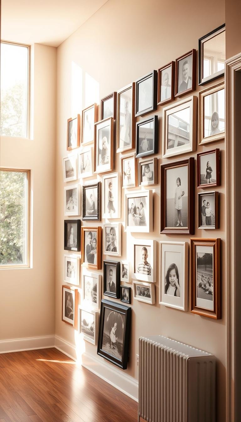
What Are the Creative Ways to Display Family Photos in a Hallway?
I love turning narrow corridors into warm, curated spaces.
I’ll map smart wall ideas that keep pictures tidy and readable. I use gallery wall plans, picture rails, and slim ledges to avoid crowded nails and keep the room calm.
Dumican Mosey Architects inspired me with a gray backdrop, black frames, and white mats that read crisp even in low light. For quick swaps, wire-with-clips systems and ledges let me rotate travel shots and casual prints without damage.
One hero photo on an oversized mat lifts snapshots into art. I’ll cover safe glazing, ideal mounting height, and spacing so photos last through busy years in your house.
Throughout this post, I share renter-friendly tricks and a simple checklist that helps your hallway feel intentional and unmistakably yours.
Key Takeaways
- Plan a cohesive gallery wall for narrow halls.
- Use ledges or wire clips for easy updates.
- Pick one oversized hero photo for calm focus.
- Choose frame glazing and spacing for durability.
- Mix portraits, travel snaps, and small art with balance.
How I Think About Hallway Photo Walls for a Warm, Lived-In Look
I imagine how daily life will interact with the photos before I hang a single frame.
I ask whether the corridor should feel lived-in, not staged. That question guides my choice of gallery approach and overall style.
I edit images so each photo earns its spot. A tighter selection makes the wall read calm and curated even after years of family living.
I favor consistent centerlines and even spacing. In a narrow hall, rhythm calms the eye and turns many pictures into one cohesive statement.

Grid or eclectic? For a crisp look I pick a grid gallery wall with black, brass, or white frames. If I go eclectic, I keep one visual thread—black-and-white prints or a repeat finish—so the display still feels intentional.
- I mix candid shots with portraits for a real-house vibe.
- I choose durable frames and warm lighting to protect and flatter faces.
- I pick a way display that fits our home and tells our story every time I walk through.
| Approach | Look | Strength | Best for |
|---|---|---|---|
| Grid | Streamlined | Clean rhythm and low visual clutter | Dim halls, consistent frames |
| Eclectic | Gathered-over-years | Personality with a shared thread | Homes with mixed finishes |
| Ledges/rails | Flexible | Easy swaps, damage-free updates | High-traffic, rental houses |
Grid-Style Gallery Walls That Make a Narrow Hallway Feel Polished
A tight, even grid brings order to a narrow corridor and makes every photo feel intentional.
I use identical frames and steady spacing when I want the hall to read calm and refined. Designers often recommend matching sizes and even rows so a long wall reads as one composed piece.

Perfect squares: identical frames in a tight, even grid
Identical frames and consistent margins create rhythm that guides the eye forward. I measure twice, mark a center line, then set equal gaps so the gallery wall looks professionally hung.
Black frames + white mats for crisp contrast in low light
I love black white pairings for black-and-white prints. That high contrast keeps faces clear even in dim halls and gives the whole gallery a timeless look.
Brass or mixed metals to echo hardware and lighting
For warmth, I swap in brass or mixed metals. A few brass frames will tie the gallery to door hardware and sconces and help the corridor feel cohesive.
“That gray-wall, black-frame, white-mat arrangement reads like a miniature museum right at home.”
- I anchor the center with my most meaningful family photo, then mirror outward for balance.
- On long walls I break the grid into panels to avoid cramped corners near doors.
- Ready-made frames with mats are an affordable example of how to standardize sizes for easy replacements.
Picture Rails and Slim Ledges: Flexible Displays for Changing Photos
I turn to picture rails and slim ledges when I want flexibility without new holes in the wall. These narrow shelves make it simple to shift a photo or swap in new art the minute inspiration hits.

Leaning layers are my go-to trick for depth. I overlap frames so the back ones act as anchors and lighter frames sit in front.
Leaning layers: overlap frames for depth without new nail holes
Overlapping creates a collected look without measuring every stud. I keep frame depths consistent and place sturdier pieces at the back for safety.
Match shelf and wall color so the photos do the talking
When I match the ledge paint to the wall, the rail almost disappears. That lets mats, prints, and the faces in my photo collection stand out.
- I use two ledge heights: one at eye level and a second for layering.
- Wood rails tie to nearby floors or trim for warmth and cohesion.
- I secure frames with museum putty so nothing shifts in busy spots.
“Rails give me a gallery feel with zero commitment—perfect for a hall that changes with our family.”
Stairway and Corridor Runs: Turn Transitional Space into a Family Photo Gallery
I use the handrail angle as my guide when placing frames on stair walls. That simple rule keeps the line tidy and gives the run a natural rhythm as you climb.
Follow the rise: align either frame tops or bottoms with the handrail so the display feels intentional. For mixed sizes, a low picture rail helps keep bottoms level and lets me swap pieces without remeasuring.
In narrow stairs I pick slim profiles and secure frames well. This avoids bumping and keeps the passage safe in an older house.
Anchor with a quote decal for personal flair
I often add a favorite line at the mid-landing to tie the photos into a single story. A hero family photo sits beneath it, with smaller pictures above and below to create cadence.

- I cluster shots near doorways so the wall reads in chapters, not one long strip.
- Wrap the run around turns with a tighter grouping so the story continues naturally.
- Use a thin ledge for bottoms alignment and easy updates.
“Aligning frames with the handrail turns daily transit into a curated moment.”
| Element | Why it works | Best use |
|---|---|---|
| Handrail alignment | Keeps diagonal runs organized | Long stair runs |
| Quote decal | Unifies varied photos | Mid-landing anchor |
| Picture rail | Easy swaps, consistent bottoms | Rental or changing displays |
| Slim frames | Safer, lower profile | Narrow or older stairs |
Oversized Statements: Go Big with One or Two Hero Photos
I rely on a bold hero print to make the whole wall read as one intentional piece. A large image creates calm and focus in a busy corridor. It also cuts the clutter of many small frames.

Engineer prints for dramatic, budget-friendly impact
Engineer prints give dramatic scale without a huge cost. Bloggers like Elisabeth McKnight and Chris Loves Julia use them for kids’ portraits. They look crisp from a hallway or dining sightline and slide into simple frames.
- I use one or two oversized hero photos to quiet a busy display and make a gallery wall feel curated.
- Big mats around a favorite family photo add luxury with negative space.
- Acrylic frames keep large prints modern and let wall color breathe around the image.
- For long walls, I hang a soft grid of two large photos to balance the run.
“Engineer prints prove you can get a knockout focal point on a modest budget.”
| Option | Cost | Look | Best use |
|---|---|---|---|
| Engineer print | Low | Bold, matte | Hallway or dining sightline |
| Framed with big mat | Medium | Classic, museum feel | Entry walls, over console |
| Acrylic float | Higher | Airy, modern | Bright halls, minimal decor |
Tasteful and Eclectic Mixes That Still Feel Cohesive
I like mixing frame finishes so a hallway reads collected, never cluttered. A controlled mix gives life without looking chaotic.

Blend black, wood, and brass finishes
I balance black, wood, and brass frames so the wall feels curated. Wood frames warm white halls, while brass ties into door hardware and lighting.
Mix portraits, travel shots, and small art
I pair candid family photos with travel prints and a tiny abstract or two. That small surprise makes the eye pause and adds story.
Unify with one repeated element
Choose a unifier: all black-and-white images or a repeated frame color. This keeps varied sizes and styles looking put together.
“Repeating one visual thread makes an eclectic gallery read like a single conversation.”
| Element | Why it works | How I use it |
|---|---|---|
| Mixed finishes | Collected, layered look | Repeat each finish at least twice |
| Varying sizes | Adds rhythm and scale | Cluster small frames in groups to match a larger piece |
| Matted vs. unmatted | Textural contrast | Keep consistent spacing and a shared centerline |
- I maintain steady spacing so different sizes feel intentional.
- I repeat a wood tone or brass accent so any vintage frame fits the decor.
- I swap photos over time without changing the wall’s overall style.
Black-and-White Family Photos for Timeless Hallway Style
Black-and-white portraits give a hallway an ageless, museum-like calm. I use a single photographer series when I want that cohesive, gallery feel.

Matching lighting and composition across a set makes every image read as part of one story. I favor slim black or silver frames with white mats. Oversized mats lift casual snaps into fine art and add breathing room around each picture.
I set a small grid or a neat line so attention stays on faces and texture, not mixed frame styles. I pick matte glazing and deeper mats to cut glare in narrow corridors. For softer warmth, I sometimes swap to warm-tone mats while keeping images monochrome.
“Keeping the centerline at about 57–60 inches makes faces hit eye level and keeps the display feeling deliberate.”
- I reach for this palette when I want a polished, quiet look that ages well.
- A neutral wall color helps the photos and mats remain the focal point.
| Element | Choice | Why it works |
|---|---|---|
| Frames | Slim black or silver | Simple edge that unifies the grid |
| Mats | White, deep | Creates museum feel and reduces glare |
| Layout | Small grid / line | Keeps focus on faces and texture |
What Are the Creative Ways to Display Family Photos in a Hallway?
I prefer quick-change displays that let me swap prints during a single coffee break.
Clip-and-string setups are my go-to when I want instant updates. A taut wire and tiny clothespins let me display photos fast and rotate them without remeasuring or nails.
Clipboard grids scratch the gallery wall itch while keeping holes minimal. I hang clipboards in a tidy array and slide in recent trip shots or school pictures for a fresh look each month.

Renter-friendly hanging and antique touches
Curtain rods with clip rings give me a neat row of pictures that I reshuffle whenever I want new energy on the wall. It’s low-commitment and easy to take with me.
For an heirloom vibe, I mix vintage frames with old black-and-white family photo prints. The patina of frames adds warmth and makes the wall feel collected.
Modern materials for tight light and traffic
Canvas prints cut glare and stay lightweight in narrow halls. Acrylic pieces look modern, wipe clean, and read bright under directional sconces.
“Mix a single acrylic hero with a short run of clip displays nearby for a layered, evolving gallery.”
- I group similar display types together so each section reads intentional.
- I keep a small box of printed pictures ready for five-minute swaps on the weekend.
- I watch light: strong glare means canvas or matte acrylic; dim light calls for brighter prints and lighter mats.
| Method | Why I use it | Best for |
|---|---|---|
| Wire + clothespins | Fast swaps, low effort | Rotating snapshots |
| Clipboard grid | Minimal holes, neat repeatable look | Renter walls, school photos |
| Curtain rod + clips | Easy to hang and move | Neat row, renter-friendly |
| Vintage frames | Warmth and history | Heirloom prints |
| Canvas / acrylic | Low glare, modern finish | Tight, bright halls |
Mats, Frames, and Spacing: The Small Choices That Change the Whole Wall
Small choices—like mat width and frame finish—reshape how a hall feels. I start by picturing how each piece will read from the doorway before I mark a single nail.
Oversized mats lift casual snapshots and give a single photo presence. I use wide white margins so each image breathes and reads like art rather than a quick snap.

Plan sizes and balance visual weight
I plan sizes in advance so visual weight stays even. Pairing two small prints opposite one larger piece keeps the run balanced.
One spacing rule calms a busy hall
I pick a consistent gap—often 2 inches—and stick with it. Standardizing spacing makes the whole gallery wall look professional and intentional.
- I keep mat and print sizes consistent when frames vary so photos read unified.
- Repeating one or two frame colors helps with matching without strict uniformity.
- For high-traffic zones I choose shatter-resistant glazing and secure hardware.
“A steady centerline and thoughtful mats turn casual pictures into a polished display.”
| Choice | Why it helps | Best use |
|---|---|---|
| Oversized mat | Adds presence | Hero photo |
| Consistent gap | Calms the eye | Long runs |
| Shatter glazing | Durability | High-traffic halls |
Designing for Color, Light, and Traffic in a Real Home
I tune color and scale to the hallway’s light so the display reads right from the doorway.
In dim corridors, I prefer monochrome prints paired with light mats. That combo keeps faces legible and the wall calm. In brighter runs, I introduce bold color photos for energy and contrast.
Matching shelves or rails to the wall color helps the frames float and lets the photos take center stage. I use picture rails and secure mounts where doors or foot traffic might jostle the display.
Practical choices for busy passages
Low-profile frames that sit close to the wall reduce snags. I pick shatter-resistant glazing in high-traffic zones for safety and durability.
I test lighting at different times and reposition sconces or swap bulbs to cut glare. For narrow widths, I choose slender frames and fewer pieces. In wider runs, I scale up with one or two larger family photo heroes.
“Practical details keep a photo gallery beautiful every day.”

- I secure heavy frames with proper anchors and museum putty near doors.
- For kids, I place durable, easy-clean pieces low or move fragile items higher.
- I avoid benches or runners that make the way tight and risk bumps.
| Concern | Solution | Best use |
|---|---|---|
| Low light | Monochrome photos + light mats | Dim corridors |
| High traffic | Low-profile frames + shatter glazing | Busy family halls |
| Changing displays | Picture rails + matched shelves | Rental or active home |
Conclusion
Conclusion
Good hall design balances daily life with display so photos stay personal and polished. Use proven wall ideas—grids with black frames and white mats for calm, picture rails for swaps, or one oversized print for instant impact.
Mix thoughtfully: blend wood frames or brass accents with a unifying black-and-white thread when you want collected charm. In dim runs keep color simple; in bright halls add bolder photos or acrylic and canvas to cut glare.
I suggest renter-friendly fixes like curtain rods with clips or clipboard grids for easy updates. For a quick example, try a 2×3 grid near dining and a low picture rail farther down the hall for seasonal rotation.
Over the years, rotate pictures and refine mats, sizes, and frame finishes so the family photo gallery feels like home every time people walk through. For more photo wall ideas, see photo wall ideas.