How Do I Choose the Right Tiles for a Stylish Kitchen Backsplash?
I want a backsplash that protects and expresses my taste. I start by naming my kitchen style and measuring the space I have. That focus helps me match materials and patterns to daily wear and how I cook.
I lean toward ceramic or porcelain when I need balance: they are popular, affordable, and offer many designs. For brighter accents I consider glass. If I want luxury, natural stone like marble or granite fits. Metals add an urban edge.
Budget matters. Pro installs often run $600–$1,200, with high-end work up to $3,000. DIY can cut costs by half or more, but I factor time and skill before I decide.
I test samples under my lights, pick sheen carefully, and plan focal points like the range wall. With a simple step plan—refine palette, pick material, test grout, confirm maintenance, and order extra—I feel ready to transform my kitchen.
Key Takeaways
- Start by defining style and measuring space.
- Ceramic and porcelain suit most needs and budgets.
- Glass, stone, or metal offer distinct looks and costs.
- Know pro vs DIY price ranges before committing.
- Test samples under real lighting for true color and sheen.
- Plan for waste and simple maintenance up front.
Understand my kitchen’s style, workflow, and focal points first
I walk the kitchen and note fixed elements so the backsplash can support rather than fight the room. I list cabinet tones, countertop surfaces, appliance finishes, and lighting. This quick audit keeps the final design cohesive with existing pieces.

Audit finishes and lighting
Pay attention to color shifts. Bulb temperature and daylight change how colors read. I photograph surfaces at several times so samples make sense later.
Map splash zones and daily use
Prioritize durable material behind ranges and sinks. Identify the coffee station and food prep areas where grease and steam hit most. Frequent cooks benefit from smooth, wipeable tiles; light-use walls can be more decorative.
| Element | What I note | Impact on backsplash |
|---|---|---|
| Cabinets | Finish and tone | Choose complementary colors and visual weight |
| Countertops | Material and pattern | Balance with subtle or bold tile choices |
| Appliances & lighting | Metal finishes and bulb temp | Match metals and test samples in both warm and cool light |
Pro tip: Photograph the space during morning and evening to judge true colors. That helps homeowners pick tiles that feel right in real life.
Set a realistic budget and scope for my backsplash project
Before ordering tile I set a clear budget and list every task so costs don’t surprise me. I include demolition, substrate prep, tile, grout, trim, tools, and disposal. That makes my budget reflect real-world work, not just materials.

Typical U.S. pro install costs vs. DIY savings
Most professional ceramic tile backsplash installations run about $600–$1,200. Complex or custom layouts can reach $3,000. If I have tools and skill, DIY can save more than half, but I weigh time and risk before committing.
Mixing premium focal areas with budget-friendly fills
I often place premium tile at the range wall and use affordable field tiles elsewhere. This stretches dollars while keeping a strong focal point that reads like an upgrade.
“Order 10–15% extra to cover cuts and future repairs; small trim choices affect both cost and finish.”
| Item | Budget impact | Action |
|---|---|---|
| Demolition & prep | Low–High | Inspect walls early; add contingency |
| Material (tile & trim) | Moderate–High | Mix premium focal tile with budget field tile |
| Labor vs DIY | Save vs pay | Compare time, tools, and skill before choosing |
| Maintenance | Ongoing | Factor sealing or resealing into lifetime cost |
- Use national ranges to sanity-check bids.
- Compare trim options: bullnose, metal Schluter, or mitered edges.
- Ask suppliers about overage policies and order extra.
Choose the best backsplash materials for my lifestyle
My daily routine steers me toward materials that stand up to spills, heat, and busy family life. I weigh durability, look, and upkeep before ordering anything.

Ceramic and porcelain: practical color and texture choices
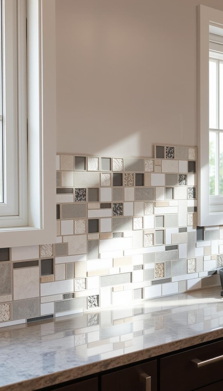
Ceramic is the most popular choice—about 56% of homeowners pick it. Porcelain adds toughness for heavy use, so I lean on it at busy cooking zones.
Note: Both ceramic and cementitious grout often need sealing. That step preserves color and stops stains.
Glass tile: light play and cleaning trade-offs
Glass brings jewel-like luminosity and reflects light in small kitchens. It shows fingerprints and splashes more, so I plan faster wipe-downs.
Natural stone: marble and granite for luxe movement
Natural stone offers unique veining and high-end appeal but comes at a premium. I schedule sealing and use gentle cleaners to protect the surface.
Metal accents: urban edge and placement tips
Copper, brass, and stainless make bold accents at niches or horizontal bands. I sometimes choose full metal panels for a dramatic, reflective wall.
- I favor ceramic or porcelain when I want broad colors, textures, and budget-friendly durability for busy kitchens.
- I reserve artisanal or porous pieces for low-splash walls and always test samples for staining with oil and tomato.
“Confirm finish—matte, satin, or high-gloss—because it affects sheen, slip, and cleaning needs.”
Dial in color and tone to coordinate with cabinets and countertops
I tune my palette so cabinets and counters feel like parts of a single plan. Coordinating colors with cabinets, countertops, and floors creates a polished, cohesive look that reads intentional rather than forced.

Pull one to two hues from existing finishes
I pick one primary hue from a cabinet or counter and one accent from a secondary finish. This keeps the palette grounded and tied to real materials.
Tip: Hold samples next to cabinet doors and countertop offcuts. That reveals true harmony under your lights and avoids surprises.
Bold versus neutral palettes: when to go vibrant
When the rest of the kitchen is calm and simple, a bold green or blue can become the star. If countertops already show strong movement, I favor neutral field tiles to balance the room.
Before final buys, I tape a small swath of tiles to the wall and live with it for a few days. That test shows how daylight and LEDs change the look and touch of finishes.
“Test grout strips in light, mid, and dark values to predict whether the final layout will read graphic or blended.”
Backsplash patterns that fit my design vision
The pattern I pick sets pace and personality for the room. I start by picturing which wall will be the focal point and how much visual energy I want there.

Timeless choices
I rely on classic repeats like subway brick, stacked runs, and herringbone when I want safe longevity.
These patterns read familiar and sellable, so they age well.
Modern options
When I want a signature touch I pick fish-scale, geometric, abstract, or artisanal patterns.
They add character without breaking a home’s rhythm when used sparingly.
Scale matters
Large-format pieces reduce grout lines for a sleek look. Petite mosaics bring intricate detail in a small area.
I always map how a repeat turns corners and where the eye will land.
- I mock up focal walls with bolder patterns and keep adjacent runs simple.
- I test grout contrast to decide whether to highlight geometry or blend softly.
- I avoid heavy 3D tiles behind a messy cooktop to protect touch and cleaning.
| Pattern Type | Best Use | Visual Effect |
|---|---|---|
| Subway / Stacked | Full run or range wall | Timeless, clean lines |
| Herringbone / Diagonal | Accent bands, focal wall | Movement and depth |
| Fish-scale / Geometric | Niche or backsplash strip | Artful, signature look |
| Large-format / Mosaics | Whole wall vs. small area | Sleek vs. intricate texture |
How Do I Choose the Right Tiles for a Stylish Kitchen Backsplash? My step-by-step method
Before I commit I test and mock up everything in my actual space. Small trials reveal color shifts, visual scale, and real-world wear. That cuts surprises and helps me lock in the best tile backsplash plan.

Gather samples and test light
I begin by narrowing options to five to seven tiles and taping them to the wall. I check them in morning, afternoon, and evening light.
Photos from standing and seated views show how a choice reads at counter height and across the room.
Mock up grout and layout
I make a small mockup with two or three grout sticks to judge contrast. Contrasting grout makes patterns pop; color-matched grout blends the field.
Confirm maintenance and wear
I run quick stain tests—oil, tomato, coffee—and time the cleanup. Epoxy grout resists stains; cement grout needs resealing.
- I tape samples and live with them for days.
- I label repeats and mock cuts before installation.
- I verify trim, sealing needs, and cleaning routines.
- I order 10–15% extra to cover breaks and future repairs.
Final step: Sketch the layout and frame bold pattern areas with complementary fields so the kitchen design feels intentional and calm.
Shape and texture: adding depth, character, and movement
Shapes beyond rectangles bring instant movement and visual rhythm to a wall. Small shifts in profile make a backsplash feel layered and deliberate.

Hexagons, diamonds, circles, octagons, and fluted pieces create geometric dimension that plays well with cabinets and counters. Hexagons and diamonds add movement without fuss, which works especially well in a compact kitchen.
Form choices that add tactile interest
Fluted tiles give subtle shadow play that deepens appearance under cabinet lighting. I limit 3D relief near the range so grease won’t collect, and reserve those tiles for drier stretches.
Artisan finishes and mixed materials
Hand-painted tiles and hammered metal introduce artisan character in small doses. I pair glossy glass accents with matte stone or porcelain to keep the surface dynamic and avoid a flat read.
- Map transitions where complex shapes meet straight edges so cuts look intentional.
- Align shapes with home architecture: arches favor curves; modern homes suit crisp geometrics.
- Use a single stripe of metal or a niche of hand-painted tile to add character without overwhelming.
“Small-format pieces add texture and tiles add personality where hands and eyes linger.”
Grout strategy: the quiet design decision that changes everything
Grout often gets overlooked, but it shapes how a backsplash reads and wears over time. A clear grout plan helps me pick a look and plan long-term care.

Contrast versus color-matched grout to define pattern
Contrast grout—several shades lighter or darker—makes lines and geometry pop. It highlights pattern and gives small tiles bold rhythm.
Matching grout blends tiles into one smooth field and softens visual noise. I test two or three colors on a sample board before I commit.
Epoxy versus cement grout: durability, stain resistance, and resealing
Epoxy grout costs more but resists stains and holds up in heavy-use kitchens. I accept the higher upfront price for easier upkeep.
Cement grout is budget-friendly and offers many colors, but it typically needs annual resealing to stay stain-free.
- I decide early whether pattern should shout or whisper; joint color steers that choice.
- I keep joint width proportional to tile size—thin for modern, wider for rustic.
- I confirm grout compatibility with glass, stone, and metal to avoid scratches.
- I store leftover grout and note brand and color for future touch-ups.
“Test grout choices on a small mockup so maintenance and appearance feel right in real life.”
Plan a tile layout that feels cohesive and intentional
Start by picturing which wall will act as the anchor and plan tile sizes around that focal point. A clear plan keeps patterns from competing and makes each section read as part of one design.

Combining tile sizes: creating hierarchy and focal walls
Large tiles ground a run and frame focal walls. Medium pieces serve as smooth transitions. Small mosaics deliver concentrated detail without overwhelming a space.
Cluster mosaics into panels or bands rather than scattering them. That concentrated placement reads as purposeful character and keeps the composition calm.
Framing bold patterns with complementary fields
Center statement designs on the cooktop or sink window, then work outward with a simple field. Dry-fit the first course to set level lines and prevent compounding errors.
- Align critical lines—countertop, hood, and sills—so subway or stacked runs avoid thin slivers.
- Confirm trim and terminations at open ends for a finished look.
- Photograph the dry layout to catch misalignments before thinset gets applied.
| Role | Typical Size | Visual Effect |
|---|---|---|
| Anchor | Large-format | Calm, modern field |
| Transition | Mid-size | Balanced flow |
| Detail | Small mosaic | Focused character |
Trends I’m seeing now in the United States
Right now kitchen palettes are leaning into saturated greens and deep blues that feel modern and calm. These colors pair well with warm metals and natural stone to create contrast and softness. I see designers mixing bold hues with quieter fields for balance.

Green and blue tones, recycled glass, mixed media, brick and 3D effects
Eco-conscious materials like recycled glass are growing in popularity. Mixed media combos—brick textures next to sculpted 3D tiles—add real depth without heavy fuss.
Zellige sheen, checkerboard moments, Delft motifs, and marine hues
Handmade zellige brings a watery sheen that livens small spaces. Checkerboard accents, sometimes multicolored, give playful pattern moments while Delft blue-and-white tiles nod to tradition.
- Saturated greens and blues pair with brass or nickel for warm contrast.
- Recycled glass and mixed materials create layered surfaces and depth.
- Subway still appears, updated with longer formats, irregular edges, and gloss shifts.
- A single feature run of tiles adds big personality while keeping most walls timeless.
“One feature wall can deliver a current design trend while the rest of the room stays classic.”
Smart design moves from real homes to inspire my backsplash
Real homes often teach quick tricks that lift a backsplash from pretty to purposeful. I collect small, repeatable moves that blend form and function.

Color-match, extend, and double-up zones
I color-match cabinets and backsplash hues to create a seamless flow. Sage or olive pairs beautifully with warm wood and muted brass accents.
Running tile up and over a hood gives a continuous wall that reads high-end. I also use a different backsplash tile at the range to mark the cooking zone and protect surfaces.
Mirror, brick, and bold stone moments
Mirrored panels bounce light into dark prep corners and make small spots feel larger. Light brick warms an otherwise white kitchen without adding heavy color.
For showpiece impact I let dramatic Calacatta veins travel from countertops up onto the backsplash. That unified stone look feels intentional and luxe.
- I keep subway classic but tweak scale or finish to modernize it.
- I anchor bold moves with simple field tiles so the overall look stays calm.
| Move | Benefit | Best use |
|---|---|---|
| Color-match cabinets + backsplash | Seamless flow | Sage, olive, or muted tones |
| Tile over hood | Continuous, custom look | Range wall or full run |
| Double tile at stove | Defines cooking zone | Patterned insert or mosaic |
| Mirrored panel | Adds light and depth | Dark corners, small prep areas |
“Small, practical moves from real homes make a big design difference.”
Backsplash height and placement: where the tile should begin and end
Deciding where tile starts and stops gives a backsplash its purpose and polish. Standard practice runs tile from countertop to the bottom of upper cabinets—about 18 inches—which covers the main splash area and keeps costs reasonable.

Standard counter-to-cabinet vs. full-height to the ceiling
I pick counter-to-cabinet height when I want classic coverage and efficient material use. It protects the key work area and minimizes waste.
For drama, I extend tile to the ceiling on one or two walls. Full-height runs elongate a room and make that wall read like custom cabinetry.
Wrapping windows, alcoves, and niches for storage and style
When a window or niche sits in the run, I wrap tile so cuts look intentional and edges stay protected. A recessed niche behind the range doubles as storage for oils and spices and keeps that area tidy.
Before installation I sketch layouts to plan intersections and terminations. That helps me place outlets and switches so they align with grout lines or sit out of sight.
- Check that the substrate is flat; uneven walls show on glossy finishes.
- Measure clearances at counter and sill lines to avoid thin slivers at edges.
- Decide terminations—cap trim, Schluter, or a clean paint line—for a polished edge detail.
- For more on measurements and examples, see this backsplash height guide.
“Sketch desired layouts to plan intersections and terminations before installation.”
DIY or hire a pro: choosing the right installation path
Deciding between DIY and a pro starts with an honest skills audit. I take stock of layout skills, cutting, thinset timing, and my patience before I commit to an option. DIY can save over 50% when I already have tools and experience, but that saving only helps if the work looks good.

Skill check, tools, and timeline for DIY success
I list necessary tools: wet saw, spacers, trowels, level, laser line, and a mixing paddle. I price rentals versus buying for my project space and add time for drying and grout cure.
When professional cutting and templating pay off
I hire a pro for complex patterns, costly stone, or many tricky cuts around windows and niches. Pros provide precise cutting, templating, and clean transitions that protect the final design.
- I insist on substrate prep—flat, plumb, and clean—because backsplashes show every irregularity.
- I clarify edge details and trim before work begins so finish choices aren’t made on the fly.
- I ask for written bids that detail demo, disposal, layout pattern, grout type, and sealing.
- I request a dry layout so I can approve pattern balance and focal alignment for the space.
“A clear plan and an honest skill check save time, money, and regret.”
Care, cleaning, and maintenance for long-lasting beauty
Daily habits keep surfaces looking fresh and reduce long-term work. A few minutes after cooking prevents splatters from setting and keeps the room ready for use. Below are simple routines and seasonal checks that protect finish and color.

Daily wipe-downs and safe cleaners
Make a soft sponge and mild soap your go-to. Wet the sponge, wipe spills, then dry with a clean cloth. This quick move keeps grease from bonding to tile and saves scrubbing later.
Avoid harsh chemicals and abrasives that can etch stone or degrade grout. For a low-maintenance option, pick epoxy grout when installing; it resists stains and cuts cleaning time.
Sealing schedules, stains, and spot fixes
Many stones and some tiles need sealers per manufacturer guidance. Test a sealer in an out-of-the-way spot first, since some deepen color.
Reseal cement grout yearly and spot-treat oil or tomato immediately so stains do not sink into porous material. Keep a small stash of spare backsplash tiles and labeled grout for future chip repairs.
“Quick spills caught early are the easiest problems to manage.”
| Task | Frequency | Best Product |
|---|---|---|
| Daily wipe | After cooking | Soft sponge + mild soap |
| Grout care | Annually (cement) / one-time (epoxy) | Resealer or epoxy grout |
| Stone sealing | Per manufacturer (often yearly) | PENETRATING sealer (test first) |
| Edge caulk check | Yearly | Silicone caulk |
Common mistakes to avoid when picking backsplash tile
Good choices start by avoiding easy missteps. I test scale, light, and grout before ordering. That simple sequence keeps a final look calm and confident.

Overbusy patterns, grout errors, and lighting slips
Too many competing patterns make a space feel chaotic. Let one star hold center stage and keep other elements supportive.
Mind scale: petite mosaics next to complex countertops can overwhelm, while large pieces calm fussy veining. Pick grout with intent—contrast highlights geometry; matched grout softens it.
Test tiles under your actual bulbs and daylight. Color, sheen, and texture shift between showroom light and real-use spaces.
- Avoid impulse buys; live with samples for days.
- Don’t ignore edge terminations or mismatched trim.
- If unsure, subway or stacked runs age gracefully and pair well with many styles.
- Match texture to messy zones so cleanup stays easy.
| Mistake | Effect | Fix |
|---|---|---|
| Too many patterns | Chaotic feel | Pick one focal motif |
| Poor grout choice | Harsh or lost detail | Mockup grout samples |
| Ignoring lighting | Color surprises | Test samples at home |
“Small tests at home prevent big regrets.”
Conclusion
A clear plan makes sure each wall detail works as part of one cohesive kitchen plan. I confirm palette, pick material and format, and settle on a grout strategy that sets the overall tone.
I prioritize function behind cooktops and sinks, then add color or texture where a subtle touch can shine. Extending tile to the ceiling or wrapping windows adds drama when I want it.
Practical steps: lock a layout that frames focal points, order 10–15% extra, schedule proper dry times, and set simple care routines so a backsplash tile stays fresh for years.
Keep notes on sources, SKUs, and grout color so future repairs match. Enjoy the result—beautiful, durable, and truly yours.