How Can I Create a Vintage Revival Look in a Contemporary Apartment?
I believe mixing past and present brings warmth and personality to my modern home. My aim is to fuse nostalgic cues with current comforts so each room feels lived-in, not staged.
I focus on bold palettes—mustard, burnt orange, deep teal—and playful lighting like globe pendants and colored glass. I pair rattan with velvet and matte with lacquer to add tactile contrast.
My approach begins by defining what revival means to me, then choosing one statement piece per room. I map a clear focal point, mix era furniture with modern function, and preserve negative space so patterns can breathe.
This short guide will walk me through sourcing real finds, practical buys, and easy upgrades that fit everyday living. The result is a curated space with genuine character and lasting style.
Key Takeaways
- Define a personal vision that balances nostalgia and comfort.
- Anchor rooms with one strong focal piece and a retro palette.
- Mix textures and iconic silhouettes for authenticity.
- Work within small spaces by preserving negative space.
- Source thoughtfully—vintage markets and trusted online platforms.
- Prioritize durable fabrics and flexible lighting for real life.
Understanding the Vintage Revival I Want Now
I’m drawn to objects that carry history and make my rooms feel gently worn-in. Those pieces add instant character and a human scale that pure modernism sometimes lacks.
Vintage and retro interiors celebrate imperfection. They favor bold patterns, rich tones, and sculptural lighting from the 60s through the 80s. That mix gives my living spaces warmth and narrative.

Why these choices matter to me
I value craftsmanship: solid woods, patina, and tactile finishes make a room feel anchored. One well-chosen piece from a favored decade shapes the atmosphere more than dozens of new accessories.
“A single object with history can change how a room feels and functions.”
How I pick an era and keep it livable
- I pick a decade for its mood—70s cozy maximalism or mid-century clean lines—so my choices read as intentional.
- I balance emotion with daily needs: storage, seating, and lighting that work for my life.
- When I need guidance, I check resources on the vintage revival design trend to refine my approach over time.
My Game Plan: Palette, Patterns, and Proportions for Small Spaces
Starting with a focused palette helps me avoid visual clutter in small living areas.
I pick one hero hue—mustard, burnt orange, avocado, or deep teal—and use it across textiles and accents for cohesion.

Iconic retro palettes to lean on
Choose a dominant color and repeat it: a teal lamp tied to a patterned rug makes the whole design feel intentional.
Pattern play with confidence
I mix two to three patterns max: geometrics, checkerboard, plus a floral or stripe. Solids give the eye rest so prints read as intentional, not noisy.
Scale and negative space: making bold prints work
I put large-scale patterns on rugs or drapery and smaller motifs on pillows. That keeps the room’s lines calm and the space airy.
“Layer with restraint: one hero hue, two patterns, and measured negative space.”
- I test combos visually before buying to balance contrast.
- I let walls or big upholstery stay quiet when I want patterned accents to pop.
- Every pattern earns its place—defining walkways or anchoring a bed.
| Hero Hue | Best Surface | Pattern Pairing |
|---|---|---|
| Mustard | Accent chair | Geometric + stripe |
| Burnt orange | Rug | Checkerboard + floral |
| Deep teal | Lamp or cushion | Geometrics + small print |
How Can I Create a Vintage Revival Look in a Contemporary Apartment?
I favor one strong period piece alongside pared-back modern items to set the tone for each room. That single choice makes decisions that follow much easier.

Mixing old and new: balancing mid-century lines with modern minimalism
Mid-century silhouettes with tapered legs and rounded edges pair beautifully with clean modern forms.
I like iconic shapes—an Eames lounge or Panton chair—to signal era without overwhelming the space.
Statement lighting, such as globe pendants or colored glass, anchors zones and brings focus to the interior design.
Focal points that anchor rooms: sofas, chairs, and statement accents
I start each room by choosing one focal point: a velvet sofa, sculptural chair, or bold light that sets the vintage tone.
- I mix vintage pieces with simple contemporary basics so the composition reads fresh.
- I echo lines and materials across the space so old and new elements feel related.
- I keep surrounding furniture restrained when a statement element leads the living room.
“A single strong focal point lets smaller era-true accents support the theme without competing.”
Furnishings and Lighting That Do the Heavy Lifting
Statement seating and layered lighting often do more for my interiors than dozens of small accents. I pick a few hero furnishings that carry clear lines and shape the room’s mood from the start.
Furniture with flare means tapered legs, rounded silhouettes, and plush velvet that invite touch. I shortlist channel-tufted sofas or curved armchairs so each piece reads as purposeful and comfortable.

Era markers I love
I invest in one icon—an Eames lounge or a Panton chair—that instantly lifts the design. A light 70s hanging chair or ottoman nods to the decade while keeping the space livable.
Lighting for mood and impact
I layer overhead, task, and accent lighting so the interior shifts from bright to cozy on demand. Globe pendants or an atomic chandelier provide sculptural impact without weighing the room down.
Neon and metallics as punctuation
I use colored glass table lamps for a soft color touch and let metallics appear in small doses: a brass floor lamp or chrome side table to reflect light and add drama.
“One or two bold pieces and thoughtful lighting make the entire style feel intentional.”
- I choose hero pieces with signature lines to create instant vintage credibility.
- I balance era-specific items with modern basics so the design stays current.
- I keep neon as an accent and let colored glass add a warm, flattering glow.
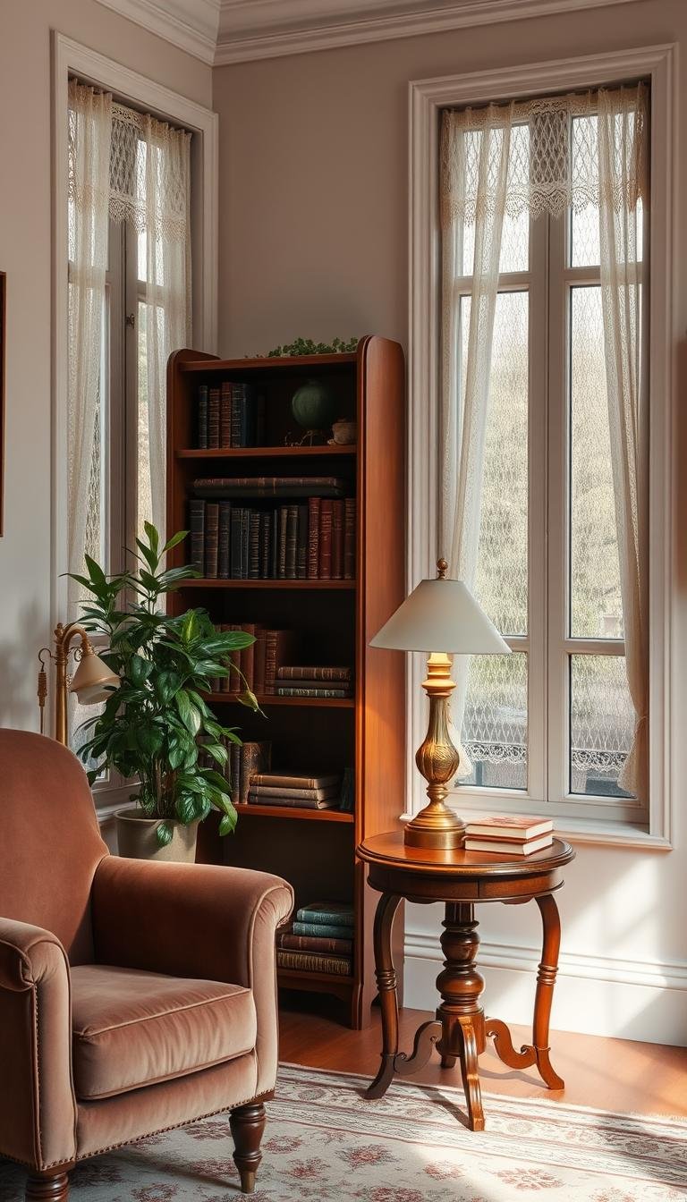
Textures, Woods, and Retro Materials That Add Depth
Texture is the quiet shorthand that makes a room read as collected, not staged. I use material contrasts to give each corner tactile interest without crowding the space.

Textural contrasts that work
I pair rattan with velvet and matte paint with high-gloss lacquer to create lively tension. Glass set against nubby weaves lets light play across surfaces.
Warmth through wood details
Wood details bring instant warmth. I favor light oak slatted panels or walnut accents with clean lines so the room feels modern and cozy.
Terrazzo and shag for playful layers
Small terrazzo pieces—planters or trays—add pattern without dominating rooms. I use 70s-inspired shag in throws or a small rug to boost comfort.
“I repeat one or two textures across a room so every piece feels intentional.”
| Material | Best Use | Effect |
|---|---|---|
| Rattan + Velvet | Chair + Cushion | Textural contrast, tactile warmth |
| Light Oak | Paneling, Shelves | Modern warmth and cohesion |
| Terrazzo | Trays, Planters | Graphic interest in small doses |
| Shag | Throw or Accent Rug | Comfort without clutter |
I balance reflective and matte elements so lighting animates the interior all day. Every piece I add must earn its place by boosting function or tactile richness.
Art, Accessories, and Sourcing for Authentic Character
Curating prints and frames turns blank walls into lived-in stories. I treat art as the finishing layer that ties palette, texture, and furniture together.

Mixing timeless styles
I pair Art Deco geometry, Mid-century abstracts, and a bold Pop Art print to give each room layered personality.
European classics add formality when I want depth, while mid-century pieces keep the mood light.
Matching frame to era
Gilded frames suit old masters; simple wood or black frames suit mid-century works. That choice reads as intentional and helps prints feel authentic.
Gallery walls versus single statements
I prefer one strong statement or a tight gallery wall so the house has a clear art story without clutter.
- I source from Etsy, 1stDibs, eBay, antique fairs, Saatchi Art, and Artfinder to build the collection slowly.
- Transparent acrylic tables and a lucite bar cart keep the footprint light and mobile for entertaining.
- I weave colors from art back into textiles so each print feels integrated, not tacked on.
| Frame Type | Best For | Effect |
|---|---|---|
| Gilded | European classics | Rich, formal |
| Wood / Black | Mid-century prints | Crisp, modern |
| Minimal | Pop and abstracts | Bold, gallery-like |
“I use art as a conversation-starting touch near seating or entries where it gets the most appreciation.”
Room-by-Room Ideas to Bring Vintage to Life
Tuning each room to a clear mood lets period pieces sing without clutter. Below I map simple moves for every zone so the whole apartment reads cohesive and lived-in.

Living area focal choices
I anchor the living room with a velvet sofa, patterned rug, and a sculptural floor lamp as my focal point. Then I add one or two 70s touches—maybe a hanging chair or a metallic side table—to echo the mood.
Kitchen pops and appliances
Retro-style appliances, like a Smeg fridge, bring instant character. I use color blocking on cabinets or a single wall for a cheerful pop that stays modern.
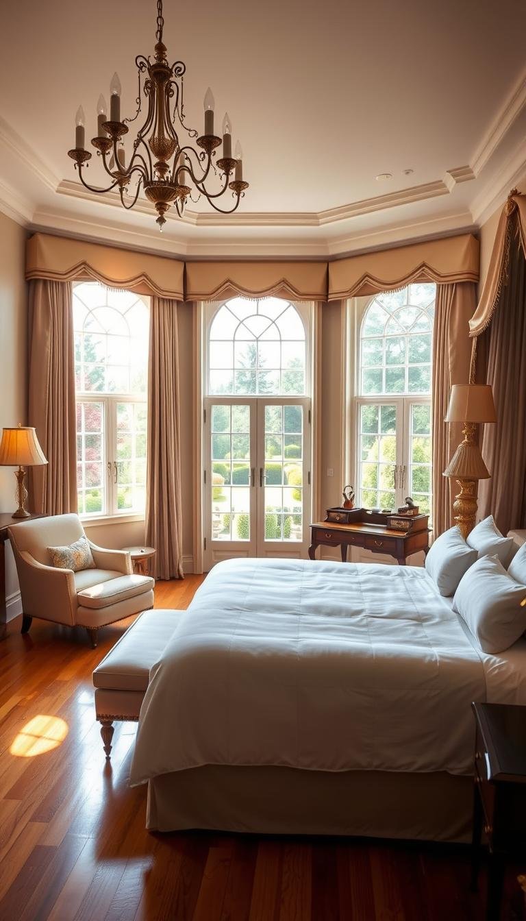
Bedroom warmth and lighting
Wood paneling in lighter tones modernizes the wall. Soft lighting on dimmers and a moody palette make the room a restful retreat.
Entry impact and small-space tricks
Geometric wallpaper or an Art Deco print gives entries big presence with small effort. For tight spaces I pick clear furniture, add plants, and keep patterns proportion-smart to preserve flow.
“Repeat a few colors across rooms so every space feels like part of one thoughtful design.”
Conclusion
Small, decisive edits often turn scattered objects into a cohesive interior story.
I commit to one or two era anchors per room and build around them with supportive pieces and consistent color to keep the whole home cohesive.
Choose furniture and lighting that offer function and character, then refine with wood accents, patterns, and a light metallic touch for impact.
Take this guide slowly: test ideas, invest in what lasts, and let trends filter through durable fabrics and smart layouts so rooms age well over years.
Keep negative space so focal points breathe. Edit often, trust your eye, and let vintage details give each interior lasting character and real living value.